Captain Apollo
Coach
- Messages
- 18,411
No sailor moon this year?
Nah they'll just dak someone during a game to show a moon instead

No sailor moon this year?
I know there didn`t seem to be the effort put into this the last couple of seasons - except for the NRLW who have been excellent - but it`s a real shame this has been canned. I thought this was uniquely NRL and NRLW with a real opportunity to show the `cool` and `humorous` side of our code. Something other codes struggle with.Try July given the flick by SportsBet
Agree. It's definitely something the NRL could run on its own or get one of its other partners to sponsor.Why does Try July need to be owned by a betting company? Why can’t we do Try July as a charity event
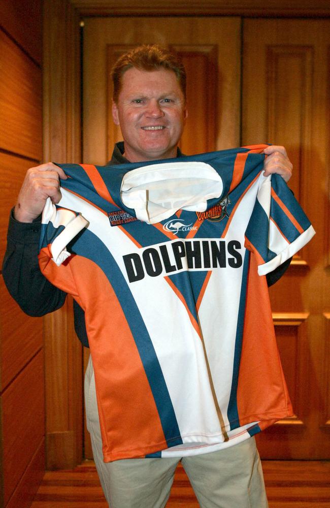
The current Bears NSW Cup alternate jersey seems to be inspired by the Red's Super League jerseyNext we need a Perth Reds inspired Perth Bears jersey.

Ah dammit who cares, let`s go for broke (unfortunate choice of words).. Pokie Den July.Aristocrat try July
There is so much wrong with this. Those colours should not work. Apart from one season, the extinct club being celebrated were not particularly successful on the field, yet they are being celebrated.
 www.roosters.com.au
The garish nature of that colour combination IMO says Gold Coast better than the Giants & Seagulls coloursets that went before it... and I'd argue it even gives the Titans one a run for it's money.There is so much wrong with this. Those colours should not work. Apart from one season, the extinct club being celebrated were not particularly successful on the field, yet they are being celebrated.
But f**k me, it just works. Titans have done a brilliant job with it, even the detail of the modified front sponsor, and the sleeve sponsor mimicking the gold sleeve numbers of the original. Sensational.
Yea I couldn’t help myself. I’ve already a few Titans jerseys, but as a QLDer I support everyone on a tiered basis..That’s hot. Anyone not a titans fan and buying one? I’m thinking of pulling the trigger. At least that cap!

It doesn't just give the Titans a run for its money. Chargers jersey and colour is more iconic, no question. Seen heaps of titans supporters say this is their best jersey ever.The garish nature of that colour combination IMO says Gold Coast better than the Giants & Seagulls coloursets that went before it... and I'd argue it even gives the Titans one a run for it's money.
If the Titans used the Chargers kit design with Titan colours I think it would be a hit.It doesn't just give the Titans a run for its money. Chargers jersey and colour is more iconic, no question. Seen heaps of titans supporters say this is their best jersey ever.
But there in lies the problem for the Titans. They've existed over 6 times longer then the Chargers. They are playing their 20th season and lack a more iconic brand identity then the team that lasted 3 seasons.
Which is my point. Not to mention constantly changing the shades of their colours.If the Titans used the Chargers kit design with Titan colours I think it would be a hit.
The problem is with Titans is that they have never used a traditional styled jersey since it's existence and the kit designs that have been released have been very poor.
My idea would be.Which is my point. Not to mention constantly changing the shades of their colours.
As for your first point, I would imagine it was drawn up in concept but was rejected for one reason or another. Maybe Dynasty's designers could make it work but I feel like it I've never seen a mock-up of it that looks particularly good tbh.
It’s insane that they’ve had the same name/brand for twice as long as the previous team that cycled through 4 names and 3 colourways. But those teams are more “iconic”They are playing their 20th season and lack a more iconic brand identity than the team that lasted 3 seasons.
I wouldn't be surprised to see a "Chargers in Titans colours" happen as a heritage-inspired jersey in coming years - and I think it could be mostly gold with the dark and light blue in the striped saddle, as the Titans have been using gold more often in alternates/special jerseys.Which is my point. Not to mention constantly changing the shades of their colours.
As for your first point, I would imagine it was drawn up in concept but was rejected for one reason or another. Maybe Dynasty's designers could make it work but I feel like it I've never seen a mock-up of it that looks particularly good tbh.
It’s insane that they’ve had the same name/brand for twice as long as the previous team that cycled through 4 names and 3 colourways. But those teams are more “iconic”
Teal and purple has been shown to work, I wonder if the Titans now start to consider a colour rebrand like the Panthers and Warriors have done in recent years? The Wahs returned to the originals with that 25 year retro strip and just kept it: could the Titans do the same?
What they were planning before Redcliffe threatened legal action had more personality than what they ended up with.their whole branding feels like a place-holder that they never got around to reviewing…
It reallys feels like the logo, colours, jumper and name all the result of the question: “what is the MOST average, middle-of-the-crowd, unnotable branding possible?”
Cant touch the name now, but adding a colour (Charger purple, Miami Pink, or something else) and a “core” design (the V, stripes, whatever) would do wonders for their branding