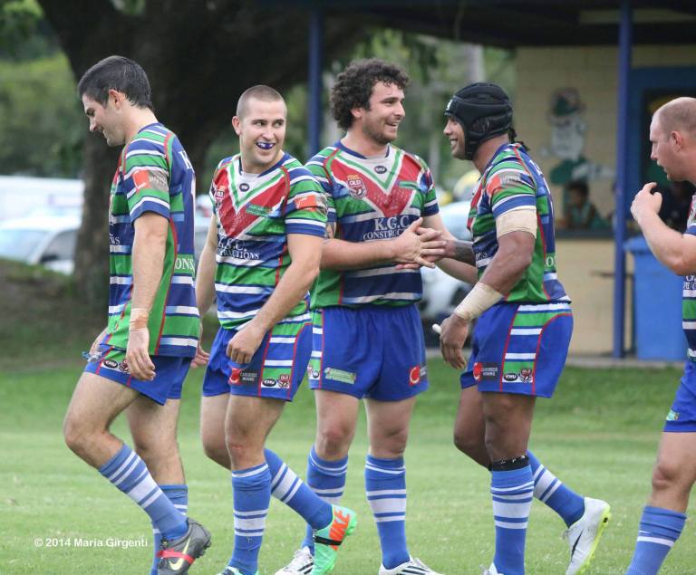
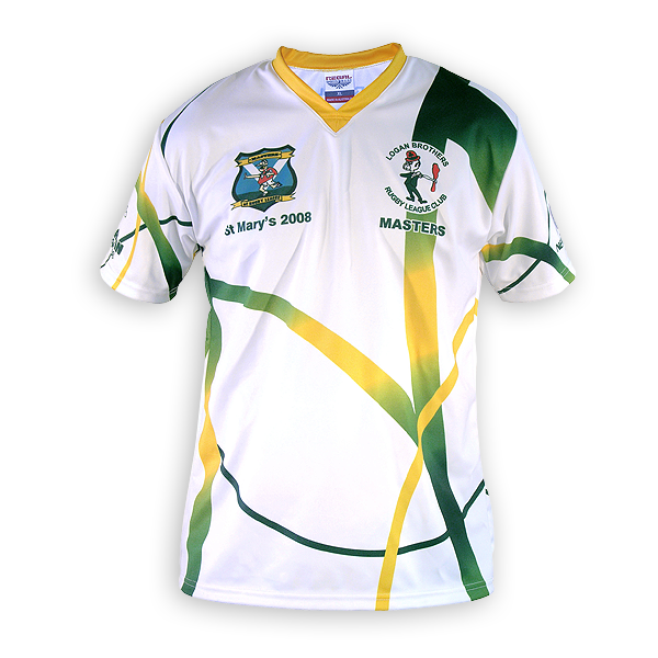
The thing about souths is that they can do anything in red and green and its them. They could do a V, a sash or a quartered jersey and it would still be unmistakable because its their core combination..
Yes I agree, but there's no reason why a club with three or four core colours cannot do the same, in fact they can and have.
If a club was to take on "blue and green butcher stripes on orange", the design has moved beyone the colours and has become dependent on the design aswell. To be recognisable in anny other design, they would NEED to maintain the "blue and green butcher stripes on orange".
Yes a club could do this, but they are entirely restricted and have immediately f*cked themselves over in all other merchandising possibilities.
I'm sorry but you have failed to show any reason why once they move away from two colours to three that "the design has moved beyond the colours and has become dependent on the design as well".
As long as after they have settled on a set of colours and maintain their colours and the ratios at which they apply said colours relatively consistently any design will still look like it is "them".
Aside from Black/white/grey (which are trim, not main colours), who does this?? The closest thing to an example i can find is the Roosters and their Tri-colours, but even that contains the receive 'White'.
Firstly, white, black and grey can be core colours.
Secondly the Raiders, Tigers, Warriors, Cowboys, Titans, Panthers, Storm, Sharks and Broncos have all sustained colour palettes with more then two core colours.
Admittedly some have dropped colours from their palettes or have even gone through re-brands where they have completely replaced their colour palette with another one, but normally that has been met with anger from their fans and not been well received by the greater public either.
Not exactly. I advocate for their CORE design/brand to remain constant (think: souths and the Red-Green stripes, Dragons and the Red-White V. Every club needs the CORE image)....
The point of there being an unchanging core is so that 9s/charity/one-offs are founded in a definite identity. In not idealistic enough to believe clubs would stop producing 5 new jerseys every year (and i dont blame them for doing it. People want to buy that shit), I just believe that these new designs need to be based on a central and unchanging brand.
(Back to the debate: i believe this core design needs to be more simple than the Orange-Green-Blue combination above, so that these peripheral designs can easily be identified as offshoots of the original)
Firstly, three colours just isn't that complex or as incohesive as you're making out.
Secondly, you haven't shown any reasons why if a core brand is really complex it can't be cohesive.
I may be misreading this, but the points your are making seem to favour my argument more so than yours....
If the decision is left to the Brothers alone, they will probably go with the blue-white butcher stripes. If they went with your Tri-colour design, it will have been imposed on them by the ARLC.
Yep you misread it, which is my fault as after rereading it I find it's meaning to be very unclear.
What I meant was that considering that they cannot have blue and white as their colours because there're already to many teams in the NRL with shades of blue and white making up the majority of their designs that they will have to choose their new brand and that nobodies opinion but their own matters when it comes to their clubs brand.
So the whole argument is redundant as blue and white simply isn't a sensible option for them anymore and whatever we'd like to see them run out in doesn't matter.
Regarding your Raiders reference specifically, again this proves my point about teams needing a simple and recognisale core image....
The gold jersey you are refering to is a periferal design, on par with a 9s jersey. It expands on the lesser seen aspects of the brand while maintaining the distinct image (the lime green) that canberra is recognised for.
I'm sorry, but that completely contradicts everything you have been saying all along!
Not only did we altered the make up of the core brand by reducing whites place in the brand and increasing yellows, we also maintain a core image with more then 2 core colours which you have claimed from the start of our discussion is to complex and thus to difficult to achieve .
This jersey isn't some one off (though the jersey that inspired it is) it's our new away jersey, hopefully we will proudly wear either yellow, blue or lime as the majority colour of every Raiders away jersey for the rest of our existence, which is something that the fans have been calling for since the 90s I might add.
It and it's one off Huawei predecessor were both loved by the majority of Raiders fans and widely ridiculed by non Raiders fans as "not looking like how Raiders jersey should look".
If your Brothers design was for a 9s game or a charity match, i wouldnt complain. But using it as the main is not comparable to Canberras trajectory (canberra are a perfect example of simple designs and limited colours creating the most recognisable jerseys)
Now your really you're really contradicting yourself to the point of not ever having a cohesive point of view (BTW I don't think that' I've ever used the word cohesive as much as I have in the last hour in my whole life), we have more core colours in our brand our brand then my proposed Orange Green and Blue design and we use them more complexly then I proposed as well!
Id say you just answered your own question about multiple colours. THAT is the deinition of a clusterf*ck design.
I think most would agree that this kind of jersey shouldnt be an NRL clubs main strip.
I agree it's a terrible design, but that doesn't mean that the same colours cannot be used to make a good design.
And my point was that they already have colours other then blue and white in their brand that they could draw from if they needed to, which in my opinon they would have to if they were to enter the NRL.
Obviously the template i used isnt of a billiant quality. Basically, it was ment to be an inverse version of the Raiders colour scheme (raiders: 1 main colour + the 2 classics as trim / Potential brothers: 2 main colours + 1 classic as trim)
I wouldnt say its a good decision, but if they did use 3 colours that would be the way to do it....
Firstly your design wouldn't just use the blue as the trim on the jersey, it would have it as an armband which is part of the desigin of the jerseys.
Secondly why not integrate the blue into the design more like my idea would and still use it as the colour for the trim and collar (which I would have done in the first place), it would make good use of the colour while still honoring the clubs heritage. And BTW there would be nothing stopping them from using variations of their blue and white stripes as their heritage/charity jersey every year.


