yakstorm
First Grade
- Messages
- 6,084
Huddersfield Testimonial jersey

Nothing says professionalism and enterprise quite like Comic Sans
Huddersfield Testimonial jersey
Titans should use this gold tooLove that gold, so hope if pirates ever get to nrl they use scarlet red and this gold!
Nothing says professionalism and enterprise quite like Comic Sans
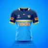
Was really disappointed with the new Titans jersey released this week so decided to have a crack at one.
The design takes inspiration from the original Gold Coast Giants jersey, while remaining with the sky blue that the Titans entered the league with.
Thoughts?
Again we learn that people on here do a better job than morons in marketing.Was really disappointed with the new Titans jersey released this week so decided to have a crack at one.
The design takes inspiration from the original Gold Coast Giants jersey, while remaining with the sky blue that the Titans entered the league with.
Thoughts?
Was really disappointed with the new Titans jersey released this week so decided to have a crack at one.
The design takes inspiration from the original Gold Coast Giants jersey, while remaining with the sky blue that the Titans entered the league with.
Thoughts?
NoiceWas really disappointed with the new Titans jersey released this week so decided to have a crack at one.
The design takes inspiration from the original Gold Coast Giants jersey, while remaining with the sky blue that the Titans entered the league with.
Thoughts?
PerfectionWas really disappointed with the new Titans jersey released this week so decided to have a crack at one.
The design takes inspiration from the original Gold Coast Giants jersey, while remaining with the sky blue that the Titans entered the league with.
Thoughts?
Both Brisbane and NQ usually have strong horizontal elements in their designs. It would be good if the Titans settled on a V based design as it sets them apart in Qld as well as from other teams using similar shades of blue (Eels and Sharks).It's an improvement obviously. However it's a little too reminiscent of a Cowboys jersey to me.
:format(webp)/cdn.vox-cdn.com/uploads/chorus_image/image/62184061/usa_today_11594262.0.jpg)
It's an improvement obviously. However it's a little too reminiscent of a Cowboys jersey to me.
Both Brisbane and NQ usually have strong horizontal elements in their designs. It would be good if the Titans settled on a V based design as it sets them apart in Qld as well as from other teams using similar shades of blue (Eels and Sharks).
Whoever decided on predominantly navy this year needs to take a good hard look at themselves. Having the Titans in blue is one thing but switching to navy is ridiculous. I've actually been thinking of adjusting a previous concept to bring more green into the blue. The Miami Dolphins' current shade is very pleasing to the eye and would look good with a rich gold (not orange).
I doubt Redcliffe will let them have the name. But shifting the colours very slightly in that direction would at least be a nod to the original bid while also setting the club apart in terms of colours. @Hello, I'm The Doctor has suggested a complete switch to teal/orange in the past (amongst about 50 other things for the tits) but I'd prefer to see somewhere in between.Even if they went the whole Dolphins thing, Gold Coast = poor man's Miami. It makes sense.

Haha thanks mate! Nah don’t give a rats about Q CUP but yeah they are taking their time with 2019 strips, c’mon dhgateuser XiLowshung1985, I have customers
It's an improvement obviously. However it's a little too reminiscent of a Cowboys jersey to me.