What's new
The Front Row Forums

Register a free account today to become a member of the world's largest Rugby League discussion forum! Once signed in, you'll be able to participate on this site by adding your own topics and posts, as well as connect with other members through your own private inbox!

The Game Jerseys, Logos, Mock Ups, Photos ANYTHING

Hello, I'm The Doctor

First Grade
Messages
9,124
New sponsor for challenge cup
DxcTH40X4AANvHN

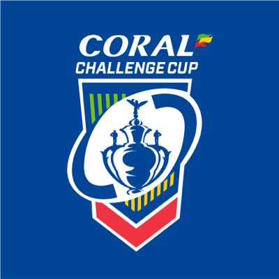
WHat a weird logo....

Its like 10 people had suggestions and they didnt want to leave anyone out.
 

Hello, I'm The Doctor

First Grade
Messages
9,124
It’s a damn shame that the Tigers don’t have a predominately orange jersey. It Looks so good when placed next to all the other jerseys on the wall.

The politics of the club is such a shame...

They cant do whats best for the current club (the brand, the stadiums) because each of the former clubs and their supports are more interested in seeing their side of the merge get equal billing.

Hopefully now with Balmain dead, not everything will have to be an unsatisfying comprise.
 

gzerounian

Juniors
Messages
1,090
Interesting that enough time has passed that we now see early-years NRL jerseys as retro (Storm, Dragons and Tigers)
And ones that are not cotton (in the case of storm and tigers). Time passes quickly doesn't it. Soon there will be retro jerseys made of jersey designs that we have reviewed on in these forums when they were first released.
 

Timmah

LeagueUnlimited News Editor
Staff member
Messages
100,901
WHat a weird logo....

Its like 10 people had suggestions and they didnt want to leave anyone out.
It looks like it's just the challenge cup logo they had prior to the sponsor coming on and because Corals logo is all those colours they just applied it to parts of it
 

Hello, I'm The Doctor

First Grade
Messages
9,124
It looks like it's just the challenge cup logo they had prior to the sponsor coming on and because Corals logo is all those colours they just applied it to parts of it

I dont have much of a problem with the sponsor or the colouring (not great, but hardly terrible)...

The problem is the weird angles and elements; the oval running diagonal to the vaguely sloping shield, not even mentioning the half finished trophy.

THere is no dominant piece to the design. EVERYTHING is background.
 

Timmah

LeagueUnlimited News Editor
Staff member
Messages
100,901
images
DxcTH40X4AANvHN


Looks amateur compared to the previous one
There was one in between which was essentially a de-branded/sponsorless version of the Coral one.

upload_2019-1-23_10-51-47.png

This is the closest I could find. It basically looks like another evolution of the weird shield branding RFL has opted for across a lot of their stuff lately.

36098159_1_L.jpg
 

Hello, I'm The Doctor

First Grade
Messages
9,124
There was one in between which was essentially a de-branded/sponsorless version of the Coral one.

View attachment 26518

This is the closest I could find. It basically looks like another evolution of the weird shield branding RFL has opted for across a lot of their stuff lately.

36098159_1_L.jpg

Alright, i see what they were going for...

Seeing the RFL logo (I havent seen this one before, i thought they still had the ball-hand thing) i can see what they were going for. Making the RFL logo more famous by using it as a frame is a good idea, this is just very bad execution.

Rather than making the ball a window for half the trophy, put the WHOLE trophy in there so it is the dominant element. Even if that means shrinking the trophy, angling it or just taking an element of it (maybe that angel thing on top).
 
Messages
8,480
Was at Mick Symmons today. This is exactly how they presented their jerseys back in the late 80's when there used to be a branch at my local shopping centre.
View attachment 26481

It's near my offices in the city (although I think there are two in the Sydney CBD). Love sticking my head in now and then, buy the odd bit of kit.

That's a great showcase there.

For mine

BEST - Western Suburbs Magpies.
WORST - Broncos diamonds jersey. I was never a fan, know some here are. Looked like jockey silks to me.
 

gzerounian

Juniors
Messages
1,090
It's near my offices in the city (although I think there are two in the Sydney CBD). Love sticking my head in now and then, buy the odd bit of kit.

That's a great showcase there.

For mine

BEST - Western Suburbs Magpies.
WORST - Broncos diamonds jersey. I was never a fan, know some here are. Looked like jockey silks to me.
Magpies is a pretty cool jersey. I like the Bears jersey and the Broncos with yellow on top. They should do a magpies plain white Victa jersey from the early 80's
 

sempmrh

Juniors
Messages
1,198
With the retro jerseys, I’m still genuinely surprised that they have original sponsors (with the exception of course of some of the original apparel supplier logos). So many of those companies have no association with rugby league anymore and some are in direct competition with current league sponsors (the Knights jersey has an Optus ARL logo for example). If only we had someone here who worked for Classic and could possibly enlighten us on how these jerseys happen.
 
Top