GAZF
First Grade
- Messages
- 8,756
The Raiders have caused the Raiders the most heartache over the last two years. Like the design though.the team which has undoubtedly caused Raiders fans the most heartache over the last two years.
The Raiders have caused the Raiders the most heartache over the last two years. Like the design though.the team which has undoubtedly caused Raiders fans the most heartache over the last two years.
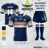
Week 4 takes us to the foot of the mountains to re-design the team which has undoubtedly caused Raiders fans the most heartache over the last two years. Full credit to Penrith, their 2019 jerseys are easily some of the best in the comp and are a nice modification of the classic “Licorice All Sorts” Penrith jerseys of the 90s.
My designs look to combine this same look with the premiership winning 2003 jerseys, creating a nice middle ground between the two. I’ve also changed the away shorts to black, as I think the full white design looked average in the trial against Parramatta. Would love to hear your thoughts and feedback!
View attachment 28048 View attachment 28049
What is that, a logo for ants
Grab your 2019 WC Pirates retro jersey. Just $60.
https://www.struddysonline.com.au/nrlwa/
View attachment 28108
Holy shit that is tempting. Mrs will probably kill me though.

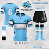
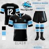



Nice simplification of their classic design, so of course the Sharks haven't done it in real life. The sponsor needs to shift up a bit so its centered on the band though.The Cronulla Sharks are a team whose jerseys have always thrived with simplicity. Whenever they’ve shifted away from the pale blue with white hoops/v it’s usually been for the worst (see early 2000s cartoon shark jerseys). With my design, I’ve looked to declutter the iconic Sharks jersey, eliminating the unnecessary black or white panel on the back of the jersey to create a cleaner look.
Also attached a third jersey I made out of curiosity.
View attachment 28485 View attachment 28486 View attachment 28487


MG turning back the clock in this years Pirates Heritage jersey.
View attachment 28532
View attachment 28533
The only team to nail a heritage jersey isn’t even in the NRL...MG turning back the clock in this years Pirates Heritage jersey.
View attachment 28532
View attachment 28533
