What's new
The Front Row Forums

Register a free account today to become a member of the world's largest Rugby League discussion forum! Once signed in, you'll be able to participate on this site by adding your own topics and posts, as well as connect with other members through your own private inbox!

The Game Jerseys, Logos, Mock Ups, Photos ANYTHING

Heisenberg

Juniors
Messages
77
They've changed since re-admission this year. WA colours, I like it. And don't know why they didn'r rune with this in the first place..
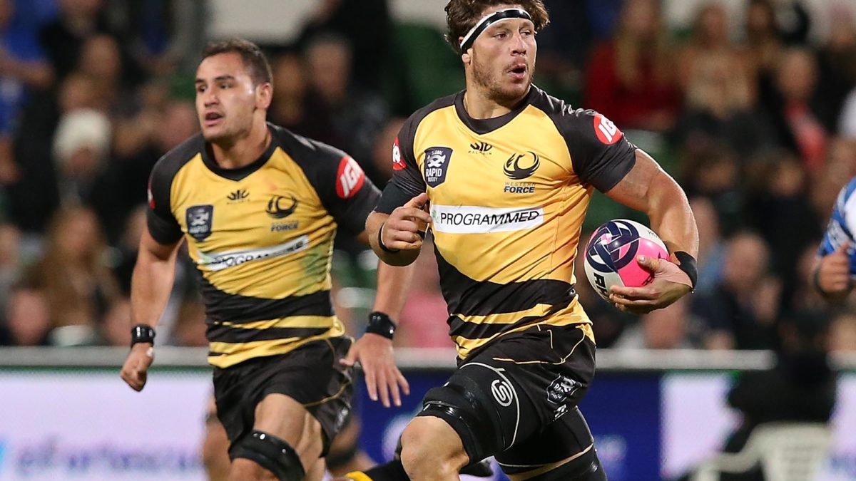
rugby-union-western-force-brynard-stander-1200x675.jpg
Think the clash with the Wellington Hurricanes might have had something to do with this.
 

Nqcowboy

Juniors
Messages
157
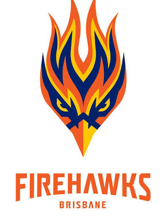
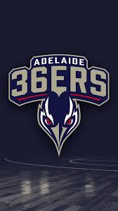
Haven’t followed the nbl closely for awhile and didn’t realise the 36’ers had changed logos but without the wings the fire hawks logo does look they pretty much copied the adelaide logo, but then again everything is a remix.
On a side note the fire hawk is a native bird that gets its name because it literally starts fires by picking up smouldering embers and dropping them on I burnt Bush land, they’re like an avian arsonist or a just a fireman back burning but in bird form
 
Last edited:

sempmrh

Juniors
Messages
1,211
I’ve never been a fan of that 36ers logo or colour change since they unveiled it. They’ve had a history of underwhelming or generic logos but I feel like this attempt to give them some kind of identity missed the mark. I like the Firehawks logo better despite the similarities - but if the Firehawks get granted an NRL license I wouldn’t be surprised to see a different logo.
 

PARRA_FAN

Coach
Messages
17,677
I like the nickname Firehawks, something different, not a fan of "Brisbane only" but the logo that Aaron Eastgate designed should be the one picked.
 
Messages
14,822
a lady reading newspapers on toilet?
:p

I like the Firehawks logo, but I reckon Easts would be better suited teaming up with Wynnum Manly Seagulls to become the East Coast Seagulls. That way the club represents two giants from the BRL era and its name is unique. It would represent the south-eastern side of the city, where it is based, allowing the Broncos to focus on the north-West.9088CF50-1E1D-42F2-86A3-45BB971424BE.jpeg
 
Last edited:

blue bags

First Grade
Messages
9,597
:p

I like the Firehawks logo, but I reckon Easts would be better suited teaming up with Wynnum Manly Seagulls to become the East Coast Seagulls. That way the club represents two giants from the BRL era and its name is unique. It would represent the south-eastern side of the city, where it is based, allowing the Broncos to focus on the north-West.View attachment 40392
i like your postings, but this is just a seagull head, they should use a whole seagull, wings an all
 

Latest posts

Top