How many times can you add the team shield to a jersey? I'm counting 7 on just the front.
.jpg)
It's not actually the club logo, it's some logo with an Owl on to celebrate the Wigan Casino.
.jpg)
Cracking Sheffield Wednesday logo though. If you removed that, it'd improve the kit tenfold.
Linking the brand with the casino is called cross-promotion. Done right it's an incredibly powerful marketing tool.When I was looking on my phone at the previous post I didn't notice the Owls, just the circle badge with the text, but they are really obvious now...
I just don't get why... If they want to promote the casino, promote it, don't put some hybrid Warrior - Owl logo thing...
I really feel like Wigan does not understand the basics of brand marketing... Firstly they make a big deal about the new logo and refreshed brand and release large amounts of PR dribble outlining the importance of the core elements which reflect their identity which were 'cherry & white stripes', the shield and the warrior head....
Then they release a red & black home strip, make the logo blue & black on the away and then incorporate someone else's logo into theirs for some strange promotion...
I mean there is nothing wrong with colour changing logos, the likes of Nike, Apple, Telstra, etc have been doing it for years, but if you do that, you can't say 'cherry & white hoops' are an important part of your brand identity.
Linking the brand with the casino is called cross-promotion. Done right it's an incredibly powerful marketing tool.
Changing the colour of the logo on the away jersey is integration, it's intended to make the logo fit in better with the jersey and give the brand overall a more streamlined look.
They are attempting to go with a multifaceted brand, i.e. flexible enough to appeal to a broad group of people. Just because cherry and white is an important part of the brand that doesn't mean it's the be all and end all for the brand, and that they shouldn't, or can't, try to broaden the brands scope.
Now I'm not saying that what Wigan have done here are good examples of what I'm (extremely briefly) describing above, in fact I think they are all very clunky attempts, but to say that they show a lack of understanding of the basics of brand marketing is just wrong. They understand basic brand marketing just fine, they just aren't practicing it the way you would prefer.
When I was looking on my phone at the previous post I didn't notice the Owls, just the circle badge with the text, but they are really obvious now...
I just don't get why... If they want to promote the casino, promote it, don't put some hybrid Warrior - Owl logo thing...
I really feel like Wigan does not understand the basics of brand marketing... Firstly they make a big deal about the new logo and refreshed brand and release large amounts of PR dribble outlining the importance of the core elements which reflect their identity which were 'cherry & white stripes', the shield and the warrior head....
Then they release a red & black home strip, make the logo blue & black on the away and then incorporate someone else's logo into theirs for some strange promotion...
I mean there is nothing wrong with colour changing logos, the likes of Nike, Apple, Telstra, etc have been doing it for years, but if you do that, you can't say 'cherry & white hoops' are an important part of your brand identity.
I can see the angle on this one - what is Wigan famous for, apart from League and discounting pies which is hardly attractive brand association? Globally, it’s northern soul at the Wigan Casino - classic beats that inspired generations of DJs, early breakdancing, it’s got some proper potential in building some nice ‘retro and cool’ brand values
Fair call, I just feel like the execution doesn't make me think 'Wigan Casino' without someone explaining it to me, but I'm not from Wigan, so maybe that is the problem.
Sorry but that is hideous.Wests Tigers old Florida Panthers ripoff could probably do with an upgrade as well. Though its the only thing about the 'brand' that has remained consistent.

And they were never Wests magpies . That made up word is sooo 99Sorry but that is hideous.
And they were never Wests magpies . That made up word is sooo 99
Thats probably the best broncos jersey ive seen in a while
The best Raiders Away jersey if seen in a while
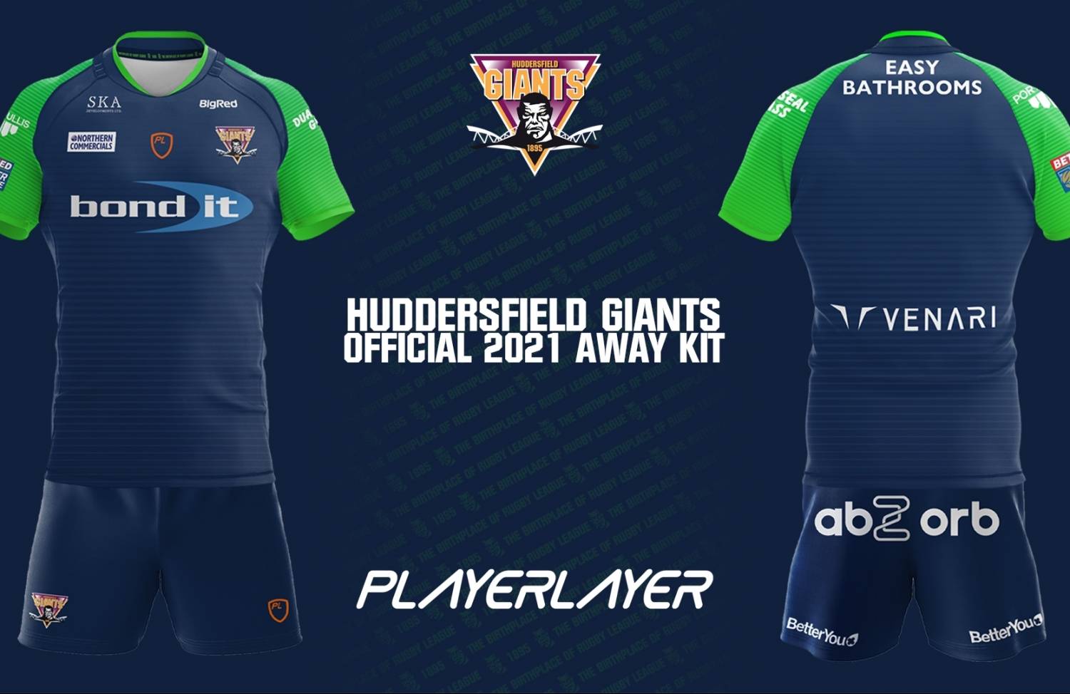
Huddersfield Away Kit 2021
