yeah that pink one is fine 
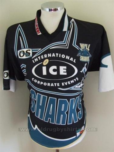
the sharks gold standard for bad jerseys is the white and grey. there is no debate its even worse than the sharkmouth jersey
https://us.ev2sportswear.com/collec...lando-gators-masters-rugby-league-club-jersey https://us.ev2sportswear.com/collections/mid-atlantic-reapers-rugby-league https://us.ev2sportswear.com/collections/tampa-mayhem-rugby-league https://us.ev2sportswear.com/collections/delaware-black-foxes-rugby-league
I actually don't mind that one.. they tried an away that looked like a shark's belly & gills. Even though it had grey (not typically part of the club's colours), it was ok. Reminded me of the white "fins" alternate, which I think was a nice direction for the club - unfortunately pretty quickly abandoned.
Zimbabwe new Rugby jersery/logo really like the Sable logo https://www.facebook.com/ZimbabweRugbyUnion/
the more you see lists just with their town/region, the more "Sydney" seems redundant, in a comp full of Sydney teams, a team solely called Sydney is redundant... Hence more folks on here getting behind the Sydney City name being returned, or even better East Sydney....
https://us.ev2sportswear.com/collections/white-plains-wombats-rugby-league https://us.ev2sportswear.com/collections/brooklyn-kings-rugby-league