What's new
The Front Row Forums

Register a free account today to become a member of the world's largest Rugby League discussion forum! Once signed in, you'll be able to participate on this site by adding your own topics and posts, as well as connect with other members through your own private inbox!

The Game Jerseys, Logos, Mock Ups, Photos ANYTHING

sempmrh

Juniors
Messages
1,210
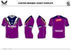
Storm has been holding a competition for members to design an alternate jersey for next year. Please excuse my shitty Paint skills - I had forgotten about the deadline and rushed to get it in in time. It would have helped if they provided cleaner template images - or if I wasn’t too slack in the moment to dig up something better than Paint. I think it gets the point across, though - and if it gets chosen as one of the top four they’ll clean it up and present it professionally.

Basically I wanted something like our original 1998 jersey but with an emphasis on a solid purple colour. It’s very similar to our 2021 home jersey as well - which just shows how a tweak or two would have made it so much better.
5BC0E857-CB9F-4111-957D-DF812F872C07.jpeg
 

sempmrh

Juniors
Messages
1,210
If you're going to do an alternate, that gold training jersey with the navy, purple and white V from a few years back is a winner.
My personal preference is for gold/yellow to be an accent colour only - but possibly as a one-off, pre-season or Nines jersey. I like us in a clean, white jersey when playing away.
 

beagle

Juniors
Messages
763
A bit of lockdown boredom
Really hope Parra ditch the away and alternate jerseys next year. It's usually 2 years but I think they can apply to change it before that.

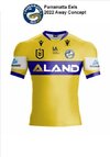
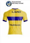
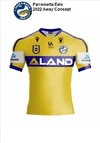
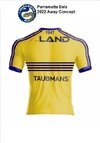
Away jersey concepts/mockups based on the Foundation jersey with colours reversed, and the 1981 away jersey

Parrakitbuilderfrontresize.jpgParraktibuilderbackresize.jpgParra2kitbuilderfrontresize.jpgparra2kitbuilderbackresize.jpg
 

toomuchsoup

Juniors
Messages
2,255
I think the idea of a home and away jersey isn’t great. Although some of them serve the purpose of not clashing, some fall flat. For example. The Roosters (Navy, red & white) vs The Knights (Blue & red). I think that adding white to the knights colour palette makes for more of a clash with the roosters than the knights home. Although they share similar colours, just the knights home jersey being a solid colour is more than enough visual difference to the roosters with their white shorts.

I’d have it so teams have a ‘Main’ jersey, then they have to have 2 alternate/clash jerseys, 1 being majority dark and the other majority light.

I dunno, that Roosters vs Knights clash has just bothered me for a while now
 

flippikat

First Grade
Messages
5,215
I think the idea of a home and away jersey isn’t great. Although some of them serve the purpose of not clashing, some fall flat. For example. The Roosters (Navy, red & white) vs The Knights (Blue & red). I think that adding white to the knights colour palette makes for more of a clash with the roosters than the knights home. Although they share similar colours, just the knights home jersey being a solid colour is more than enough visual difference to the roosters with their white shorts.

I’d have it so teams have a ‘Main’ jersey, then they have to have 2 alternate/clash jerseys, 1 being majority dark and the other majority light.

I dunno, that Roosters vs Knights clash has just bothered me for a while now

Roosters v Knights is an easy one to fix IMO - just do a mostly red design as an alternate for the Knights.. for example this one from "Concept Lab" Facebook page.
 

Attachments

  • FB_IMG_1627127737574.jpg
    FB_IMG_1627127737574.jpg
    36 KB · Views: 9

MugaB

Coach
Messages
15,020
I think the idea of a home and away jersey isn’t great. Although some of them serve the purpose of not clashing, some fall flat. For example. The Roosters (Navy, red & white) vs The Knights (Blue & red). I think that adding white to the knights colour palette makes for more of a clash with the roosters than the knights home. Although they share similar colours, just the knights home jersey being a solid colour is more than enough visual difference to the roosters with their white shorts.

I’d have it so teams have a ‘Main’ jersey, then they have to have 2 alternate/clash jerseys, 1 being majority dark and the other majority light.

I dunno, that Roosters vs Knights clash has just bothered me for a while now
I seriously think all we need is a home and away only, when I've been making concepts ive added in a heritage, purely coz the off chance that the home jersey doesn't reflect the current sides main colors, for example this year Canberra has gone with a new color scheme, but kept their pine lime as the "heritage" lots of teams can do this, both honouring the past but also reflecting their future, and making sure out of the three they have an option not to clash.
Ive noticed you've been making 4 concepts per club, its one too much for me, i think an alternate shouldn't exist, if your looking to design a 4th kit maybe a training one, some teams have been great at those, for example panthers have the chocolate soldiers,warriors with their green to blue fade etc...
but three kits per club should be more than enough
 
Last edited:

flippikat

First Grade
Messages
5,215
I seriously think all we need is a home and away only, when I've been making concepts ive added in a heritage, purely coz the off chance that the home jersey doesn't reflect the current sides main colors, for example this year Canberra has gone with a new color scheme, but kept their pine lime as the "heritage" lots of teams can do this, both honouring the past but also reflecting their future, and making sure out of the three they have an option not to clash.
Totally agree. Clubs should have a main, alternate & heritage.

Problem is that the "event" jerseys - basically ANZAC, Women in League & Indigenous - have become such an ingrained part of the competition now, that if they get stopped (or replaced by a special logo or patch) then the NRL would be accused of acting against those rounds - nevermind the fact that the jerseys often don't get used on the actual round they're designed for!

The easy way to do it would be to have a poppy label added to the heritage jersey for all teams playing on ANZAC round (so Heritage jerseys get a guaranteed run that weekend), maybe a special NRL logo for Indigenous Round, and a special logo/pink socks for women in league.. with players wearing special "warm up" shirts that get auctioned for charity after the game (each club nominating a charity like Women's Refuge etc)

Oh, and I'd love to see the heritage set across all teams reflect a certain era.. Fox League are running a 90s theme in their coverage next week - how good would it be for all teams to run out in 90s designs?
 

SLRBRONCOS

Referee
Messages
25,162
Storm has been holding a competition for members to design an alternate jersey for next year. Please excuse my shitty Paint skills - I had forgotten about the deadline and rushed to get it in in time. It would have helped if they provided cleaner template images - or if I wasn’t too slack in the moment to dig up something better than Paint. I think it gets the point across, though - and if it gets chosen as one of the top four they’ll clean it up and present it professionally.

Basically I wanted something like our original 1998 jersey but with an emphasis on a solid purple colour. It’s very similar to our 2021 home jersey as well - which just shows how a tweak or two would have made it so much better.

View attachment 51163
You did that on paint!? That’s an awesome job!
 

flippikat

First Grade
Messages
5,215
Interesting.. I wonder whether this is "best guess" mockups done by someone or actual graphics from their respective bid documents?

Of the three (on purely aesthetics), I really like the Jets the most - looks a bit like the NZ Maori jersey with the dark green & black.. shorts should be green imo as a point of difference from Souths. Glad they dropped the yellow/gold too, as it's a good admission that this won't be their Qld Cup team & a bit of outreach.

Firehawks probably my 2nd fave - orange & blue with some black is a pretty cool scheme. I hope they pair it with blue shorts as a further point of difference from their Qld Cup outfit & the Wests Tigers. Make orange the main colour, blue 2nd, and black an accent/3rd, and they can't go wrong.

Redcliffe.. *sigh* you really get the feeling that they're grudgingly adding gold.. and it's pretty much one of their Qld Cup jerseys, yeah?? I WISH they'd picked silver instead - it's in the logo, and Dolphins are actually silver too. It just smacks as a wasted opportunity to differentiate the NRL team from the Qld Cup operation. They should have done far more to appeal the city-wide fans. Big fail, in my reckoning.
 
Messages
23,965
I like the Jets one the most, but would love it if they lost the white stripes above and below the V. Love that a dark green and white colour scheme is being considered, plenty of lower grade sides to take inspiration for design (St Marys, Renown United, Como-Jannali, etc).
 

toomuchsoup

Juniors
Messages
2,255
I seriously think all we need is a home and away only, when I've been making concepts ive added in a heritage, purely coz the off chance that the home jersey doesn't reflect the current sides main colors, for example this year Canberra has gone with a new color scheme, but kept their pine lime as the "heritage" lots of teams can do this, both honouring the past but also reflecting their future, and making sure out of the three they have an option not to clash.
Ive noticed you've been making 4 concepts per club, its one too much for me, i think an alternate shouldn't exist, if your looking to design a 4th kit maybe a training one, some teams have been great at those, for example panthers have the chocolate soldiers,warriors with their green to blue fade etc...
but three kits per club should be more than enough
I totally agree, I’d love for teams to wearing their truest identity as often as possible. I’ve been nerding out on NBA and NFL jerseys lately. I just dig the way a lot of them have a few different coloured kits that still fit their identity and I guess I did my mock-ups in that mindset.

Its a bit all over the shop at the moment. Home, away, indigenous, then some having an Anzac, some having WIL, heritage.

I think some kind of standardisation would be good. Not on a super league level like they did with the designs but with the amount of jerseys, the way they look on the field and making sure the game looks as clean and professional as possible
 

MugaB

Coach
Messages
15,020
Lol. The Firehawks template is the Emu Sportswear online editor that Muga and I have been using, and the Jets and Dolphins are the Struddys Template I was using before. Not saying they’re not what the jerseys might look like, but those would have taken 5 mins to make
Yes whoever pur those three jerseys together we not trying hard, none of them look good
 

MugaB

Coach
Messages
15,020
I totally agree, I’d love for teams to wearing their truest identity as often as possible. I’ve been nerding out on NBA and NFL jerseys lately. I just dig the way a lot of them have a few different coloured kits that still fit their identity and I guess I did my mock-ups in that mindset.

Its a bit all over the shop at the moment. Home, away, indigenous, then some having an Anzac, some having WIL, heritage.

I think some kind of standardisation would be good. Not on a super league level like they did with the designs but with the amount of jerseys, the way they look on the field and making sure the game looks as clean and professional as possible
Well for example penrith won't be wearing the white away kit, wests wouldn't wear the white/gold alternate kit, and canberra, dragons and souths alternate isn't really doing anything for them..
Need to stick to home, away and heritage, like flippikat mentioned the one off WIL, Indigenous, Anzac, can all be patches on a heritage jersey
 

toomuchsoup

Juniors
Messages
2,255
Well for example penrith won't be wearing the white away kit, wests wouldn't wear the white/gold alternate kit, and canberra, dragons and souths alternate isn't really doing anything for them..
Need to stick to home, away and heritage, like flippikat mentioned the one off WIL, Indigenous, Anzac, can all be patches on a heritage jersey
I think what I’m trying to say is that sometimes just one ‘away’ jersey isn’t enough in terms of having a good contrasting matchup of all jerseys. The problem sometimes lies with clubs that have a mixture of light and dark colours (eg. roosters, bulldogs, warriors, manly, south away etc) For example if the Firehawks get the bid, a lighter away for the tigers might be necessary. I also think having 3rd option of showing of your ‘Identity’ in a different colourway is kind of cool. But these are just my silly imaginary mock-ups of how I’d like to see the comp
 

Latest posts

Top