sempmrh
Juniors
- Messages
- 1,197
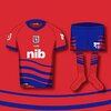
Storm has been holding a competition for members to design an alternate jersey for next year. Please excuse my shitty Paint skills - I had forgotten about the deadline and rushed to get it in in time. It would have helped if they provided cleaner template images - or if I wasn’t too slack in the moment to dig up something better than Paint. I think it gets the point across, though - and if it gets chosen as one of the top four they’ll clean it up and present it professionally.
Basically I wanted something like our original 1998 jersey but with an emphasis on a solid purple colour. It’s very similar to our 2021 home jersey as well - which just shows how a tweak or two would have made it so much better.

Basically I wanted something like our original 1998 jersey but with an emphasis on a solid purple colour. It’s very similar to our 2021 home jersey as well - which just shows how a tweak or two would have made it so much better.