toomuchsoup
Juniors
- Messages
- 2,255
Should try warriors in greenReaaally bored in lockdown so I made a ‘colour rush’ round concept. They do it in the NFL and I think it could be cool for a one off or for magic round or something
View attachment 53123
The sponsors would be stoked.Reaaally bored in lockdown so I made a ‘colour rush’ round concept. They do it in the NFL and I think it could be cool for a one off or for magic round or something
View attachment 53123
They definitely wouldn’tThe sponsors would be stoked.
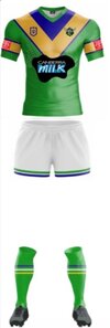
It's a better execution of a V than the 2012 jersey, which had a thin, shallow V that was cluttered with white.And another Raiders concept. I don’t like the navy direction that they’ve gone with. I think the gold and blue go with light green really well.View attachment 53124

Yeah spew.It's a better execution of a V than the 2012 jersey, which had a thin, shallow V that was cluttered with white.
View attachment 53228
What if you use a referee's interpretation of a shoulder?Yeah spew.
If the V doesnt touch the shoulders it can f**k off
The white on the outside of the blue and yellow is traditionally how the Raiders have presented those colours.It's a better execution of a V than the 2012 jersey, which had a thin, shallow V that was cluttered with white.
View attachment 53228
It's a better execution of a V than the 2012 jersey, which had a thin, shallow V that was cluttered with white.
View attachment 53228
You're right. There's no other possible circumstance where this design feature could look cluttered on a rugby league jersey.In other words the white outside the blue and yellow is the norm and not an outlier, and nobody would ever suggest that it's 'cluttered' in any other circumstances.

That's not clutter because the white is on the outside though is it.You're right. There's no other possible circumstance where this design feature could look cluttered on a rugby league jersey.

See, with that particular cut jersey I prefer the V like that. When ISC had the Dragons contract, they added a shoulder & back part to the V and it was ugly as sin: the chest V often wouldn’t line up with the shoulder V, and in situations the jersey looked more like a U than a V.Yeah spew.
If the V doesnt touch the shoulders it can f**k off
I disagree. A neutered V comes across a bit like…See, with that particular cut jersey I prefer the V like that. When ISC had the Dragons contract, they added a shoulder & back part to the V and it was ugly as sin: the chest V often wouldn’t line up with the shoulder V, and in situations the jersey looked more like a U than a V.

Its cluttered because of the positioning, how complex the striping pattern is, and the surrounding logos. If you had your heart set on putting sponsors and design elements like striping in the same space, you have to make compromises like simplifying the design element (remove/thin out the white, thicken the blue and gold, for example). I'd say the same thing if Brisbane or Parra tried a V with their traditional striping.That's not clutter because the white is on the outside though is it.
It's cluttered because a sponsor has been placed right on top of it. Almost any design is going to look cluttered if other design elements are placed on top of them...
Refer to NIB sponsorship on newcastleThat's not clutter because the white is on the outside though is it.
It's cluttered because a sponsor has been placed right on top of it. Almost any design is going to look cluttered if other design elements are placed on top of them...


I like the first one with white shorts.And another Raiders concept. I don’t like the navy direction that they’ve gone with. I think the gold and blue go with light green really well.View attachment 53124

