hrundi99
First Grade
- Messages
- 8,415
Yep. Traditional shield etc. with "modern" font.The shield is ok, probably needs a bit of clean-up, but that wordmark doesn't suit at all.
Yep. Traditional shield etc. with "modern" font.The shield is ok, probably needs a bit of clean-up, but that wordmark doesn't suit at all.
Cheers man. Fair enough. Yeah, it’s not exactly ‘traditional’ Raiders… My thinking was to incorporate some the features of their current ‘home and away’ but make it look a bit more ‘Raiders-ish’.I usually love your work Toomuchsoup. Those Dolphins and Reds jerseys are ridiculously good. But as a Raiders fan I am not super loving the Raider ones. Not that they are terrible in any way and they are not as bad as some of the kits we have played in but I’m just thinking it’s the V.


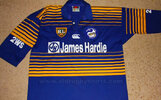
That's looking sharp. Reminds me a lot of the mid-90s Parramatta jersey, just with some of the "fading stripes" on the body & arms removed.. and looks a lot cleaner that way.
A little random, maybe, however recently I cast my eyes over all the NRL club logos, and I noticed that Manly's current logo is pretty much the last of the cartoony 1990's logos that remains. I mean, it's no 'Sydney City Roosters' running chook logo, but it's still cartoony and contains colours that aren't maroon and white (I always much prefer if logos can solely incorporate the colours of the club they represent).
With all this in mind, I had the idea to revisit their previous iconic logo, but tweak it a bit.
So, for no other reason than 'just because', I'm posting my couple of quick ideas here..!
There's a lot of black, in that merch, is this another 4th color i supposeNew Dolphin Kings merch is out. Red and gold nice colour scheme.
View attachment 55861
View attachment 55862
Meh….New Dolphin Kings merch is out. Red and gold nice colour scheme.
View attachment 55861
View attachment 55862
There's a lot of black, in that merch, is this another 4th color i suppose
These may be old but there is a retro tshirt range I came across
View attachment 55679
Cheers man. Fair enough. Yeah, it’s not exactly ‘traditional’ Raiders… My thinking was to incorporate some the features of their current ‘home and away’ but make it look a bit more ‘Raiders-ish’.