What's new
The Front Row Forums

Register a free account today to become a member of the world's largest Rugby League discussion forum! Once signed in, you'll be able to participate on this site by adding your own topics and posts, as well as connect with other members through your own private inbox!

The Game Jerseys, Logos, Mock Ups, Photos ANYTHING

applesauce

Bench
Messages
3,573
Can somebody mock up a storm jersey with bank of Melbourne sponsorship?

How I hope it looks:
2nr0lm8.jpg


How it will look:
2ahwfwk.jpg
 

kdalymc

Bench
Messages
4,353
Yeah all good. Just someone suggested that jersey had no roosters input whilst it most clearly did...
 

Lambretta

First Grade
Messages
8,689
Front left is quite clearly Great Britain :/
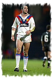
I took the separated red and blue lines to be Roosters and the joined red and blue to be this GB jersey which Morley debuted in


adrian_morley.jpg


The separated red and blue was the Roosters GF jersey in 2002
_38264127_morley300.jpg


Morley never played in a Roosters jersey that had joined red and blue on white. That was in 2010. He was long back in the UK by then
 

Hello, I'm The Doctor

First Grade
Messages
9,124
The storm need to let go of the lightning bolts on the body. The sponsor logo covers up what makes it a lightning bolt.

This.

Dont lose the Bolts all together, just use them for designs arount the collar/shoulders/side panels.

Ive always thought that teams with a distinctive colour (Raiders in lime-green, Broncos in Maroon, Storm in Purple) should do jerseys in a solid colour (no design). Think of the Origin jerseys; Queensland potentially have their best ever and thats because it is bold and simple.

Just imagine this...

DFA0E31528341B408B7E8DA34795712F.JPG


...without the Bolts or the box. Just a plain, bright purple; distinctive and clean.

And if you are still desperate to keep the lightning bolts (they are pretty cool), im sure there is a far more subtle place to put them...
 

kdalymc

Bench
Messages
4,353
I took the separated red and blue lines to be Roosters and the joined red and blue to be this GB jersey which Morley debuted in


adrian_morley.jpg


The separated red and blue was the Roosters GF jersey in 2002
_38264127_morley300.jpg


Morley never played in a Roosters jersey that had joined red and blue on white. That was in 2010. He was long back in the UK by then


Ffs have a look at the f**ken jersey- the (his) right side is GB, the left is CLEARLY roosters, red is ABOVE the blue. He may not of worn it, but it IS the 2010 (or so) roosters away. I posted the exact jersey and statement on the previous page.
 
Messages
3,987
wow, those are great.

id never want to see any of those as main jersey, but thats exact what 9's jerseys should have been.

Still, theres always next year....


I love the Roosters 9's jersey they have for the tournament this year. I do not normally buy one off jerseys but this one is great. As is there ANZAC Day one. Actually this is the first year I love every Roosters jersey and think they are great.
 

Lambretta

First Grade
Messages
8,689
Ffs have a look at the f**ken jersey- the (his) right side is GB, the left is CLEARLY roosters, red is ABOVE the blue. He may not of worn it, but it IS the 2010 (or so) roosters away. I posted the exact jersey and statement on the previous page.

You are right

They have f**ked the Jersey IMO

They used a Roosters design never worn by Morley and used a GB Jersey not associated with him

Either that or they got the colours upside down on each side. Strange
 

Canard

Immortal
Messages
35,787
A few months ago a post was made showing some cool NRL hoodies, anyone remember what comany was offering those up for sale?
 

Latest posts

Top