What's new
The Front Row Forums

Register a free account today to become a member of the world's largest Rugby League discussion forum! Once signed in, you'll be able to participate on this site by adding your own topics and posts, as well as connect with other members through your own private inbox!

The Game Jerseys, Logos, Mock Ups, Photos ANYTHING

The Great Dane

First Grade
Messages
7,957
anyone know what the story was with the black in 2000 strip? and jesus there is a lot of different 'lime' greens

It was part of the re-brand for 'the new millennium'/attempt to completely wash away the connections to Super League stylistically that the previous jersey design had as much as possible.

By and large the whole re-brand (particularly the dark green) wasn't very popular with the fans so it was chucked out.
 

GAZF

First Grade
Messages
8,752
The only one getting "pissy" about anything seems to be you! I mean Jesus you're taking a sarcastic comment and trying to paint it as if I hold it as a point of principle or something.

I'm sorry, no post of yours that I've bothered to read cover to cover ever suggested you tended towards sarcasm. I took it as an absolute statement which seems to better fit your prose. Had someone else said it in this discussion, I may not have interpreted it that way.

You're not even arguing the point that gzerounian brought up that- Which is abjectly false...
Why do I have to argue someone else's point? I was adding my two cents on this point you made...

Also would it have killed them to get the design correct... The bands go all the way around the sleeves not halfway around!

...and included the photos to suggest that a sponsor blocking the most visible section of the stripe was visually equal to or worse than part of the stripe missing from the armpit. Then you made it about a historical precedent for sponsors covering the stripes, so you're not even arguing the point that I brought up- Which is abjectly false.
 

The Great Dane

First Grade
Messages
7,957
Why do I have to argue someone else's point? I was adding my two cents on this point you made...

I'm not suggesting that you do, my point is that you weren't even attacking a point that was being made and instead inserted a point into the argument and attacked that point (again a point that I never seriously held), when it wasn't pertinent to what was being discussed anyway.

...and included the photos to suggest that a sponsor blocking the most visible section of the stripe was visually equal to or worse than part of the stripe missing from the armpit.

I would say that they are visually equal, the designs are effectively the same hence why saying "out of all the times the raiders have done a remake of their 80's/90's jersey, none have been as good as this Widnes one" was an ignorant thing to say and is simply incorrect.

Yes parts of the bands are missing when in a perfect world they wouldn't be, but otherwise the designs are effectively exactly the same, so no the Widnes one isn't better then all the Raiders ones cause they are effectively the same design.

Then you made it about a historical precedent for sponsors covering the stripes, so you're not even arguing the point that I brought up- Which is abjectly false.

Well, yeah I am actually arguing the point you brought up cause you are suggesting that the Raiders reproduction of the original designs are lesser cause the sponsorship is obstructing the bands and hence isn't being true to the original design when in reality often the bands were obstructed in the original design as well, so it could be argued that they are being true to multiple versions of the original design even with the bands being obstructed by sponsors.
The same is true of the shade of green when people say this shade of green or that shade of green is more accurate to the original shade of green or that this or that shade of green is the iconic Raiders green when the club pretty much had a different shade of green every year (and sometimes multiple times a year), so there really is no definitive single shade that is 'the Raiders shade'.

Oh and BTW it isn't abjectly false it did happen relatively often, look at Laurie's Jersey here-
24d344ccc65e606d38f605cb5e69212c

It's not the best example, but better examples (or worse depending on your point of view) did exist, I just couldn't find one during my quick Google search.
 

The Great Dane

First Grade
Messages
7,957
If you're gonna have an opinion about the Raiders you better get it signed off by this bloke!

Have an opinion all you like I don't care, but if you build that opinion on a foundation of factual inaccuracies I'm going to point them out, and I'd expect no less from anybody else.
 

GAZF

First Grade
Messages
8,752
I'm not suggesting that you do, my point is that you weren't even attacking a point that was being made and instead inserted a point into the argument and attacked that point (again a point that I never seriously held), when it wasn't pertinent to what was being discussed anyway.

I read the part that I was addressing as you being disappointed in the negative visual impact of the missing part of the sleeve stripe. How am I to know whether you're being serious or not? And am I not allowed to add a point to the discussion based on an assumption (now proven to be incorrect) if I find it to be relevant or just a general comment on how any throwback has its weak points?

Well, yeah I am actually arguing the point you brought up cause you are suggesting that the Raiders reproduction of the original designs are lesser cause the sponsorship is obstructing the bands and hence isn't being true to the original design when in reality often the bands were obstructed in the original design as well, so it could be argued that they are being true to multiple versions of the original design even with the bands being obstructed by sponsors.

I never said they were inferior in my original point. I was just pointing out that every throwback has its weak points and that the Widnes version was a pretty good throwback despite the changes made to them for practical considerations.

I personally think the 2008 throwback is the best of all of them (the supporters version fit sucks fwiw) because they also matched the club and CMFEU sponsor logos to a specific era. But the sleeve sponsor covering the stripe is a definite weak point.

On that topic, despite older designs having logos over the sleeve stripes, they were never covering them up to the degree that any of the throwbacks you posted did - Ansett in 1996 is the worst case that comes to mind. The era that the 2008 throwback references to didn't even have sleeve sponsors (other than the 1987/89 GF) but did have sleeve numbers interchangeably above or partly on top of the stripe.

Its a practical concession because sponsors are a necessary evil just like adapting designs to a modern template is. But there are alternatives to having the sleeve stripe covered and the club didn't bother trying any until 2015 (high sleeve stripe, low sponsor).

Keep in mind that everything below here was not my initial point but its been coaxed out in the discussion.

I would say that they are visually equal, the designs are effectively the same hence why saying "out of all the times the raiders have done a remake of their 80's/90's jersey, none have been as good as this Widnes one" was an ignorant thing to say and is simply incorrect.

I don't think that's a completely true statement given that the 20 year jersey from 2001 doesn't seem to replicate any previous design, if that's how you're marking them. It could be a mix of designs though.

@gzerounian could have said the Widnes throwback was the best simply because he prefers that iteration of the design (he did outline the design features he liked after all), which would make it his subjective opinion based at least partly on looks and not ignorant and incorrect as you suggested.

The same is true of the shade of green when people say this shade of green or that shade of green is more accurate to the original shade of green or that this or that shade of green is the iconic Raiders green when the club pretty much had a different shade of green every year (and sometimes multiple times a year), so there really is no definitive single shade that is 'the Raiders shade'.

Oh and BTW it isn't abjectly false it did happen relatively often, look at Laurie's Jersey here-
24d344ccc65e606d38f605cb5e69212c

It's not the best example, but better examples (or worse depending on your point of view) did exist, I just couldn't find one during my quick Google search.

All good points. Not necessarily what you and I were talking about but an interesting aside that is related to the discussion. Where have I seen that before?

Oh and BTW it isn't abjectly false it did happen relatively often, look at Laurie's Jersey here-

I was calling my own point abjectly false to take the piss out of the absolute statements you're very fond of. So I guess we're now 1-1 for both misinterpreting points and misinterpreting humour.
 
Last edited:

gzerounian

Juniors
Messages
1,094
a8S9A2381.jpg

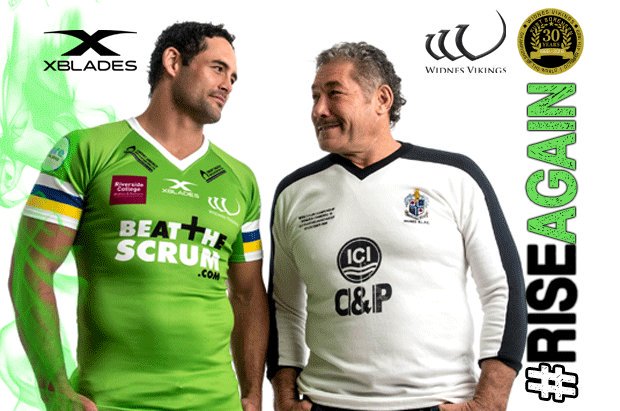
The supporters version has the stripes going all the way around suggesting they are cut off on the player kit for a side-panel that extends down the inner side of the arm. Sponsors aside, the supporters jersey is a pretty faithful replica of the 1989 Canberra Raiders World Club Challenge jersey, and the playing kit isn't too bad either.


Get over yourself. Its commemorating a jersey that didn't obstructed striping and you're getting pissy about the armpits (which are plain for practical reasons and will probably not be very visible anyway)?


I also love (just my personal opinion) how the white goes all the way to the edge of the sleeve. The players who wore short sleeve of the time (eg Daley and Clyde) would make them short by just cutting the 3/4 sleeve jerseys. They would use the end of the white as their guide for cutting making it look like the sleeves ended at the white. I think (and I could be wrong) it wasn't until 1991 that Canterbury started to actually manufacture short sleeves for the players which included a small strip of green after the white.
 

GAZF

First Grade
Messages
8,752
I also love (just my personal opinion) how the white goes all the way to the edge of the sleeve. The players who wore short sleeve of the time (eg Daley and Clyde) would make them short by just cutting the 3/4 sleeve jerseys. They would use the end of the white as their guide for cutting making it look like the sleeves ended at the white. I think (and I could be wrong) it wasn't until 1991 that Canterbury started to actually manufacture short sleeves for the players which included a small strip of green after the white.
I agree, would like to see the Raiders do it again if ISC goes back to a thinner cuff. Its a great way of freeing up real estate for the sleeve sponsor and has a retro vibe to it.
 

PARRA_FAN

Coach
Messages
17,676
Not sure what 'McFaddden' was but that wouldve been just after they lost Woodgers as their sponsor because I think in early 1990 for the Lotto Challenge and Sevens they played without a sponsor until Round 1 when Video Ezy became their major sponsor.
 

Prometheus

Juniors
Messages
1,081
You can't claim that someone's subjective opinion is "false".

Of course you can. Everyone may be entitled to their opinion, but that doesn't mean that every opinion is valid. There are people who are of the opinion that the world is flat. People of the opinion that the government is trying to sterilize us all by using chemicals dispersed in the contrails of jet airliners. There are even people who hold the opinion that pineapple doesn't belong on pizza.

They are all wrong.
 

Canard

Immortal
Messages
35,608
Of course you can. Everyone may be entitled to their opinion, but that doesn't mean that every opinion is valid. There are people who are of the opinion that the world is flat. People of the opinion that the government is trying to sterilize us all by using chemicals dispersed in the contrails of jet airliners. There are even people who hold the opinion that pineapple doesn't belong on pizza.

They are all wrong.

Only Skippy L'Ingleise think that pineapple belongs on Pizza....
 

AJB1102

First Grade
Messages
6,339
Have an opinion all you like I don't care, but if you build that opinion on a foundation of factual inaccuracies I'm going to point them out, and I'd expect no less from anybody else.

If I think jersey A looks better than jersey B its a personal preference. There is no foundation of fact or inaccuracies. Beauty is in the eye of the beholder kind of thing.

Your preferred shade of green may differ to mine, neither of us are wrong.
 

unforgiven

Bench
Messages
3,138
If I think jersey A looks better than jersey B its a personal preference. There is no foundation of fact or inaccuracies. Beauty is in the eye of the beholder kind of thing.

Your preferred shade of green may differ to mine, neither of us are wrong.
You could be if your favourite shade of green is actually blue.
 
Last edited:

Latest posts

Top