boatboy1269
Juniors
- Messages
- 23
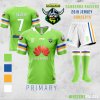
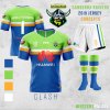
Number 9 in the weekly design series.
I’m probably the number 1 fan of this year’s Raiders home jersey but when it comes to settling on a long-term jersey for the club there really is no substitute for lime. My design primarily takes inspiration from the 2010 Raiders jersey, however with the iconic bands shifted further down the sleeve. After wrestling with the decision for weeks I finally settled on a primarily blue design for the clash jersey, as I think it represents a good middle ground between Canberra’s colour and the Raiders brand. I’ve personally never really been a fan of our white alternate jerseys over the years and given the Raiders rarely clash with anyone, I’m happy to do something different here.
Appreciate feedback as always!


