MugaB
Coach
- Messages
- 15,390
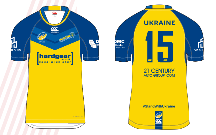
I love the Knights but everyone’s jersey looks okay after seeing their jersey. Honestly it is a disgrace. They have to either get rid of that ad or assure the fans they are getting $5m for desecrating their jersey.

I love the Knights but everyone’s jersey looks okay after seeing their jersey. Honestly it is a disgrace. They have to either get rid of that ad or assure the fans they are getting $5m for desecrating their jersey.
 europeanrugbyleague.com
I hear the players with Russian heritage will boycottCANTERBURY AND HARDGEAR TO DONATE UKRAINE KIT FOR EUROPEAN U19S
The Ukrainian Federation of Rugby League’s fundraising efforts to reach the European U19s Championships have been given a major boost thanks to the generosity of European Rugby League’s official kit p...

gold coast chargers spin off would also look goodGOLD Coast Titans
View attachment 64394
Steve Mascord is far and away the best league journo , no one comes close. I've refused to read the SMH since they shafted him.
I know this is the BRL but the ISP has had some cracking clashes in the past. Tweed Heads vs Souths Logan and Ipswich vs Townsville from a few years back were brutal. The Tweed Heads one in particular was real bad because it was almost as if someone at the QRL decided the Seagulls' yellow numbers made the difference...Jesus gronking Christ jersey clash in Brisbane opens View attachment 64663


Nice, look much better. Always makes me wonder why fans can do better than the professionals responsible!Had a crack at re-designing the official NRL club flags. In more recent years, the standard club supporter flags have become either:
a) Too complex (close up of the team logo with another smaller logo in the background, flag copies the current jersey pattern, unnecessary text with the team name and their year of inauguration on the side etc)
b) Too uniform (every team has the same white flag with the only difference the colour of the stripes in the middle and the team name)
This gives the flags a cheap knock-off look. Instead, simple is better. If a single colour background, every team flag should have it's own unique colour, or else an even split of it's main colours. The aim is that even if you see the flag from a distance, you instantly know what team it is. Again: simplicity is best:
View attachment 64703
View attachment 64704
Nice work mate. Have you ever tried to inverse our current home jersey- ie blue where the gold stripe across the chest is, and a gold gradient from dark to light through the rest?? I'd love that to be our away jersey if it worked- should try and learn the software you guys use to design jerseys....GOLD Coast Titans
View attachment 64394

I'd love to know where this stupid idea that brand identity means never making any significant changes to the branding came from.From what I have heard, and it is by no way locked in, but the current design is basically going to remain in some form from now on with just minor changes as the club wants to have a design that creates a brand identity like St. George, Souths, and the Roosters. So don't expect anything too drastic should there be a new jersey.
Souths would be nuts to change their colours from red & green to say, orange and purple or get rid of the hoops for verticale pin stripes, wouldn’t they? Saints aren’t Saints without the red V. Should Ferrari change the prancing horse for a leopard? Or Audi ditch the four rings? These are brands that have been around basically unchanged for a long period of time and fans become invested it. The next generations of players buy into it, too. Obviously history of success is key and the identity associated with it should remain unchanged as it becomes a bankable commodity.I'd love to know where this stupid idea that brand identity means never making any significant changes to the branding came from.
I find it fascinating that something so untrue, and frankly damaging, seems to have become accepted as an unassailable fact within so many organisations within the sports industry in recent times.
This is called a strawman...Souths would be nuts to change their colours from red & green to say, orange and purple or get rid of the hoops for verticale pin stripes, wouldn’t they? Saints aren’t Saints without the red V. Should Ferrari change the prancing horse for a leopard? Or Audi ditch the four rings? These are brands that have been around basically unchanged for a long period of time and fans become invested it. The next generations of players buy into it, too. Obviously history of success is key and the identity associated with it should remain unchanged as it becomes a bankable commodity.
The trouble with the Tigers is, apart from lack of success is they’re struggling to find an identity. That’s the issue with mergers I guess but by contrast, it serves to illustrate how powerful Saints’ identity is because Illawarra gave theirs up simply because the red V was infinitely more marketable.

 www.footyheadlines.com
Mate, i can only reply to what you post and you said “substantial change” on which my argument was based on. Clearly we have different views on what ‘substantial’ means. A logo evolution in my view is not a substantial change and in the case of a footy club, their identity is just as much anchored to their jersey which allows them to modernise logos from time to time. Easts, Souths and Saints - case in point.This is called a strawman...
Nobody said anything about radically rebranding anybody (though you could make a strong argument for some), however if a brand (keeping in mind that a brand is more than just the aesthetic elements of the company, though that's what we are focused on here) isn't constantly evolving in reaction to changes in the market then it's becoming irrelevant.
Simplifying for sake of time, if a brand fails to evolve it means that it's becoming a nostalgia product as it doesn't need/want to, or is incapable of, appealing to new generations of customers, and thus becomes a nostalgia sale.
For many products that tactic can be intentional, but in our case of sports clubs it's a disaster because it means that it's failing to effectively appeal to new generations of customers when a football club has no choice but to appeal to new generations if it is to remain a sustainable business in the long term. In other words, if it can't replace the customers it loses to time then it'll fail when the club's fanbase dies out.
Brand identity means exactly what it says, the identity of your company, including it's ideals, and how that's presented to the general public. A strong brand identity is the ability to evolve your brand through time to appeal to new generations of customers, yet still maintaining high brand recognition despite those changes. Take Pepsi's logo for example-
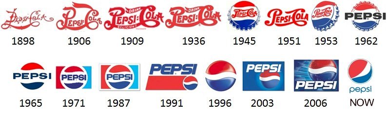
They have regularly tweaked and changed it to fit their companies needs and to appeal to the tastes and technology of the time, yet all of them are instantly recognisable as Pepsi's brand. That's a strong brand identity.
One of the best tools sports clubs in particular have to evolve their brand is making changes to their uniforms. Removing that tool from the tool box because of a stupid misunderstanding of what a brand identity is and how it works would be a massive mistake that will have long term impacts on the club as a product.
BTW, it's highly debatable that St. George has a strong brand identity.
You'd have to do a study, but I'd be willing to bet that their brand recognition is very high in the 60-70+ demographic, but drops with each generation until it's effectively bottomed out in under 30s. I'd also be willing to bet that it's not in the top five most recognisable NRL brands anymore. St. George's brand taking precedent over the Steelers also had a lot more to do with that merger being more of a hostile takeover than anything else.
Souths and St. George creating a new popular jersey design other than the hoops or vee would be an absolute boon for them, and their merchandise sales, if they went about it the right way as well.
