kdalymc
Bench
- Messages
- 4,384
That's shit
Australia 2022 Centenary Retro Kit Released
International kit news today as Australia have released their new 2022 centenary retro jersey.www.footyheadlines.com
That's shitAustralia 2022 Centenary Retro Kit Released
International kit news today as Australia have released their new 2022 centenary retro jersey.
Yep, i see those kinda fleece shirts.....That's shit
Look, it's obvious that you've entered this discussion with a heavy confirmation bias towards "traditional brands" and jerseys (i.e. change nothing/as little as possible because [insert appeal to tradition here]) because your club effectively hasn't changed their home jersey design (other than the template and materials) since the 1950s, and you feel it necessary to defend that decision, but your own examples are simply factually inaccurate.Mate, i can only reply to what you post and you said “substantial change” on which my argument was based on. Clearly we have different views on what ‘substantial’ means. A logo evolution in my view is not a substantial change and in the case of a footy club, their identity is just as much anchored to their jersey which allows them to modernise logos from time to time. Easts, Souths and Saints - case in point.
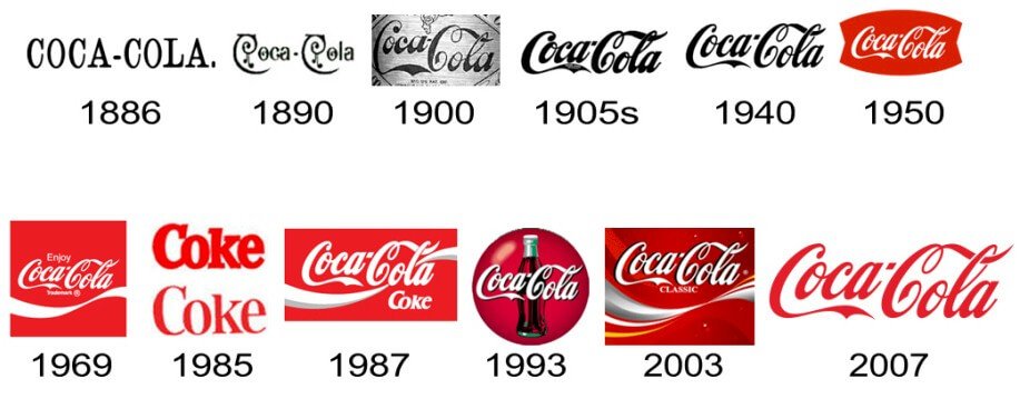
I’m glad you brought up Pepsi, who btw are often held up in marketing classes as what not to do. Their logo evolution is proof that they have struggled with identity for over a 100 years. They’ve always been number two to Coca-Cola and their logo changes are proof of desperation while Coke have largely stuck to their ribbon script logo for more than a century. Sure there were changes at the beginning while they were still new in the market. But once a solid foundation of success was built they stuck solid. They tried a modern ‘Coke’ logo in the 80s but even then, the original logo sat on the other side of the can or appeared next to it on signage. Why? Because it’s a foundation to attach to. Heritage is a valuable commodity.
An example of a ‘substantial change’ here is ‘Clear Coke’ which was an unmitigated disaster. It was still the same product and still the same flavour. Only the look was different. It was rejected purely on aesthetics.
Now if we put the lessons of Coke in a footy context, it’s okay to experiment with change while new and still looking for regular success. Saints began with the ‘blood and bandages’ before settling on the V before their great run of premierships began. I’d argue we never would’ve seen the V if they enjoyed that run in the hoops kit. Most Souths fans only remember one premiership but they love their kit because of the records associated with it. Keeps them invested.
As for Souths/Saints changing their kit, they already do enough one-offs for marketing purposes but the traditional kit is the Coca-Cola ribbon that will continue to sell long after we’re gone. Ask their fans if they want to see a jersey change.
Lesson for Tigers is no point settling on an identity while still associated with spoons.


In answer to your last question, of course I don’t. As I explained in my last post, I had a different view of what ”significant change” meant and why our opinions differed. I even bolded that part of your post to avoid confusion.Look, it's obvious that you've entered this discussion with a heavy confirmation bias towards "traditional brands" and jerseys (i.e. change nothing/as little as possible because [insert appeal to tradition here]) because your club effectively hasn't changed their home jersey design (other than the template and materials) since the 1950s, and you feel it necessary to defend that decision, but your own examples are simply factually inaccurate.
Take Coke's logo. Their wordmark hasn't changed as radically, or as often, as Pepsi's has historically. However there's more to a brand than just the wordmark, and Coca-Cola has regularly updated and adjusted their branding, including their logo, throughout history. BTW, keep in mind that none of the histories I've provided are comprehensive.
Also your "Clear Coke" never existed...
I think you are might be getting confused with Crystal Pepsi, as it best fits your description, but you might also be referring to Tab Clear. Tab Clear was Coke's response to Crystal Pepsi, that was released on their significantly less successful at the time, and now discontinued, diet brand Tab. Either way, both were part of an ill-fated 90's trend that was doomed to fail.
You could also be confusing it with New Coke, but that's a whole other can of worms that was an unbelievably stupid idea irrespective of branding, and doesn't fit your description at all.
Anyhow, it's a poor argument to bring up a minor variant product in their range, which was sold under a different brand than the Coke brand, and argue that it was less successful than the flagship product because the brand wasn't as popular. . . Like no shit sherlock. Furthermore, the clear cola trend failed because initially they were subtly marketed as healthy alternatives when they simply weren't. Their popularity tanked as soon as the public found out that they weren't in fact any better for you than a regular can of Tab or Pepsi, and after that there was literally no market for it other than the novelty effect. They also famously tasted different from normal Pepsi/Tab despite what their advertising claimed. In other words they were doomed to fail from the start because of bad business practices, which has very little to do with their aesthetics.
Moving on from the Cola wars, most sports brands around the world regularly make changes to their uniform, and you'll find that the ones that don't have lower sales of their uniforms than the ones that do. Admittedly there are a handful of exceptions, but there're always exceptions that prove the rule.
Higher sales equals more people wearing your kit in public, more people wearing your kit in public equals plenty of free passive advertising, plenty of passive advertising pushes interest, which then pushes fan growth and sponsorship value, etc, etc, you get the idea.
Genuine question would you say that these teams have bad brand identity?-
The other part of my counter argument to yours was that teams are already making different jerseys in the form of away kits and the now very many marketing one offs such as indigenous and Anzac. There are plenty of different kits for fans to get their hands on giving the clubs more revenue. Again, in my view and evidenced anywhere you care to look, tradition is a foundation that fans remain invested in. I also applied this logic to the older clubs and that newer clubs such as the Tigers should be free to change until they work out what their identity is.I'd love to know where this stupid idea that brand identity means never making any significant changes to the branding came from.
I find it fascinating that something so untrue, and frankly damaging, seems to have become accepted as an unassailable fact within so many organisations within the sports industry in recent times.
So the Ducks change from "The Mighty Ducks of Anaheim" to "the Anaheim Ducks", where they came as close to rebranding as you can without actually rebranding, wasn't significant change. . . If you say so.In answer to your last question, of course I don’t. As I explained in my last post, I had a different view of what ”significant change” meant and why our opinions differed. I even bolded that part of your post to avoid confusion.
Earlier you said-Anyway, let’s take your Barcelona jersey evolution example.
They toyed with it here and there, sure and apart from a couple of designs, it intrinsically looks Barcelona FC because of the stripes motif was kept. I notice they went back to a more traditional look after the chequered version. I’d dare say fan feedback might’ve been responsible? Souths from time to time changed the thickness of their stripes too and currently have side panels down the torso but the jersey has always remained recognisable.
Barcelona has done that and much more. They started with a halved jersey, since then they've had stripes, hoops, thirds, all manner of weird faded designs, etc, they've even added and removed colours from their scheme. All of which you started off saying Souths would be "nuts" to do, and you're now saying that isn't what you thought I meant by significant change...Souths would be nuts to change their colours from red & green to say, orange and purple or get rid of the hoops for verticale pin stripes
That's not a counter argument, it's a red herring.The other part of my counter argument to yours was that teams are already making different jerseys in the form of away kits and the now very many marketing one offs such as indigenous and Anzac. There are plenty of different kits for fans to get their hands on giving the clubs more revenue.
Your argument isn't evidenced by anything except your feelings and a small echo chamber that's repeated it back to you.Again, in my view and evidenced anywhere you care to look, tradition is a foundation that fans remain invested in. I also applied this logic to the older clubs and that newer clubs such as the Tigers should be free to change until they work out what their identity is.
This post is already too long to go into detail, but I've already touched on it a lot throughout this discussion anyway.BTW I’d like to know how you think it’s damaging to Souths, Saints or Easts hanging onto their traditional identity and I’m genuinely opened minded to your opinion on it.
I only used Pepsi's logo history to illustrate a point, I could have used almost any other major brand in world.Also, I brought up Coke because you thought Pepsi was relevant.
Clear Coke btw and if memory serves was a test bed in Japan. Think they took the caramel out to make it clear? Anyway they were to scared launch it in the States for obvious reasons. They often do test cases in experimental markets. Since I’m already off topic, 1980s Moove Flavoured Milk we’re going to launch a carbonated (not a typo) version. Had product and packaging ready to go with ad agencies pitching until John Singleton talked them out of it. Again, significant change can bite you on the bum. Moral of the story, just because you can - doesn’t mean you should.
I’m sure there’s a process that can make it happen. Anyway, my mate worked on the pitch at Mojo advertising in the late 80s. They had a campaign ready to go. Singo turned up by himself and told them they were fools to run it as it was an awful product.Also mister Singleton's telling porkies, or at least highly exaggerating the story. Carbonating milk curdles it and makes it taste sour.

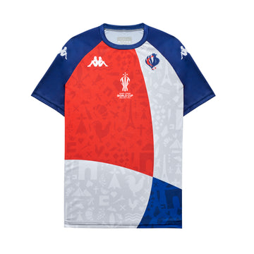
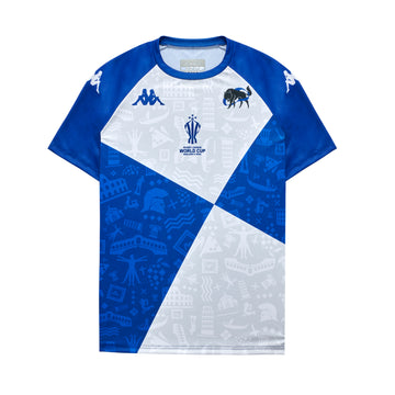
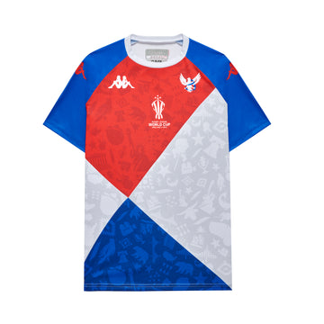
 shop.rlwc2021.com
green sleeves wtfAustralia PM XIII has inversed their jersey for this year and will have a Gold torso and Green shoulders.
PNG XIII will be predominantly red and a gold V
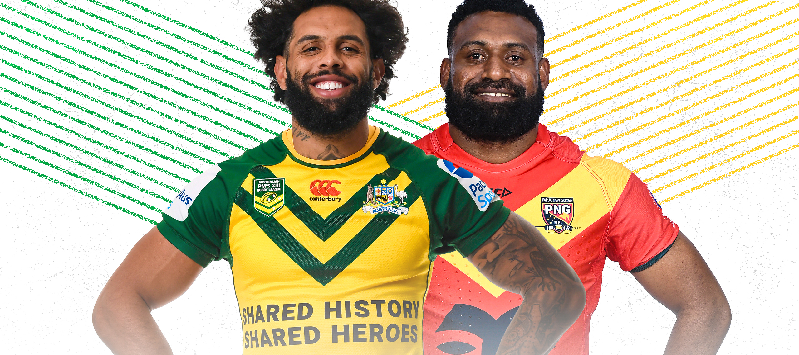
was it always the PNG pm13 we played? i swear it was just us, and we played the kumuls? surely a 2nd rate png team is a bit unfair
Could they not have lowered the sponsor so it sits just below the V?WA 2022 rep jerseys just used in State Championship. Looked really nice.
View attachment 66657
Can ANY team in the last 20yrs?!!Could they not have lowered the sponsor so it sits just below the V?
That's what I've said for ages. Simple, mostly gold-with-black design, with just a touch of red.Bit of red pin striping on that WA kit and I reckon we've got our first Pirates kit when we enter")
Roosters/dogs got it right. With the WA jersey they were frustratingly almost there. Just a bee’s dick was needed.Can ANY team in the last 20yrs?!!
While I agree with you, at least the sponsor's logo just sits over the top and doesn't impede on the jersey's design.