What's new
The Front Row Forums

Register a free account today to become a member of the world's largest Rugby League discussion forum! Once signed in, you'll be able to participate on this site by adding your own topics and posts, as well as connect with other members through your own private inbox!

Origin logos - NSW

RoosTah

Juniors
Messages
2,257
So as some of the Roosters fans here may know, I'm a bit of a stickler for logo design and the need to respect the past when modernising.

I've done what I think is as good as I can with my club, but ever since the NRL rebrand a couple years ago the new streamlined Origin and Kangaroos logos have kinda irked me... I like the idea of harmonising them, but think they could have a bit more history and character in them all the same.

With that in mind, I've knocked up the below concept based on incorporating a couple basic elements of thee old school NSW RL logo with the current one. Let me know what you think:

NSW_logo_update.png
 

strong_latte

Juniors
Messages
1,665
Love it mate! Have always felt the new rep logos looked a little bit bland and overly simplistic.

Great way to bring in a bit of the old school whilst still keeping the corporate uniformity.

We don't have a problem quite as big with the Kangaroos logo, but do you reckon you could have a crack at jazzing that one up and giving it a bit of classic look.
 
Last edited:

RoosTah

Juniors
Messages
2,257
The ball looks a bit like a Sharon. Needs to look more Steeden like. Maybe white, not red.
Yeah I know what you mean and I thought about that, but I always assumed the ball was red for NSW as a kind of substitute for a red waratah.

Will do an alternative version for the sake of comparison anyway and put it up later
 

T-Boon

Coach
Messages
15,325
Yeah I know what you mean and I thought about that, but I always assumed the ball was red for NSW as a kind of substitute for a red waratah.

Will do an alternative version for the sake of comparison anyway and put it up later

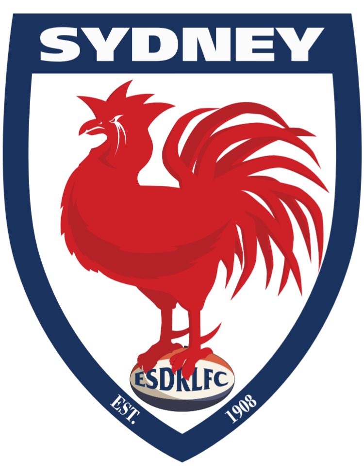
Is that Roosters Logo your design?
It looks much better than the present one.
But I guess the rooster comb they have at present is supposed to be the opera house?
 

RoosTah

Juniors
Messages
2,257
Is that Roosters Logo your design?
It looks much better than the present one.
But I guess the rooster comb they have at present is supposed to be the opera house?
Yeah it's my own proposed design to replace the cartoon loony tunes looking one we have now. My basic premise was to take the 2008 centenary concept and just run with it 100% by incorporating older designs like the 1967 logo bird perched on a ball.

This is it in full
DAZ7giCU0AAKf6k
 

RoosTah

Juniors
Messages
2,257
Classy. The Rooster speaks for itself so you don't need that tacky "Roosters" they presently have across the design. Good stuff.
Cheers mate! I've sent a proposal to the club outlining my rationale and design steps, but I don't think they're too keen sadly.
 

RoosTah

Juniors
Messages
2,257
Yeah. That works. Nice.
Cheers mate. I'm a little torn over the red ball to be honest, but looking back at it, they haven't used the red ball in the logos since the 80s-90s Origin jersey, so it's probably fair enough we retire it given we have other elements from that era in it.

Either way though, key question for everyone here is do you reckon this version of the logo is better than the one we've actually got?
 

beave

Coach
Messages
15,562
Agreed, nice work mate. Would love to see what you could do with the Cowboys logo, she's starting to look pretty tired these days.
 

RoosTah

Juniors
Messages
2,257
Thanks guys - I doubt I'll get much traction, but I might flick it to the NSW RL anyway to see if I can get a reaction
 

Knightmare

Coach
Messages
10,716
Version with the white ball
NSW_1.png

I would make the outline and shading of the football the same navy blue as the outline of the shield and background to the 'Blues' banner. It'd make the logo more balanced. What you've got is a predominance of white/ sky blue up top and then darker/ navy blue in the lower 50% of the logo. This gives it a 'bottom heavy' feel.

Try that and show us the results...
 

RoosTah

Juniors
Messages
2,257
I would make the outline and shading of the football the same navy blue as the outline of the shield and background to the 'Blues' banner. It'd make the logo more balanced. What you've got is a predominance of white/ sky blue up top and then darker/ navy blue in the lower 50% of the logo. This gives it a 'bottom heavy' feel.

Try that and show us the results...

To be honest, this was very much by design given the rep colours are sky blue up top and navy from the.

Take your point though and have made those changes to the footy:
NSW4.png
 

beave

Coach
Messages
15,562
I actually think Knightmares suggestions make looks better mate. Nice stuff.

Now do a QLD one and a cowboys one....... :p
 

RoosTah

Juniors
Messages
2,257
I actually think Knightmares suggestions make looks better mate. Nice stuff.

Now do a QLD one and a cowboys one....... :p

Haha you know to be honest I don't mind the Cowboys logo - as one of the newer teams the version they went for seemed a pretty neat and simple way to update it when they last changed.

That said, I've always been a bit squeemish about us adopting yank terms - I'd prefered it if the Broncos had been called the Brumbies (they existed before the Union side, so could have taken it first) and the Cowboys the Jackaroos or the Stockmen.

If I had a crack at another one it'd probably the Kangaroos one as per Latte's suggestion above, as the version we've got feels a bit of a rush job to me (I actually really liked the version in latte's logo though, so would be happy to see us go back to that).
 

strong_latte

Juniors
Messages
1,665
To be honest, this was very much by design given the rep colours are sky blue up top and navy from the.

Take your point though and have made those changes to the footy:
NSW4.png
Definitely works mate. That said, looking again back at the comparison above in your opening post, I would like to see it with a white inner border, as I think that makes the centre pop out a bit more. You might have to change the order of the white panels up top, but I reckon it'd look good.
 
Top