What's new
The Front Row Forums

Register a free account today to become a member of the world's largest Rugby League discussion forum! Once signed in, you'll be able to participate on this site by adding your own topics and posts, as well as connect with other members through your own private inbox!

Southern Bears

MugaB

Coach
Messages
15,042
That’s pretty hectic, it was pretty good to start with especially with all the little bits like the ears etc.
I like how the WA Coastline and top teeth were added.
Wa Coastline was my idea, the W and N ears were not, that was already on the existing logo, the teeth needed to be there, and more color too, having white involved in the logo ruined it for me
 

Perth Red

Post Whore
Messages
69,548
It’s nice, and u usually for a logo well thought out!, but in this day and age of digital logos it’s too busy. Everyone’s going simple for digital application.
 

greenBV4

Bench
Messages
2,510
It’s nice, and u usually for a logo well thought out!, but in this day and age of digital logos it’s too busy. Everyone’s going simple for digital application.
yep, like it or hate it modern logos are simplistic and need to retain their form well in a monotone application
 

jim_57

Moderator
Staff member
Messages
4,602
I like this logo but many Bears traditionalists wouldn’t, the background is probably a bit too red and I think it needs black around the outside of the shield.

Controversial opinion maybe but I don’t like the idea of adding a colour to existing brands as some sort of point of difference. Not all clubs have to have a colour(s) of the city or area they’re representing, it ain’t a rep team.

If the bears come back wherever just keep them black and red, don’t mess with a classic colour scheme. Likewise Dolphin’s use of gold was unnecessary, could have maybe added a touch of grey or black to differentiate from the Dragons without making half their jersey gold.
 

MugaB

Coach
Messages
15,042
Controversial opinion maybe but I don’t like the idea of adding a colour to existing brands as some sort of point of difference. Not all clubs have to have a colour(s) of the city or area they’re representing, it ain’t a rep team.

If the bears come back wherever just keep them black and red, don’t mess with a classic colour scheme. Likewise Dolphin’s use of gold was unnecessary, could have maybe added a touch of grey or black to differentiate from the Dragons without making half their jersey gold.
I like the gold and red of the dolphins, its a color scheme we haven't had in the game, and its new for a new team.. you're relating their old red and white colors of redcliffe and then adding grey or black is already diluting that brand, where theyve chosen gold to set themselves apart from anyone else in the comp... a good example is penrith, they weren't brown and white in their lower divisions, they were black blue and white, but since cronulla joined ahead of them with those same colors they went with brown... raiders with lime, broncos with maroon, cowboys with silver, storm with purple, theres lots of instances where a new expansion team has moved away from their local colors to add something new the comp aswell as themselves, i see dolphins are no different
 

MugaB

Coach
Messages
15,042
Btw all those instances for raiders, broncos, cowboys, storm, are all because parramatta were the blue and gold already in the comp, those 4 teams needed to do something else coz their local city colors or the ones they wanted to be were blue and gold, hence why i brought up those colors...
 
Last edited:

jim_57

Moderator
Staff member
Messages
4,602
I like the gold and red of the dolphins, its a color scheme we haven't had in the game, and its new for a new team.. you're relating their old red and white colors of redcliffe and then adding grey or black is already diluting that brand, where theyve chosen gold to set themselves apart from anyone else in the comp... a good example is penrith, they weren't brown and white in their lower divisions, they were black blue and white, but since cronulla joined ahead of them with those same colors they went with brown... raiders with lime, broncos with maroon, cowboys with silver, storm with purple, theres lots of instances where a new expansion team has moved away from their local colors to add something new the comp aswell as themselves, i see dolphins are no different

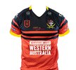
Yeh like I said I don’t expect everyone to agree, I think the gold on the dolphins looks shit but maybe that’s the design more than the gold itself, a decent design and it might grow on me. They’ve used grey in the past and their old dolphin logo was predominantly grey so that wouldn’t really have diluted their brand.

For the Bears though Red, black and yellow would look wrong/weird, like we’ve just gone over no reason a team has to have one of their local colours and the yellow trim wouldn’t be necessary. Likewise Christchurch or Wellington should go with something different than just copying Crusaders or Hurricanes aka “local” colours.
 

Centy Coast

Juniors
Messages
1,757
Yeh like I said I don’t expect everyone to agree, I think the gold on the dolphins looks shit but maybe that’s the design more than the gold itself, a decent design and it might grow on me. They’ve used grey in the past and their old dolphin logo was predominantly grey so that wouldn’t really have diluted their brand.

For the Bears though Red, black and yellow would look wrong/weird, like we’ve just gone over no reason a team has to have one of their local colours and the yellow trim wouldn’t be necessary. Likewise Christchurch or Wellington should go with something different than just copying Crusaders or Hurricanes aka “local” colours.
I’m a long time Bears fan but I’m open to adding yellow just slightly to the colour scheme.
Most clubs use white and the Bears have added white in the past , yellow makes it different and actually makes the red and black more prominent.
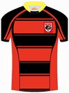
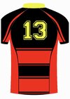
The Central Coast rugby union colours are red and black with yellow lining, it looks good.
 

Perth Red

Post Whore
Messages
69,548
Yeh like I said I don’t expect everyone to agree, I think the gold on the dolphins looks shit but maybe that’s the design more than the gold itself, a decent design and it might grow on me. They’ve used grey in the past and their old dolphin logo was predominantly grey so that wouldn’t really have diluted their brand.

For the Bears though Red, black and yellow would look wrong/weird, like we’ve just gone over no reason a team has to have one of their local colours and the yellow trim wouldn’t be necessary. Likewise Christchurch or Wellington should go with something different than just copying Crusaders or Hurricanes aka “local” colours.
Disagree, Red black and yellow works for WA whatever the brand we end up with.

D90C8B67-9E3A-46AB-8EF2-0A75A92A5DC3.jpeg
 

MugaB

Coach
Messages
15,042
Between Wellington, Christchurch and North Sydney... you made it about WA..
This conversation travelled 8000km to serve your self interest.
Absolutely incredible!
20230421_135014.jpg

Southern is a terrible name, should always have been wests
 

Pneuma

First Grade
Messages
5,475
Further confirmation that NRL Victoria is growing steadily. Taken a while but the momentum is real.

 
Last edited:

Latest posts

Top