flippikat
Bench
- Messages
- 4,480
on a kinda tangent here... question time.
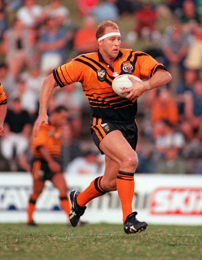
What jersey from a current NRL team would you LOVE to see back in the competition - either as a home, alternate or heritage?
I'll start.
I'd love to see this late 1990s Balmain jersey become the Wests Tigers main jersey, or at least a heritage jersey.
It's a deft mid-1990s update of the 1960s-early 1990s Balmain strip, with a "shutter effect" of stripes on the bottom half of the jersey.
Sure a sponsor logo might blunt the effect (at least on the front), but I like it.


.png")


