What's new
The Front Row Forums

Register a free account today to become a member of the world's largest Rugby League discussion forum! Once signed in, you'll be able to participate on this site by adding your own topics and posts, as well as connect with other members through your own private inbox!

2026 Jerseys, Sponsorships, Logos

yakstorm

First Grade
Messages
6,799
Here is the designer's post on LinkedIn explaining his process if anyone is interested

I've met Aaron, he's definitely a die-hard Bulldogs fan. For me personally, I preferred what they previously had.
 

Nuke

Moderator
Staff member
Messages
5,894
Westfence creative or whatever they call themselves.

I thought they did a good job with Manly’s logo. Swing a kiss by the guy who claims to be a Bulldogs fan on this one imo.
If it was indeed Westfence, then yes, he is most definitely a Bulldogs fan. I've known him for maybe 10yrs when he and I were the wingers for Joondalup Giants Reserve Grade team for the 1 year he was over here in WA.
He is 100% a Bulldogs fan through and through. Even has the late 90s Bulldogs logo as a tattoo.
 

macavity

Referee
Messages
21,299
Its better than the shield and sleepy dog logo, but thats all about how bad those logos were.

The roundel was near perfect. Just go back to that.
 

wittyfan

Immortal
Messages
30,107

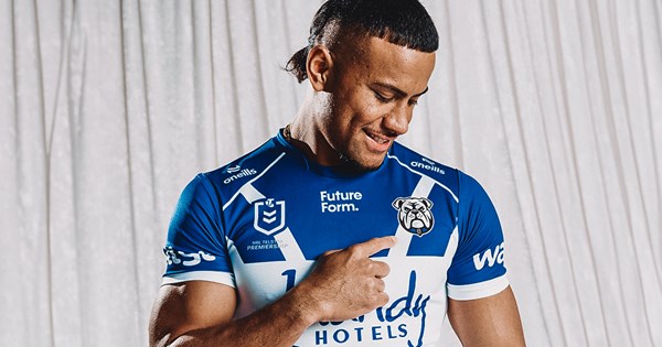
The Canterbury-Bankstown Bulldogs are proud to announce the introduction of a refreshed Club logo, to be officially adopted from November 1.

The new emblem represents a proud evolution of the Bulldogs’ identity - honouring more than 90 years of heritage while looking boldly to the future with eyes forward.

Bulldogs Chief Executive Officer Aaron Warburton said the redesign process was guided by a commitment to ensuring the Club’s visual identity continues to reflect the passion and pride of the Bulldogs family.

Built For What’s NextBuilt For What’s Next
Built For What’s Next
“This new emblem is more than just a logo – it reflects who we are, where we’ve come from, and where we’re going. It carries forward the fighting spirit that has defined this Club since 1935, while facing the future head-on with confidence and pride,” Warburton said.

We’re incredibly proud of the design and believe it strikes the right balance between paying tribute to our 90-year legacy and capturing the energy, ambition and unity that will define our future.

The refreshed logo - redrawn with a modern, digital-first approach - also draws inspiration from key elements of the Club’s visual history, woven together to create an identity that is both familiar and unmistakably built for what’s next.

The new emblem will begin rolling out across all Bulldogs platforms, merchandise, and communications in line with the launch of the 2026 season on November 1.

The Bulldogs look forward to embracing this exciting new era - and new look that represents it - with pride, unity, and the unwavering spirit that defines the Blue and White.

Forged from 90 years of history, facing forward to the future - this is who we are. A new look, same heart. Built for what’s next.


View attachment 107150
Lol! What a mess!
 
Messages
12,606

The Canterbury-Bankstown Bulldogs are proud to announce the introduction of a refreshed Club logo, to be officially adopted from November 1.

The new emblem represents a proud evolution of the Bulldogs’ identity - honouring more than 90 years of heritage while looking boldly to the future with eyes forward.

Bulldogs Chief Executive Officer Aaron Warburton said the redesign process was guided by a commitment to ensuring the Club’s visual identity continues to reflect the passion and pride of the Bulldogs family.

Built For What’s NextBuilt For What’s Next
Built For What’s Next
“This new emblem is more than just a logo – it reflects who we are, where we’ve come from, and where we’re going. It carries forward the fighting spirit that has defined this Club since 1935, while facing the future head-on with confidence and pride,” Warburton said.

We’re incredibly proud of the design and believe it strikes the right balance between paying tribute to our 90-year legacy and capturing the energy, ambition and unity that will define our future.

The refreshed logo - redrawn with a modern, digital-first approach - also draws inspiration from key elements of the Club’s visual history, woven together to create an identity that is both familiar and unmistakably built for what’s next.

The new emblem will begin rolling out across all Bulldogs platforms, merchandise, and communications in line with the launch of the 2026 season on November 1.

The Bulldogs look forward to embracing this exciting new era - and new look that represents it - with pride, unity, and the unwavering spirit that defines the Blue and White.

Forged from 90 years of history, facing forward to the future - this is who we are. A new look, same heart. Built for what’s next.


View attachment 107150
WTF
 

Reflector

Bench
Messages
2,774
Ears needed to be smaller like the previous logo (bigger ears make it look too cutesy) and giving the dog collar some studs would make the whole logo look more aggressive without being try-hard.
 

Growthegame

Juniors
Messages
329
If it was indeed Westfence, then yes, he is most definitely a Bulldogs fan. I've known him for maybe 10yrs when he and I were the wingers for Joondalup Giants Reserve Grade team for the 1 year he was over here in WA.
He is 100% a Bulldogs fan through and through. Even has the late 90s Bulldogs logo as a tattoo.
What has the club done to him to make him turn on the club so badly that this logo was released.
 

beave

Coach
Messages
15,824
Ears needed to be smaller like the previous logo (bigger ears make it look too cutesy) and giving the dog collar some studs would make the whole logo look more aggressive without being try-hard.
but then it's going down Georgia Bulldogs areas....IMG_4646.jpeg
 

flippikat

First Grade
Messages
5,788

The Canterbury-Bankstown Bulldogs are proud to announce the introduction of a refreshed Club logo, to be officially adopted from November 1.

The new emblem represents a proud evolution of the Bulldogs’ identity - honouring more than 90 years of heritage while looking boldly to the future with eyes forward.

Bulldogs Chief Executive Officer Aaron Warburton said the redesign process was guided by a commitment to ensuring the Club’s visual identity continues to reflect the passion and pride of the Bulldogs family.

Built For What’s NextBuilt For What’s Next
Built For What’s Next
“This new emblem is more than just a logo – it reflects who we are, where we’ve come from, and where we’re going. It carries forward the fighting spirit that has defined this Club since 1935, while facing the future head-on with confidence and pride,” Warburton said.

We’re incredibly proud of the design and believe it strikes the right balance between paying tribute to our 90-year legacy and capturing the energy, ambition and unity that will define our future.

The refreshed logo - redrawn with a modern, digital-first approach - also draws inspiration from key elements of the Club’s visual history, woven together to create an identity that is both familiar and unmistakably built for what’s next.

The new emblem will begin rolling out across all Bulldogs platforms, merchandise, and communications in line with the launch of the 2026 season on November 1.

The Bulldogs look forward to embracing this exciting new era - and new look that represents it - with pride, unity, and the unwavering spirit that defines the Blue and White.

Forged from 90 years of history, facing forward to the future - this is who we are. A new look, same heart. Built for what’s next.


View attachment 107150
I've taken time to think about this, and you know what? I actually kinda like it.

Sure it could be a little more fearsome.. and its closer to Paw Patrol than Motorhead logo - but I can see that they're going for something that translates better to digital media.. and I think it's growing on me.
 

Dogs Of War

Coach
Messages
13,102
What has the club done to him to make him turn on the club so badly that this logo was released.

The late 90's Bulldogs logo is terrible as well. That Super League one lasted way too long. I own nothing with that on it. Refused to give them money for that. Have been rocking my 1995 jersey for way too long until they updated the logo. But with this change, I'm once again voting with my wallet which will remain shut. That said, they have 40% off everything that is left in the store at the moment applied at checkout. Grabbed the 2004 retro jersey with the current logo they wore against Manly and the Roosters this year.
 

Game_Breaker

Coach
Messages
15,345

The Canterbury-Bankstown Bulldogs are proud to announce the introduction of a refreshed Club logo, to be officially adopted from November 1.

The new emblem represents a proud evolution of the Bulldogs’ identity - honouring more than 90 years of heritage while looking boldly to the future with eyes forward.

Bulldogs Chief Executive Officer Aaron Warburton said the redesign process was guided by a commitment to ensuring the Club’s visual identity continues to reflect the passion and pride of the Bulldogs family.

Built For What’s NextBuilt For What’s Next
Built For What’s Next
“This new emblem is more than just a logo – it reflects who we are, where we’ve come from, and where we’re going. It carries forward the fighting spirit that has defined this Club since 1935, while facing the future head-on with confidence and pride,” Warburton said.

We’re incredibly proud of the design and believe it strikes the right balance between paying tribute to our 90-year legacy and capturing the energy, ambition and unity that will define our future.

The refreshed logo - redrawn with a modern, digital-first approach - also draws inspiration from key elements of the Club’s visual history, woven together to create an identity that is both familiar and unmistakably built for what’s next.

The new emblem will begin rolling out across all Bulldogs platforms, merchandise, and communications in line with the launch of the 2026 season on November 1.

The Bulldogs look forward to embracing this exciting new era - and new look that represents it - with pride, unity, and the unwavering spirit that defines the Blue and White.

Forged from 90 years of history, facing forward to the future - this is who we are. A new look, same heart. Built for what’s next.


View attachment 107150

It just needs to be on a shield or something with the word Bulldog on top
Leaving it like that on its own is too bland and doesn’t work
 

Latest posts

Top