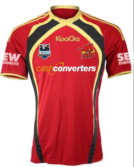
Not to nitpick, but I strongly believe that the 'WA' text should remain white. You want that to be something people see almost straight away. I am not a big fan of the current trend in the NRL that club logos heavily promote the nickname but have the area they're representing as a minor thing. To me, your club should represent your area (be it city, town, suburb, country (NZ), or in this case, state). Looking through the 2011 NRL logos, only St.George-Illawarra, Wests, Parramatta, and Souths have equal sized text for who they represent and their nickname (with the obvious exception being St.George-Illawarra who still don't have the word 'Dragons' anywhere on their logo). Even my beloved Newcastle Knights' logo disappoints me. It's a great logo, don't get me wrong, however the fact that Newcastle plays only a bit-part compared to the Knights in the logo, to me, isn't right.
Having said all that, I'm also guilty here of making 'REDS' larger than 'WA', but at least 'WA' stands out more as white text.
I will try the other suggestion/s though, but I do expect the footy to be better white than old gold, but we shall see!


