What's new
The Front Row Forums

Register a free account today to become a member of the world's largest Rugby League discussion forum! Once signed in, you'll be able to participate on this site by adding your own topics and posts, as well as connect with other members through your own private inbox!

The Game Jerseys, Logos, Mock Ups, Photos ANYTHING

beave

Coach
Messages
15,562
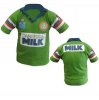
The NQ team store had a 50% off everything sale a few weeks ago, bought another classic 1995 NQ retro jersey as my previous replica from 4-5 years ago is starting to fade a bit. The standard in quality between the 2 was very noticeable, the ARL and Cowboys logos are now piss poor and look cheap and nasty.
 

sempmrh

Juniors
Messages
1,197
Interesting. Was curious as to how the Broncos managed to butcher their Super League design a few years back.

heritage-jersey-barba.jpg
I'd say that one is a result of a design choice by Nike combined with the tighter fit of the jersey. Nobody's going to be trying to pass that heritage version off as an original.

The fit of those Classic retro jerseys is ridiculous - although I suppose that would depend on the style and era the jersey is from. I've got the one and only retro design they've done for Melbourne (so it's your standard modern jersey material and not cotton) and while it fits just fine in the body, the sleeves and shoulder area are so billowy and loose it's ridiculous. I know the oversized look was the style at the time but it even looks bad by those standards. Considering seeing if I can get it altered so I can actually get some use out of it.
 

beave

Coach
Messages
15,562
I'd say that one is a result of a design choice by Nike combined with the tighter fit of the jersey. Nobody's going to be trying to pass that heritage version off as an original.

The fit of those Classic retro jerseys is ridiculous - although I suppose that would depend on the style and era the jersey is from. I've got the one and only retro design they've done for Melbourne (so it's your standard modern jersey material and not cotton) and while it fits just fine in the body, the sleeves and shoulder area are so billowy and loose it's ridiculous. I know the oversized look was the style at the time but it even looks bad by those standards. Considering seeing if I can get it altered so I can actually get some use out of it.

Those Classic retros are big for their claimed size. You gotta drop it down a couple to match modern jersey sizes.

I wear a XXL in a current ISC jersey.

The Classic retro Im a L and it’s still pretty big on me.
 

sempmrh

Juniors
Messages
1,197
Those Classic retros are big for their claimed size. You gotta drop it down a couple to match modern jersey sizes.

I wear a XXL in a current ISC jersey.

The Classic retro Im a L and it’s still pretty big on me.
Yeah, I have a size down from what I’d wear with ISC’s sizing and it fits in the body just fine. There’s just way too much fabric for the sleeves. Laid flat the jersey is basically just a big rectangle with sleeves.
 

kdalymc

Bench
Messages
4,314
Yeah, I have a size down from what I’d wear with ISC’s sizing and it fits in the body just fine. There’s just way too much fabric for the sleeves. Laid flat the jersey is basically just a big rectangle with sleeves.
Maybe it’s spot on :) jerseys were f**king pathetic until the mid 2000s
 

100%green

Juniors
Messages
514
There is a reason why the replicas aren't exacts.

It's so they can not be onsold as originals which could be worth a bit in brand new condition.

I know why they are the way they are and that isn't really the case.

As for the Milk one, there have been 3 completely different versions released by Classic that has been their stuff up.

First one was ok. Short sleeve jersey and a heat pressed Video Ezy on the sleeves with a white box. (No one expected an embroidered patch like 94).

The next run had 3/4 length sleeves and the black and white Video Ezy. (Obviously the 90 template was used with a collar and Milk added).

Third one is a 3/4 length sleeve with a black and orange Video Ezy with no white box.

It can't be that hard to follow artwork that was provided....
 

Attachments

  • 1994 Retro 1.JPG
    1994 Retro 1.JPG
    18.1 KB · Views: 11
  • 94 Retro 2.JPG
    94 Retro 2.JPG
    40.2 KB · Views: 11
Messages
1,973
I know why they are the way they are and that isn't really the case.

As for the Milk one, there have been 3 completely different versions released by Classic that has been their stuff up.

First one was ok. Short sleeve jersey and a heat pressed Video Ezy on the sleeves with a white box. (No one expected an embroidered patch like 94).

The next run had 3/4 length sleeves and the black and white Video Ezy. (Obviously the 90 template was used with a collar and Milk added).

Third one is a 3/4 length sleeve with a black and orange Video Ezy with no white box.

It can't be that hard to follow artwork that was provided....

My biggest issue is that the white box around the Milk sponsor is much bigger than the original.

Also the green on the Video Ezy and Milk versions are way too dark, they're almost Souths bottle green.

The Woodgers version is the closest to the original although not perfect.
 

100%green

Juniors
Messages
514
My biggest issue is that the white box around the Milk sponsor is much bigger than the original.

Also the green on the Video Ezy and Milk versions are way too dark, they're almost Souths bottle green.

The Woodgers version is the closest to the original although not perfect.

Don't get me started haha
 

Hello, I'm The Doctor

First Grade
Messages
9,124
The new NRL logo is actually starting to grow on me. It has a bit of a military badge look...

200


Having said that. I think it will age very badly!!!

Like the Cartoon club logos on the early 2000s, i think we will need to change this will be remembered as "of the era" and will feel oputdated very soon.

dPr0Dp
1959811_1.jpg

The NRL finally starting to build a video library with old games etc.

The NRL letters look pretty good on their own. I wonder how it would look on the Jersey if they went the KFC route and went with only the letters as the logo.

kisspng-kfc-logo-mcdonald-s-jollibee-restaurant-kfc-bucket-5b2225c6d005f0.1085914515289645508521.jpg


I think it might actually go well as the comp logo.

They only problem would be that it couldnt be used across the different grades and comps.
 

Nuke

Moderator
Staff member
Messages
5,019
For starters, Telstra wouldn't be all that thrilled with sponsoring the NRL but not having their name or logo featured!
In that instance, you could do something like this, where you'd replace the Telstra logo and name with, say, the Holden logo and text to say 'Holden' and 'Womens Premiership' or whatever comp the logo would go on.
NRL.jpg

On the darker jerseys you could have this in white like this:
NK NRL.jpg
 

Nuke

Moderator
Staff member
Messages
5,019
And yes, I know it won't work so simply on jerseys where there is more than one colour at that spot of the jersey (Roosters, for example). In this instance, you could have the NRL logo virtually sitting on a patch, taking the logo from one colour to two effectively.
 

greenBV4

Bench
Messages
2,508
I created this the other day when I was bored playing around with logos

its a mixture of the new logo and the old green and black one

the "logo" and the nrl wordmark are interchangeable and the premiership badge is the logo in a shield with the text and sponsor

iPiccy-Design.png
 

Latest posts

Top