What's new
The Front Row Forums

Register a free account today to become a member of the world's largest Rugby League discussion forum! Once signed in, you'll be able to participate on this site by adding your own topics and posts, as well as connect with other members through your own private inbox!

2013 Jersey, Logo, Sponsorship Discussion

Status
Not open for further replies.

mn_tibor

Juniors
Messages
226
I understand the functionality of side panels and why (maybe) it would be a pain to put patterns on them but I don't understand why the stripes on the black panthers jersey stop BEFORE the side panels, not at the side panel join. Especially considering they extend all the way to the side panels on the white jersey. Looks a bit strange imo. Are these on-field or fan replicas?
 

sheepbender

Juniors
Messages
517
It's possible that the black jersey is a few sizes larger than the white one. That's my only explanation. Cos it does look wrong. Plus if the away can have teal lines in the middle the home should too
 

Nezzo

Juniors
Messages
27
My Penrith Panthers mockup using deanrobinson's logo. Couldn't really be bothered editing the away to make it look perfect but you get the picture.
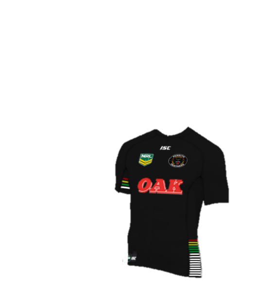
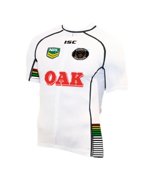
PanthersHome1.png


PanthersAway1-1.png
Bumping my mockup since where talking about the panthers.
 

Doomednow

Bench
Messages
3,133
Nezzo I prefer those but you've got no hope of a return of the yellow red and green. They would have to be teal.

But yeah not personally a fan of the faded white stripes. Or the new jersey as whole. And we've still got that bloody panther head logo.
 

Nezzo

Juniors
Messages
27
Yeh, dont know why they would want to go away from their original colours and try to establish new ones.
 

LJC

Juniors
Messages
584
I don't think its any more soccerish than their current heritage. Theres way more vertical striped teams in soccer than the single stripe.

Re: the Pandas jersey, we're waiting on LU admin to approve the site on the back of jersey.


NRL logo looks good!
Thats about it!

The stripes will not be noticed as a main theme of the jumper at all!
A very plain and bland jumper! Some type of a V shape on the chest area would have made it look like RL type jersey!
 

Didgi

Moderator
Messages
17,260
The Pink Panthers has become somewhat of an identity, should've stuck to the plain pink without any of the trimmings or bars (if they're on the front of that one too, can't see).
 

Diesel

Referee
Messages
23,784
Agree. The WIL jersey is a shocker compared to the old Pink Panthers jersey. Why must marketing get hold of something iconic and screw it up?
 

ShaneO85

Juniors
Messages
513
i don't know why penrith even have a white jersey... i personally like the idea of the pink panthers anbd thought the first few jerseys looked great... i think they should have a black home strip, and then alternate between a chocolate soldiers/oak chocolate milks and pink panthers/oak strawberry milks as their away or clash jerseys... if they do choc soldiers as brown and white then they would always have an iconic jersey they could use no matter who the opponent was
 

Frailty

First Grade
Messages
9,456
What's with the super-imposed "bars" on the front of the jersey?

And the WIL jersey doesn't look totally ridiculous as it did last year. The black shading and trim helps!


The super-imposed bars are clearly a nod to the 90s jerseys:

jersey_panthers_1991.jpg
 
Status
Not open for further replies.

Latest posts

Top