What's new
The Front Row Forums

Register a free account today to become a member of the world's largest Rugby League discussion forum! Once signed in, you'll be able to participate on this site by adding your own topics and posts, as well as connect with other members through your own private inbox!

2013 Jersey, Logo & Sponsorship Thread II

GAZF

First Grade
Messages
8,757
If you call taking a traditional jersey and chaning it splitting hairs I don't think you get it. They've f**ked one of the best symbols the game has in every way.

Like in the 1980s when they put adidas stripes down the sleeves? How about the Vs and stripes (a la the PMs jersey)? I'd love to see a Churchill era jersey, and hopefully they return to something that simple in the near future, but the Roos jersey has been clearly bastardised before. How do you think we got to the double V style in the first place?
 

cleary89

Coach
Messages
16,483
Meh all you guys are autistic. Green not being green enough and stuff. Really liked the shorts and socks. Jerseys arent bad.
 

GAZF

First Grade
Messages
8,757
So you're saying it's okay to f**k the Roos jersey. But you are whinging about the size of the numbers on the NZ jersey. Right.

No, I'm not saying its ok to f**k up the roos jersey. I made a post in this thread in the last few days trashing the uniform for its overuse of the V. I think most of Australia's jerseys haven't been worthy of being worn over the last 15 years. If anything, I'm even more extreme in my opinion than you are. We should be wearing as close to this as possible:

1952_churchill-headingley.jpg


Anything less and I'll be critical. The latest f**k up is just par for the course.

The NZ numbers are stupid because, from a practical standpoint, it makes the numbers harder to see from a distance. Theres also a huge space for larger numbers to be placed.

Meh all you guys are autistic.

Most accurate statement in this thread. I prefer to use the term "meticulous arsehole" in social settings though so I don't get treated as a child...
 

gzerounian

Juniors
Messages
1,094
Three things:

1. At least the proper coat of arms was used instead of the one you get on the fan jersey (one less chevron!)

2. The old sock were not 50/50 green and gold but did have more green than the new one

3. The players last night looked very uncomfortable and self conscious in their tight "midriff" jerseys. They were constantly pulling their jerseys down to cover their belly's and bum cracks. The only player who didn't seem to have this problem was Brett Morris, but for some reason as a consequence he looked quite "special" with his "harry high pants"

o5doc0.jpg
 

steggz

Juniors
Messages
1,410
Been reading these threads for a while, you guys have some great insights and GAZF could come and design jerseys for my team any day (but we'd have to talk about his take on the St George Illawarra logo)

Re: the Kangaroos uniform, the 'cutoff' V doesn't look as bad as I thought it would, though I would prefer it to hit the top of the shoulders (not the side like the last Classic one). The oversized Vs on the shorts looked silly, as did the 'butt sponsors' (as my wife put it!) and I like the concept of the chevrons on the socks, it didn't really work for me.
 

hellteam

First Grade
Messages
6,536
Said in another thread, but instead of the chevrons on shorts and socks, just make them two gold vertical lines on the shorts, and two green horizontal lines that go around the socks. Then would be perfect.

I actually liked the jersey, the first time I saw Gallen in it at the unveiling it looked off but on field it looked great (with proper crest, fitted "pro" jersey etc)
 

GAZF

First Grade
Messages
8,757
Samoa's jersey is good, probably doesn't need the V. Tonga's is fantastic, awesome detail on the hem and cuffs.
 

Fire

First Grade
Messages
9,669
Kiwi socks are awesome, you crazy!

I can dig that. They'll probably grow on me, I just have to get used to them.

Samoa and Tonga kits were solid last night in my opinion, nothing stood out on them that made them a nightmare to look at. Good kits.
 

GAZF

First Grade
Messages
8,757
I can dig that. They'll probably grow on me, I just have to get used to them.

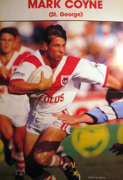
I'd have the Dragons wearing hoops like that as well. All white is boring and pays respect to neither side of the merger.
 

Fire

First Grade
Messages
9,669
I'd have the Dragons wearing hoops like that as well. All white is boring and pays respect to neither side of the merger.

Oh man tell me about it. That's one of the biggest gripes our fans have.

Bring back the hooped socks and also two straight stripes down the edges of the shorts (see below).

img_9798.jpg


Rumour is ISC is taking over from Reebok beginning next year, so hopefully they do this. They do good stuff ISC. Reebok were pathetic for us.
 

GAZF

First Grade
Messages
8,757
Oh man tell me about it. That's one of the biggest gripes our fans have.

Bring back the hooped socks and also two straight stripes down the edges of the shorts (see below).

img_9798.jpg


Rumour is ISC is taking over from Reebok beginning next year, so hopefully they do this. They do good stuff ISC. Reebok were pathetic for us.

I hope they do take over, ISC is usually the goods with newly signed clubs. With their current template I'd have an all white collar with thin red piping at the top, full (but shallower) V with sponsor underneath, red cuffs, single stripe shorts and hooped socks with no stripes at the top.

Just hope they don't do a Souths and chuck in red sidepanels.
 

Prometheus

Juniors
Messages
1,103
Oh man tell me about it. That's one of the biggest gripes our fans have.

I have never heard anybody outside of the internet complain about our socks. Most Dragons fans couldn't tell you off the top of their head what our socks look like and don't really care.

Rumour is ISC is taking over from Reebok beginning next year, so hopefully they do this. They do good stuff ISC. Reebok were pathetic for us.

I prefer the current Reebok kit to the Adidas stuff from a few years back.

I hope they do take over, ISC is usually the goods with newly signed clubs. [snip] Just hope they don't do a Souths and chuck in red sidepanels.

They'd never be allowed to mess with the Red V like that. Too many fanatics think it is sacred.
 

Latest posts

Top