What's new
The Front Row Forums

Register a free account today to become a member of the world's largest Rugby League discussion forum! Once signed in, you'll be able to participate on this site by adding your own topics and posts, as well as connect with other members through your own private inbox!

2015 NRL Jersey & Sponsorship Discussion

Blues Riff

Bench
Messages
3,350
The front of the Panthers shirt should have more gold, like the back. The back looks quite dark.

Yeah Cowboys may well beat Penrith, but who can really tell? It all depends on the squads picked and how seriously the clubs take it. Penrith definitely won't be naming any stars this year and risk another injury crisis. It's just an exhibition really. I'd actually forgotten who won it this year.
 

roofromoz

First Grade
Messages
7,580
The front of the Panthers shirt should have more gold, like the back. The back looks quite dark.

On the gold, it may have just been the shade or how it was captured, but I see it more as a light shade of brown... if that's the case, perhaps it's a nod back to 1967-1990 and this may be the wave of the future. Who knows.
 

roofromoz

First Grade
Messages
7,580
^^ Actually, ignore that assertion. It definitely is gold. But personally I would like it have a bit more of a brown tinge, if there is such a thing.
 

sheepbender

Juniors
Messages
513
I'm not understanding the love for the Titans jersey, it's alright but it's similar to the first Adidas one they had & that one was better. But then again I know there's a lot of hate for their current home & away kits which I think are great
 

Hello, I'm The Doctor

First Grade
Messages
9,124
On the gold, it may have just been the shade or how it was captured, but I see it more as a light shade of brown... if that's the case, perhaps it's a nod back to 1967-1990 and this may be the wave of the future. Who knows.

I think the Gold itself is a nod to the old brown jersey....

Id love to see Panthers totally drop the Teal and exclusively use the Gold/Black/White combination (somethimes using the classic templates with the Gold>Blown substitute)
 

natheel

Coach
Messages
12,137
Glad teams went with their own designs this year instead of many just going with the generic one like last year

Storms actual design is simple and not too bad just don't like the fact its a Guernsey

Eels is practically the same as last year but yellow and no Eels head on the front. I like this years better the more i look at it actually

My fav is Knights

Worst Tigers and Dogs

ironically if the Dogs didn't have that massive Bulldog on the front and it was just a fade out of the design it would be 100 times better
 
Last edited:

macavity

Referee
Messages
20,640
I love ours and the dragons, most are pretty meh, the panthers and bulldogs are really ugly, the sleeveless ones are stupid.
 

sheepbender

Juniors
Messages
513
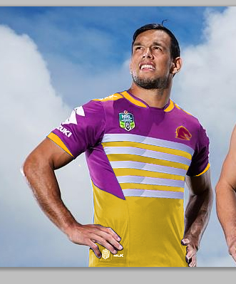
I liked the Storms basic design so decided at apply it to Brisbane.

broncosj_by_sheepbender-d89sfb7.jpg
 

Latest posts

Top