What's new
The Front Row Forums

Register a free account today to become a member of the world's largest Rugby League discussion forum! Once signed in, you'll be able to participate on this site by adding your own topics and posts, as well as connect with other members through your own private inbox!

2016 Jerseys, Sponsorship, Logos Discussion

Cowboy_4_Life

Juniors
Messages
135
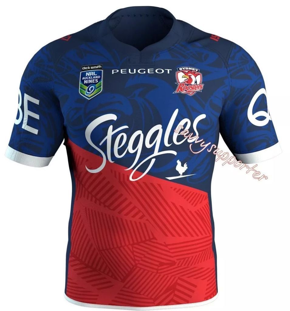
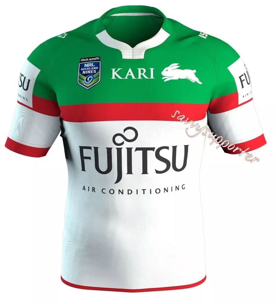
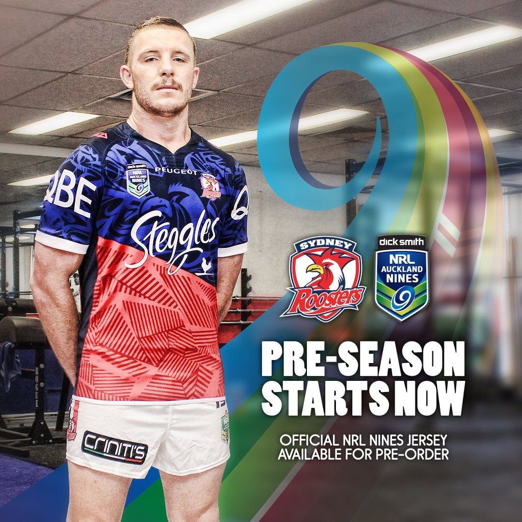
Surely the Cowboys and Storm are taking the piss with these jersey changes. Home jerseys only lasted one season. And both were bloody brilliant compared to some of there previous jerseys. Whilst the new Storm isnt bad, I still think both are step downs..

They (Cows) had the last jersey for two years (14-15); but yeah, they needed to go more OG with the 2016 design, or just keep the same for a bit longer. I really liked the chevron 14/15 jersey compared the the wavey designs they had previously. They weren't far off this year, like most people have said, just needed to go more solid on the grey, not all fancy thickness-changing, pin-stripey.
 

beave

Coach
Messages
15,563
All the cowboys had to do was take this

images


And tweak it by extending the blue down the chest and back another 3 inches. Done. Leave everything else as is. Modern take on the 1995. Go nuts on the themed jersey but that is what the home one should be for as long as they are in existence.
 
Messages
1,390
I'm going to go out on a limb. I like the Cowboys jersey. And if they play well in it next year, it will be associated with success and more people will like it. Solid colour, fairly neat details.
 

Patorick

Moderator
Staff member
Messages
8,987
Both Souths and Easts Nines jerseys are great.

Should be their away jerseys.

Liking the Manly Nines one a bit more too, not as good as this years on though.
 

flippikat

Bench
Messages
4,466
Thanks to @RLjerseyspotter


C40355A3-7351-44E9-B64B-BB51324501A3.jpg

A Souths version of 'Block and stripe'! love it.

I agree this should be their away jersey. . Reminds me a lot of the Citibank Norths design & Manly Pepsi jersey.. a simple concept, executed to perfection - nothing un-necessary.
 

GAZF

First Grade
Messages
8,740
That Roosters 9's is great, very distinct. Souths is nice but a bit plain for a 9's jersey, would make a great regular season away strip.

On closer inspection it looks like the big collar flap is actually its own panel - Canterbury did something similar with their elite rugby jerseys about 1-2 years back, much bigger fan of this than just sublimating a collar in.
 

hellteam

First Grade
Messages
6,530
Roosters and Rabbits 9's jerseys excellent. Is the pattern on the bottom of the Roosters jersey supposed to represent anything? Or just a pattern
 

flippikat

Bench
Messages
4,466
That Roosters 9's is great, very distinct. Souths is nice but a bit plain for a 9's jersey, would make a great regular season away strip.

Yeah.. Souths missed a real opportunity there to take on a great clean alternate design that's truly distinct from the home jersey.

It's expected that Nines & training gear can be weird.. and it's a healthy outlet for designers to go nuts in that context. They missed the mark, but gees it's a good look - too good to waste on a 2 day event. :(
 

PARRA_FAN

Coach
Messages
17,127
I like how compared to the last Nine's tournament, some of the designs for the 2016 tournament look quite simple but pretty good.
 

kdalymc

Bench
Messages
4,314
Yeah.. Souths missed a real opportunity there to take on a great clean alternate design that's truly distinct from the home jersey.

It's expected that Nines & training gear can be weird.. and it's a healthy outlet for designers to go nuts in that context. They missed the mark, but gees it's a good look - too good to waste on a 2 day event. :(

They could still busy it out through the year, perhaps against Canberra.. the Broncos wore the nines jersey against Auckland
 

GAZF

First Grade
Messages
8,740
Yeah.. Souths missed a real opportunity there to take on a great clean alternate design that's truly distinct from the home jersey.

It's expected that Nines & training gear can be weird.. and it's a healthy outlet for designers to go nuts in that context. They missed the mark, but gees it's a good look - too good to waste on a 2 day event. :(

Well the Broncos ended up adopting a nines design this year...
 

flippikat

Bench
Messages
4,466
Well the Broncos ended up adopting a nines design this year...

I bloody well hope Souths do likewise with their away.

Actually, I seem to recall Souths had a similar jersey as an away strip in the late 1990s or early 2000s, before privatization... so that sort of concept wouldn't be new.

I suppose the Nines could be serving a dual purpose then, extravagant gimmicky designs AND subconsciously trialling ideas that may be picked up in future seasons for alternate kits. ;-) Hopefully Souths fan base give this Nines strip plenty of support.
 

DiegoNT

First Grade
Messages
9,378
I like our 9s jumper.
But I don't see any reason to go away from the red and green (cardinal and myrtle) unless the jumper clashes (only happens with raiders) all its a special one off jumper for charity ( WIL, indigenous).
 

Rhyno

First Grade
Messages
9,318
Eels have a Radradra shirt coming on sale tomorrow
 

Attachments

  • image.jpg
    image.jpg
    110.7 KB · Views: 29

Saint Doc

Coach
Messages
11,061
Another view of the Roosters jersey. The detailing and texture/pattern is much more apparent. I initially thought it would look plain on field but I think it will look very "9's" if this photo is a faithful representation

81EBB28B-E123-40B7-95C9-2EC6B3C54DAA.jpg
 
Top