What's new
The Front Row Forums

Register a free account today to become a member of the world's largest Rugby League discussion forum! Once signed in, you'll be able to participate on this site by adding your own topics and posts, as well as connect with other members through your own private inbox!

2016 Jerseys, Sponsorship, Logos Discussion

GAZF

First Grade
Messages
8,756
Cowboys should have went back to 97-98.


BAN

I didn't mind their Super League look. That style of striping has a longer shelf life than any other they have tried. Switch the stripes to grey and make the stripes go all the way around without the white on the sides and its pretty good.
 

beave

Coach
Messages
15,679
Everytime I see the new cowboys jerseys, I do this

gEwGm-al25y6fiR5itP2fuagOZ1pL7O5rA6hX45zFHzwN0FlrOWPYRj6Urz8JNQLr88W4xgeTsWmT-6av-wGL6vw3HagAudRI1tbncgSvbeqESTl8gH8AwBLTW0-KG8rmg


Sigh.

So close, yet so far.
 

beave

Coach
Messages
15,679
Hey mate. Im biting the bullet and bought a 2015 away jersey, contacted the club to get it signed for me with the rest that got stuffed up and then getting them to send it directly back to me. I have 0 trust in the mob that were meant to be dealing with this. I was supposed to be contacted by now for courier details for pick up but they can go jump, I will do it myself to ensure it gets done properly. The club has been great through all this, I will have my full blown rant once it gets sorted and name the mob responsible. This has been a very disappointing experience tbh. I am also currently building a house as well that has been a complete nightmare of an experience, I have zero faith in human beings at the moment mate hey.
 
Last edited:

Hello, I'm The Doctor

First Grade
Messages
9,124
20151109155332-NQ16HJS1P-F-400.jpg


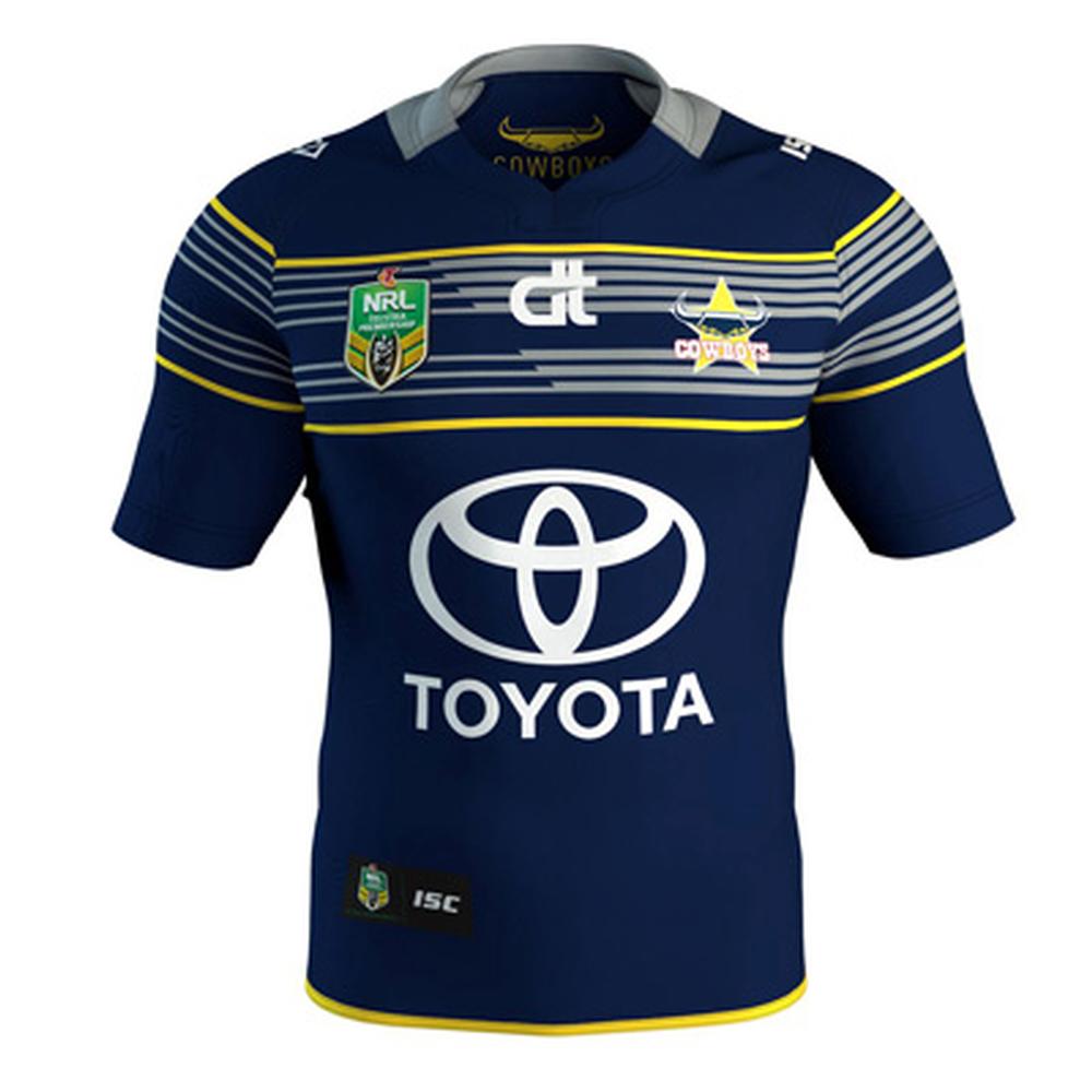
The Cowboys new jersey has actually started to really grow on me. I know most on here are disapointed it wasnt a recreation of the Foundation strip,
but it does seem to be referencing the Heritage jersey from 2008.
(Which was, i believe, a reference to an old local Rep jersey)

IMG_0411.jpg


I must say, i dont like the change in thickness of the chest stripes, but thats nitpicking.
Also, for the Away, it would have been better to do those chest stripes in Blue rather than White for a better contrast to the grey.

Still, generally a good strip. Now they just need to F*CKING STICK WITH IT!!!!!
 
Last edited:

Lambretta

First Grade
Messages
8,689
Yeah HITD - it's grown on me too

The only strange item is the extension of the collar beyond the actual collar by using the same colour out onto the shoulder

I suppose this was to try to appease all those people who wanted a return to actual flappy collars

Well, you were listened to and your silly bloody suggestions made good jerseys shit.

Well done. Whinging bastards
 

Lambretta

First Grade
Messages
8,689
As for the Roosters, the best thing I've seen from my club are the Nine's jerseys from the last two years

I love hooped designs and both of them have been cracking

The 2015 one was a real beauty
 

GAZF

First Grade
Messages
8,756
Yeah HITD - it's grown on me too

The only strange item is the extension of the collar beyond the actual collar by using the same colour out onto the shoulder

I suppose this was to try to appease all those people who wanted a return to actual flappy collars

Well, you were listened to and your silly bloody suggestions made good jerseys shit.

Well done. Whinging bastards

Would have preferred they restricted the collar to the confines of the stitching. Might have been an issue with aligning the sublimation graphics with curved stitching. The other concern is how dicky the back may look where the collar looks to abruptly stop at the seam line. Can't be 100% without other angles of it since it may just be a cloth insert for the inner logo.
 

hellteam

First Grade
Messages
6,536
I think the Cowboys home jersey might look a bit better if the "chestplate" thing was a full solid grey. You'd be able to see the logo properly then too.
 

Saint Doc

Coach
Messages
11,099
20151109155332-NQ16HJS1P-F-400.jpg


The Cowboys new jersey has actually started to really grow on me. I know most on here are disapointed it wasnt a recreation of the Foundation strip,
but it does seem to be referencing the Heritage jersey from 2008.
(Which was, i believe, a reference to an old local Rep jersey)
IMG_0411.jpg


I must say, i dont like the change in thickness of the chest stripes, but thats nitpicking.
Also, for the Away, it would have been better to do those chest stripes in Blue rather than White for a better contrast to the grey.

Still, generally a good strip. Now they just need to F*CKING STICK WITH IT!!!!!

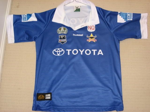
There is literally not a single thing the same between those two jerseys!!
 

Saint Doc

Coach
Messages
11,099
The only thing the comparison of those two Cowboys jerseys highlights is the size difference in Toyota sponsorship
 

Hello, I'm The Doctor

First Grade
Messages
9,124
There is literally not a single thing the same between those two jerseys!!

Its the only Cowboys jersey i know of that is a solid Blue...

The chest strip is probably a reference to the 1995 jersey, which makes me think the designers took the 2 and combined them to create this.
 

Doomednow

Bench
Messages
3,133
CTe4_RSVAAAAmd_P_jpg_large.jpg
[/url]


[/IMG]

Panthers away jersey. Home to be released on Saturday. Looks nice however i was kinda hoping to lose the pink for next season.

Was hoping for a mostly white away with black and gold trim. Always looks good. The bloody pink will just not go away. Must sell well. Or Oak loves it or something.

I'm not really a huge fan of the tilted 50 years logo on the bottom either. Looks like we can expect it on the home strip though as well. Oh well. Still looking forward to seeing it.
 

sheepbender

Juniors
Messages
516
Surely the Cowboys and Storm are taking the piss with these jersey changes. Home jerseys only lasted one season. And both were bloody brilliant compared to some of there previous jerseys. Whilst the new Storm isnt bad, I still think both are step downs..
 

roofromoz

First Grade
Messages
7,580
A bit underwhelmed with the Penrith away jersey. This was a good chance to have an away jersey that at least had a nod back to the past, even if it was just use of that fantastic 1992 strip that was used in the heritage round a few years ago (white licorice allsorts). Or better still, the 1980s white jersey with the two brown stripes on the sleeves.

I predict that the home jersey will be the same as what we have had, with the players names in the same design, which is pretty much an enhancement of the small fient horizontal stripes scheme anyway.

Also, not a fan of having just players that have played 50+ on there. Should be all in or none at all IMO.
 

hellteam

First Grade
Messages
6,536
Surely the Cowboys and Storm are taking the piss with these jersey changes. Home jerseys only lasted one season. And both were bloody brilliant compared to some of there previous jerseys. Whilst the new Storm isnt bad, I still think both are step downs..

Agree, I was a massive fan of last year's Storm jersey, best look they've had since 99 I reckon.

Best Cowboys kit for ages too.
 

Latest posts

Top