What's new
The Front Row Forums

Register a free account today to become a member of the world's largest Rugby League discussion forum! Once signed in, you'll be able to participate on this site by adding your own topics and posts, as well as connect with other members through your own private inbox!

2016 Jerseys, Sponsorship, Logos Discussion

GAZF

First Grade
Messages
8,740
Looks like the brightness/contrast of the photo has been turned up to show the detail. The dark lines around the white logos give it away. I don't think it will be that obvious on the field.
 

SLRBRONCOS

Referee
Messages
23,281
Roosters 9's jersey is foul, filthy Ed Hardy style up top. A plain red bottom half would have suited better, looks like banana leaves.

Souths is good.
 

Timmah

LeagueUnlimited News Editor
Staff member
Messages
100,897
Penrith revealed after the treasure hunt this morning. Gold side panels, nice.

20151114101602-PEN1.jpg
 

Charlie124

First Grade
Messages
8,509
Yeah that giant "50" with the Down syndrome looking panther jumping out of it like its a f**king birthday cake looks terrible. Not a fan of that gold side panelling either.

Throw it in the sea.
 

Alex28

Coach
Messages
11,781
Yeah that giant "50" with the Down syndrome looking panther jumping out of it like its a f**king birthday cake looks terrible. Not a fan of that gold side panelling either.

Throw it in the sea.

There really should be a like button for quality like this...
 

roofromoz

First Grade
Messages
7,580
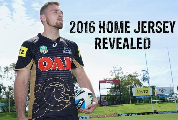
I actually don't mind it, although I'm not a fan of the large 50 on the front.

Remains to be seen whether this will be the home jersey for 2017 and beyond, or whether a new design will be unveiled. Gus is on record in wanting to establish a design that will remain unchanged for 50 years. If so, I would like to see something more distinctive, such as the gold vertical stripes based on the 1970s strip that we wore in the heritage round.

It also confirms that gold has replaced teal as the secondary colour. If we can just stick to that, with no other colours, then that will establish a long term identity. Black as what we are now, gold (as a lighter shade of brown) as what we were from 1967 to 1990.
 

Blues Riff

Bench
Messages
3,331
Take the 50 off the jerseys and they look good imo. That big logo looks shit though.
Agree, but it's only for one year. It's bold and establishes the Panthers brand and colours. In future years the big logo will disappear and the player names will go back to the feint stripes. I like the gold panels.
 

GAZF

First Grade
Messages
8,740
yuck... less is more.

Yep, large swathes of "metallic" gold probably won't date well and are difficult to match up on different items. I don't mind the idea of the gold but as you said, less is more. Maybe something like this would have a longer shelf life?

Panthers-e1447472955237.png
 
Top