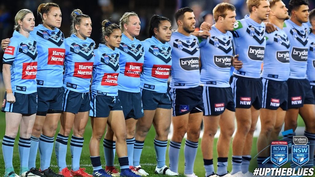
NSWRL uploaded this photo.
Not sure if it’s just because of the photoshopping of different photos or not, but the shade of blue looks quite different on women's Vs men’s jerseys

Different lighting, MCG vs. Campbelltown
That is a WAY better collar what the f**kI like it more than their actual jersey. Better collar too.
View attachment 21031
Yeah done.
Can someone do a mock up with the dark blue shield behind the NSWRL emblem like the original?either of these options, but i think folks would rather the 2nd version. piss the new versions to the back of the collar or on a sleeve...
View attachment 20968
That would look better. The last year I remember with the shield would be around 2006I always thought the shield design was only on the fan jerseys and the player jerseys have always had it embroidered. The under 20's usually have the shield.
View attachment 21051

Wigan to wear a jersey featuring poppies on armed forces day versus Leeds.
No idea why they have made the number space look like three rows rather than have it look like one full piece.
Since when does Sydney sponsor Wigan?

I posted that mockup template for anyone to use on my site. I originally based the template on the best quality image I could find (a training top) and it happened to have sidepanels. Definitely looks better without them, and the element placement and proportions are better as well.The mock up looks like it has side panels but the real one doesn't for some reason. Much better without.
Early-mid 90's Seagulls striping with Titans colours.Has a slight Titans feel to the colour set
