What's new
The Front Row Forums

Register a free account today to become a member of the world's largest Rugby League discussion forum! Once signed in, you'll be able to participate on this site by adding your own topics and posts, as well as connect with other members through your own private inbox!

2018 Jerseys/Logos/Sponsorships

Status
Not open for further replies.

GAZF

First Grade
Messages
8,752
I'll pass thanks... It's still glory days rose tinted glasses BS, and the club needs to be looking to the future not the past.

If we're going to update the current logo then all that really needs to be done is an update to the colour scheme (which is what is slowly being implemented by the club btw).

If on the other hand the club was going for a brand new logo then I'd be all for a less cartoony viking with a much more realistic and aggressive look about him, so get rid of the horned helmet and replace it with a spectacled helmet and give him more realistic dimensions, then chuck him on a badge that is made to look vaguely like a stylised viking shield with the text in the rim, then somewhere in the badge (maybe just beneath the viking) add an aggressive sort of motto (the sort of motto you could see a real raiding party from the Dark Ages having as it's motto if a raiding party from the dark ages was to have a motto) but that also acts as a statement of intent, maybe have it written in viking runes (though that would be hard to do cause of the lack of a Norse Rosetta stone) or in Latin so that it's something you have to be on the inside to understand.

That's what I'd do anyway, all the best elements of an old school European sports club logo mixed with modern stylised design and a viking motif.
You just blurted out half of a concept I have in the works. I'd prefer the horns stay though, honestly.
 

The Great Dane

First Grade
Messages
7,957
You just blurted out half of a concept I have in the works.
LOL, my bad, but great minds think alike I guess.
I'd prefer the horns stay though, honestly.
You say that, but in a strange way reality is often much more beautiful then the fiction it inspires.

Take any Gjermundbu style helmet (images below) and compare it to your average horned "viking helmet" and you'll see what I mean.

only-existing-viking-age-helmet-norway.jpg

Though this a very basic looking one is the only viking era helmet that has survived relatively intact there are plenty of Vendel helmets (effectively proto-vikings) and depictions of vikings wearing much more aesthetically pleasing ones from the viking age. Here's a reproduction of that style of helm to give you an idea what it would have looked like back in the day-
images


And here is one of my favorite Vendel helmets (though I wouldn't use it for a raiders logo cause of the covered face)-
ffb23f8f6de61fd5497d0a55d59821be.jpg

And a reproduction to give you an idea of what it would have looked like in it's prime-
426b3b3d84d259becf94ba39b15dad2f--viking-helmet-viking-age.jpg
 

beave

Coach
Messages
15,671
Yeah nah.

Horns for the win.

Except when they’re part of the actual jersey design.......... f**k you ISC.........
 

callmack1

Moderator
Staff member
Messages
12,155
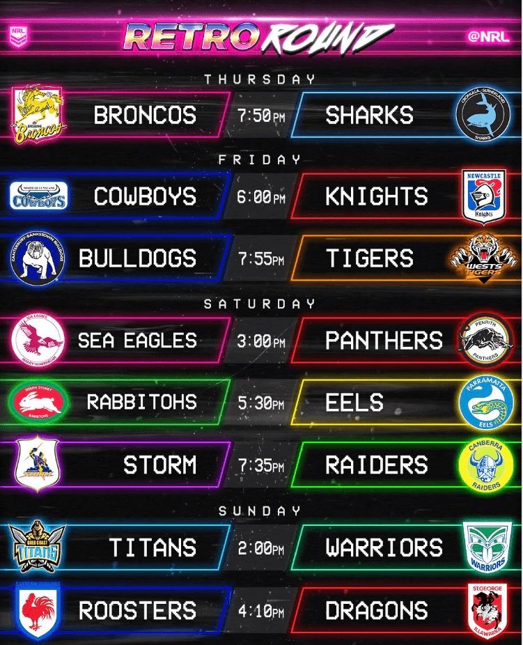
Would certainly love to see the NRL go all out for Retro Round like they do with Indigenous Round where every club must have a retro/heritage jersey. I think it's an awesome concept and generally, modern day heritage/retro jerseys look great!

Bring back the Heritage themed ball too, I loved how they used to make it brown like an old leather ball.
 

The Great Dane

First Grade
Messages
7,957
Would certainly love to see the NRL go all out for Retro Round like they do with Indigenous Round where every club must have a retro/heritage jersey. I think it's an awesome concept and generally, modern day heritage/retro jerseys look great!

Bring back the Heritage themed ball too, I loved how they used to make it brown like an old leather ball.

Pretty sure that Retro Round is a Fox thing and not an NRL thing...

Heritage Round is an NRL thing, not sure if they did it this year though.
 

The Great Dane

First Grade
Messages
7,957
Yeah nah.

Horns for the win.

Except when they’re part of the actual jersey design.......... f**k you ISC.........

Nope f**k em, they're goofy looking and cartoony, just like all of those Cowboys jerseys when they were a design feature.
 

GAZF

First Grade
Messages
8,752
Nope f**k em, they're goofy looking and cartoony, just like all of those Cowboys jerseys when they were a design feature.
While the helmet styles you proposed would be more accurate, and arguably more appealing, you need to have prior knowledge of what a viking actually looked like. A lot of the helmets in that period had similar shaped helms and some form of facial guard. The horns say "viking" and no-one's mixing that up, regardless of whether its an inaccurate stereotype or not.

And thankfully we've never gone down the route of horns on the jersey.
 

Prometheus

Juniors
Messages
1,081
Ithen somewhere in the badge (maybe just beneath the viking) add an aggressive sort of motto (the sort of motto you could see a real raiding party from the Dark Ages having as it's motto if a raiding party from the dark ages was to have a motto)

"We come from the land of the ice and snow. From the midnight sun where the hot springs flow..."
 

Zerô

Juniors
Messages
585
Viking horns would stay

- no one cares about historical accuracy or realism when it comes to sporting logos
- you can sell plastic Viking horns
- if you want a bit of realism, replace the Viking clap with a good ol rape and pillage
 

The Great Dane

First Grade
Messages
7,957
While the helmet styles you proposed would be more accurate, and arguably more appealing, you need to have prior knowledge of what a viking actually looked like. A lot of the helmets in that period had similar shaped helms and some form of facial guard. The horns say "viking" and no-one's mixing that up, regardless of whether its an inaccurate stereotype or not.

And thankfully we've never gone down the route of horns on the jersey.

Strictly speaking that's not really true, but whatever, use the logo as a teaching tool to explain to the masses that actually this is a more accurate "viking helmet" and hey they look cooler anyway so it's no big loss, I'm sure that none of them are going to give up their memberships or stop supporting the club over horns on the helmet, and if the logo looks excellent then they definitely won't mind.

Besides with the modern popularity of Norse myths and sagas and the pop-culture surrounding it like the Vikings TV show and the such more and more people aren't associating horns with Vikings anyway, and so what if they confuse it with e.g. a Saxon at first, tell em it's not a Saxon and move on, and anyhow Saxons (and the other groups they are likely to confuse with Vikings) were "raiders" as well or were largely born of Viking cultures (like the Rus or Normans) anyway so who really cares.
 

The Great Dane

First Grade
Messages
7,957
Viking horns would stay

- no one cares about historical accuracy or realism when it comes to sporting logos

Actually they do, the historical implications and the accuracy of names like the Redskins, Braves, Sioux, Chiefs, etc, has been brought into question in the US and Canada, though i think that at their core those arguments are fundamentally stupid and only exist as a political narrative (and bludgeon) and I'm not proposing them here.

My argument is purely one of aesthetics and what the visuals a Gjermundbu helmet and an horned helmet convey, and simply put the horned helmet is a caricature that every sports club using a viking theme uses and we should move away from it simply cause of it's saturation in our field and cause of the image it purveys to the viewer.

I defy you to find sports team using a logo with a Gjermundbu helmet in it's logo (I can find only one sports logo with that style of helmet, and it's a concept that isn't even in use), basically every team called the Vikings has a horned helmet in the design.

A Gjermundbu helmet is unique in our field, it's memorable, and it looks good, it can easily be used to create an aggressive image (as I'd be aiming for), so basically it's the perfect image to build a brand around.

- you can sell plastic Viking horns
- if you want a bit of realism, replace the Viking clap with a good ol rape and pillage

Firstly the Raiders don't sell any official viking helmets or any viking style merch at all anyway (I know it's a missed opportunity, but it's actually because of the NRL's rules around independent merchandising I'm told, basically the NRL handles all the merchandising apart from game day and on-field kit and all their merchandising options are universal items and can be brought in any of the clubs colours/motifs, it's against the clubs NRL license to sell any merch independent of the NRL without their go ahead, and apparently rules similar to these current ones were one of sticking points that lead John Ribot and the Broncos to conspire to come up with SL) and you can sell plastic viking Gjermundbu helmets anyway like this one- https://www.britishmuseumshoponline.org/viking-plastic-helmet.html.
 

The Great Dane

First Grade
Messages
7,957
The Viking horns aren’t going anywhere. Marketers dream.

Apart from the victor the Viking costume (which you could still sell without horns you know...) not one of those sets of horns made the Raiders or the NRL a cent...

And this guy-
thor-the-dark-world.jpg


And these guys-
vikings-5.jpeg


Make more money and are more of a marketers dream then the Raiders or any "Vikings" team could ever dream of being, and there's not one pair of horns among them...

You don't need horned helmets to have a successful viking themed brand, and most of the most successful ones currently don't have them at all...
 

Hello, I'm The Doctor

First Grade
Messages
9,124
62A722C6-55DE-4806-B3C8-3DCBE55C1062.jpg


Of the above logos...

Should revert to the above “old” logo
Roosters - Yep
Raiders - Nup, Raider are the only team to actually improve their logo during the 2000 Cartoon logo trend.
Bulldogs - Nup, The current dog is perfect. Maybe alter the shield, but the dog is perfect.
Panthers - Meh, the current logo isnt perfect but neither is the old one. The only element they NEED to bring back from this retro logo is the Red-Yellow-Green Shield.

Should stick with current “modern” logo:
Knights
Manly - Yep, but they should make the whole background white for better contrast to the bird.
Sharks - Nah, I think a modernized version of this retro logo would be a step up
Warriors

Shit old AND new logo, needs new design altogether
Broncos - Yep
Cowboys - Yep, both could do with an update.

Unchanged
Dragons
Titans - No no no, Titans have the worst logo in the comp.
Tigers - i reckon a slightly simplified version of the current logo on a solid background would be an improvement. Too much going on and it blends into the jumper too easily
Storm (essentially)
Souths
Eels (essentially reverted to very similar)
 

kdalymc

Bench
Messages
4,346
Fun fact: Canteberry and Bankstown- both nowhere near the Sydney Opera house.

I never even made that connection with the logo, was this some aftermath of when five teams were called “Sydney”
 

AlwaysGreen

Post Whore
Messages
50,165
Lol, I went into bunnings one day with a raiders hat on and the punk at the checkout tried to be intellectual and tell me that 'vikings didn't have horned helmets and so my hat was wrong'.

I told him: 'thanks for the info I already knew, I didn't design the hat, and could you concentrate on scanning because you've charged me for two pruning shears rather than one'.

images-2.jpg
 

thorson1987

Coach
Messages
16,907
Fun fact: Canteberry and Bankstown- both nowhere near the Sydney Opera house.

I never even made that connection with the logo, was this some aftermath of when five teams were called “Sydney”

In 1995 the club name was changed to 'Sydney Bulldogs', reflecting a similar change by Eastern Suburbs (to 'Sydney City Roosters'). The name changed again in 1996, returning to 'Canterbury Bulldogs' with 'Bankstown' omitted, and yet again in 2000, to the geographically indistinct 'Bulldogs'. Bob Hagan, the club boss at the time of the 2000 change, explained that the dropping of the name 'Canterbury' was intended to broaden the appeal of the club outside of its traditional supporter base, so that the club could attract a geographically diverse following like Manchester United or the Chicago Bulls. Despite the name change, some supporters, as well as many television and radio commentators, continued to refer to the club as 'Canterbury'. In the most recent change, board officials voted in late 2009 for the club to return to 'Canterbury-Bankstown Bulldogs' from the 2010 season onwards.

Had to laugh at this bit "so that the club could attract a geographically diverse following like Manchester United or the Chicago Bulls" Would kind of be the same if those clubs were simply known as "United" and "Bulls".
 

GAZF

First Grade
Messages
8,752
Strictly speaking that's not really true, but whatever, use the logo as a teaching tool to explain to the masses that actually this is a more accurate "viking helmet" and hey they look cooler anyway so it's no big loss, I'm sure that none of them are going to give up their memberships or stop supporting the club over horns on the helmet, and if the logo looks excellent then they definitely won't mind.

Besides with the modern popularity of Norse myths and sagas and the pop-culture surrounding it like the Vikings TV show and the such more and more people aren't associating horns with Vikings anyway, and so what if they confuse it with e.g. a Saxon at first, tell em it's not a Saxon and move on, and anyhow Saxons (and the other groups they are likely to confuse with Vikings) were "raiders" as well or were largely born of Viking cultures (like the Rus or Normans) anyway so who really cares.

This is just my opinion and I'm not trying to detract from yours.

Its not the club's job to teach an identity, its job is to communicate an identity effectively and immediately. You could apply sweeping changes to make cultural relics accurate within an identity but they often are left as is for the sake of continuity and often in cases because its more marketable.

Not the best example but the recent Jurassic Park movies still keep scaly, "skin over skeleton" dinosaurs and enormous velociraptors despite recent changes in thought over what dinosaurs actually looked like (fur, feathers and possibly fatty deposits). I'm guessing that whoever's in charge decided that leaving the dinosaurs as-is would sell more toys to kids than if they changed a T-Rex with body hair and a beer gut. That and a strong identity had already been built through the original movies with the dinosaurs depicted in a certain way.

I'm not the keenest history buff but I see enough to have a rough idea of what comes from where and when. Yes, the helmets you posted look like something the vikings would wear, but they contain features that could easily lead the uninformed to believe they could be a Norman helmet, or a Saxon one, or a Gaulish one, or even a Byzantine helmet. And you could just explain it to people and enlighten them as you've said, but in doing that, the identity fails to achieve what I consider to be the fundamental purpose of its existence.

Regarding superheroes and Vikings (tv show) as examples where horns aren't used yet achieve massive commercial success - they may not use horns but both lean heavily on non-factual, non-educational aspects of the viking persona. The superhero one seems to lean heavily on viking mythology and the TV show is a stylistic depiction of the time period, with some mystic aspects, and with historical figures from decades/centuries apart all mashed together for the sake of practicality. Its true that they manage to make plenty of money despite not using the horns, but I think using them as an example to follow when you're pushing for historical accuracy is a bit contradictory.
 

Saint Doc

Coach
Messages
11,091
Firstly the Raiders don't sell any official viking helmets or any viking style merch at all anyway

images


I don’t understand what you would achieve anyway from getting rid of the horns? I mean they’re a marketing tool and kids like them? What does “historical accuracy” achieve? Were there any Vikings who lived in Belconnen? Or Tuggeronong? Or Gunghalin?

St.George supposedly slayed a Dragon. Would it do Saints any favours to have a bloke on a horse put a sword through Happy Dragon as he leads the team out, in the interests of historical accuracy?!
 
Status
Not open for further replies.

Latest posts

Top