The yellow raiders jersey was worn once in Canberra for a home game as a promotion for a new Huawei phone. It was never an ‘away’ or ‘alternate’ jersey.
Yeah for the last few years they've been fazing out the current logo (which is an outdated hangover from the 2000 OzEmail brand change anyway) and slowly replacing it with this new one-
The change is only very minor, but it's still significant in that it seems like it's a change in colour scheme at least adding navy as a permanent part of our colour scheme, which personally I'm not against.
This logo is the one that the Raiders are using on basically everything now except some merch and on the jerseys, and I think considering that the Valkyrie logo is in this colour scheme as well that it's inevitable that given time this will become the official logo used on everything.
Well you should be happy cause it looks like it's hanging around, personally I don't mind it either.
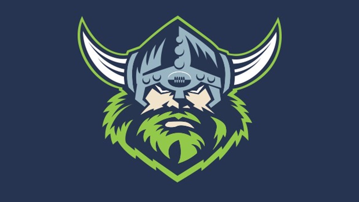
Not sure if this is what you meant but here goes:Anyone with Photoshop skills, what would this logo look like with yellow/gold rivets on the helmet and base of the horns?

I've never been a fan of the post Super League era logos that a lot of teams rebranded too during the 1998-2000 seasons.
Roosters, Broncos, Wests Tigers, Raiders, Sharks (1998-2003), Bulldogs (1998-2009), Panthers (1999-2013), Steelers (1998), Eels (2001-2011).
They were clearly designed at a time when the game was very unstable with teams being forced to merge or die and so on and with the game looking to be bigger I guess clubs were going for a franchise look and feel as opposed to a club look hence why Cronulla just became known as The Sharks and the Roosters went from being known as Easts to Sydney, but these logos are absolutely awful! They're very American inspired, very early 2000's illustrator style and badly dated and I think unnecessary with where the game is at today.
I think if the clubs paid attention to the fans they'll see that everyone goes nuts for a heritage jumpers and a vintage logo. The Eels, dogs and Panthers have gone part the way there and I've seen the Roosters have reverted back to their Easts logo on training and supported gear.
I'd love to see these clubs go back to their heritage and see the league play to the strength of supporting your club over a franchise.
Not sure if this is what you meant but here goes:
I've never been a fan of the post Super League era logos that a lot of teams rebranded too during the 1998-2000 seasons.
Roosters, Broncos, Wests Tigers, Raiders, Sharks (1998-2003), Bulldogs (1998-2009), Panthers (1999-2013), Steelers (1998), Eels (2001-2011).
They were clearly designed at a time when the game was very unstable with teams being forced to merge or die and so on and with the game looking to be bigger I guess clubs were going for a franchise look and feel as opposed to a club look hence why Cronulla just became known as The Sharks and the Roosters went from being known as Easts to Sydney, but these logos are absolutely awful! They're very American inspired, very early 2000's illustrator style and badly dated and I think unnecessary with where the game is at today.
I think if the clubs paid attention to the fans they'll see that everyone goes nuts for a heritage jumpers and a vintage logo. The Eels, dogs and Panthers have gone part the way there and I've seen the Roosters have reverted back to their Easts logo on training and supported gear.
I'd love to see these clubs go back to their heritage and see the league play to the strength of supporting your club over a franchise.
Eastern Sydney, Sydney City or Bondi too.Roosters have to go all in on this soon, it just looks so much better and they’re already half way there.
Eastern Sydney, Sydney City or Bondi too.
Being Sydney, and then having South Sydney is amateur NBL shit
Different styles work well for some and not for others. I don't think we should be looking at a uniform approach to these kind of things.I've never been a fan of the post Super League era logos that a lot of teams rebranded too during the 1998-2000 seasons.
Roosters, Broncos, Wests Tigers, Raiders, Sharks (1998-2003), Bulldogs (1998-2009), Panthers (1999-2013), Steelers (1998), Eels (2001-2011).
They were clearly designed at a time when the game was very unstable with teams being forced to merge or die and so on and with the game looking to be bigger I guess clubs were going for a franchise look and feel as opposed to a club look hence why Cronulla just became known as The Sharks and the Roosters went from being known as Easts to Sydney, but these logos are absolutely awful! They're very American inspired, very early 2000's illustrator style and badly dated and I think unnecessary with where the game is at today.
I think if the clubs paid attention to the fans they'll see that everyone goes nuts for a heritage jumpers and a vintage logo. The Eels, dogs and Panthers have gone part the way there and I've seen the Roosters have reverted back to their Easts logo on training and supported gear.
I'd love to see these clubs go back to their heritage and see the league play to the strength of supporting your club over a franchise.
The yellow raiders jersey was worn once in Canberra for a home game as a promotion for a new Huawei phone. It was never an ‘away’ or ‘alternate’ jersey.
Maybe they should have taken heed and adopted it? It looked good from memory.

I believe every logo has it's place, no matter how bad they are.
Give them a few more decades and people would love to wear a logo their team had as a kid.
And if they're really bad, someone will wear it in a ironic way
Nobody ever said that the Huawei jersey became "an 'away' or 'alternate jersey', but it did lead to this yellow jersey that was the Raiders away jersey in 2015-16-
So yeah in a round about way they did adopt the 'gold' Huawei jersey...
You should really read through stuff before responding to it...
The current logo has much better execution than the original (mainly due to the technology available at the time). Fans like the original because we had success with it.I've always really liked the Raiders current logo, even more so then our old one.
I know it's blasphemy, but I always felt like I could draw a better viking than the old one.
Omg, I just realised that the green beard is a C for Canberra.Not sure if this is what you meant but here goes:
Have the Knights ever worn that orange hi -vis jersey against anyone but the Tigers? They ALWAYS wear it against us. Surely its a deliberate ploy to freak us out?