sempmrh
Juniors
- Messages
- 1,216
It's a combination of the jersey and shorts being different fabrics and the lighting.hmm shorts look like a slightly different colour....
It's a combination of the jersey and shorts being different fabrics and the lighting.hmm shorts look like a slightly different colour....
just wish the wide gold band would go all the way round the back of the jersey as well.
The only thing the new one has over the old one is that they somehow developed the magical technology to print on side panels. Its not a bad design and I get why they cut the band at the back, but they should have avoided the white and gold touching on the band.Last years Broncos was nearly perfect.
This is rubbish compared to it, but they’ve had much worse in the past
At least it looks somewhat like a broncos kit
View attachment 26427
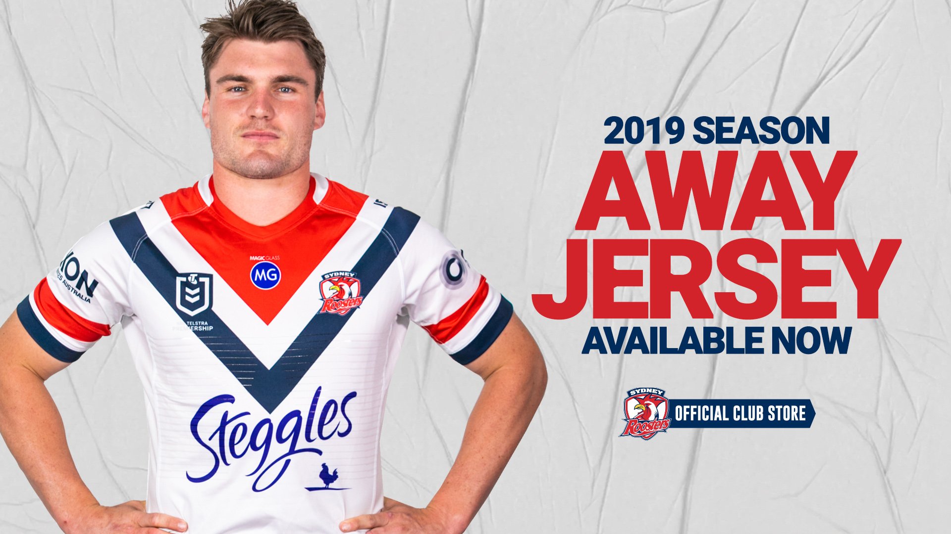
Back of Roosters away.
Yes and only a vague window of early 2019 for when they’ll be confirmed.Hopefully we can see the South's home jersey very soon.
Who else haven't released their jerseys yet? I think it's just the Storm home & away, from memory... yeah?
Souths homeHopefully we can see the South's home jersey very soon.
Who else haven't released their jerseys yet? I think it's just the Storm home & away, from memory... yeah?
Awesome news for us!! Hopefully it'll be good sponsor intergration and done in a similar way to Alcatel on the Away jersey.https://www.rabbitohs.com.au/news/2019/01/21/aqualand-signs-on-as-major-home-corporate-partner/
Rabbitohs finally confirm Aqualand as front of home.
I think it will be one of the middle two on the bottom. The one with just the wordmark looks best.Some possibilities of what they might do:
View attachment 26502
They would have been even better off if they just kept the existing Telstra Premiership logo.
The more I see the execution of the competition logo the more it annoys me.
They almost would've been better off doing away with the wordmark and just having the shield.
Some possibilities of what they might do:
View attachment 26502
I'm hoping it's similar to one of the bottom ones (with a black sublimated logo) that fits in between the two red hoops. That'd be primo and it'd mean that in terms of sponsor intergration, 2019 will be the best it's been in years.Some possibilities of what they might do:
View attachment 26502
