UmmmmThe artwork has been applied to a jersey that Cliff wore while representing the Sea Eagles
They've slightly updated the Origin logo - just the font and flattening all the elements changed really.
Disappointing as it would've been a nice idea to bring it into line with the new branding.

I realised that’s what it’s based on, but saying it’s “a jersey cliff wore” is going abit far...It’s based on this:View attachment 29794
Wow.. Red background nrl logo on a red strip where it belongsPreview of the Rabbitohs Indigenous jersey

There's a lot going on in that icon and I can't see it fitting perfectly into the new branding structure. The icons in the other logos have way less detail and aren't wider than they are tall.They've slightly updated the Origin logo - just the font and flattening all the elements changed really.
Disappointing as it would've been a nice idea to bring it into line with the new branding.

When sponsors pay the kind of $$$ Telstra and Holden do I doubt they'd settle for that.IMO I think the NRL are prioritising the sponsor logo rather than the competition name in their current branding.
I think the sponsorship logo should be separate/underneath to the NRL/SOO logo.
When sponsors pay the kind of $$$ Telstra and Holden do I doubt they'd settle for that.
These brands have formed part of the logo for more than a decade now, sometimes longer.
Just released
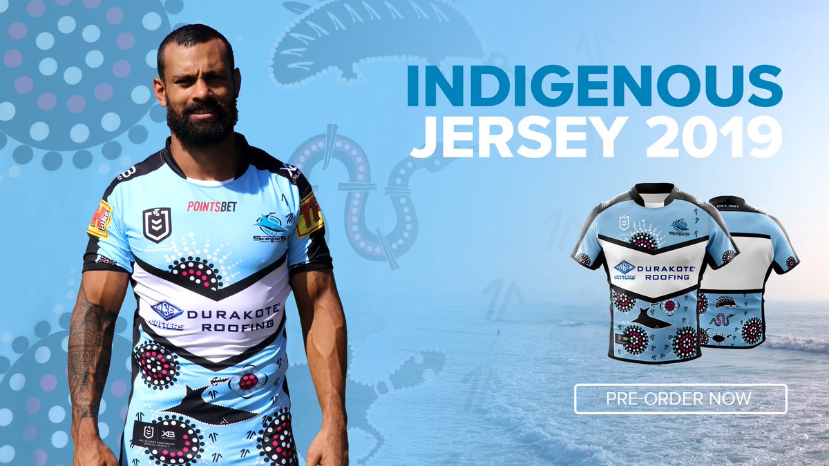
that is pretty fugly!Better look at Sharks Indigenous Jersey on a player (again with the black badge)

Wish the colours were reversed.. love a broncos yellowView attachment 29594 View attachment 29595
