What's new
The Front Row Forums

Register a free account today to become a member of the world's largest Rugby League discussion forum! Once signed in, you'll be able to participate on this site by adding your own topics and posts, as well as connect with other members through your own private inbox!

2019 Jerseys/Logos/Sponsorships

Timmah

LeagueUnlimited News Editor
Staff member
Messages
100,987
From the link above:

Dn_2CINXcAM-cBp.jpg:large


Penrith Panthers is delighted to reveal the club's official logos for the 2019 NRL season and beyond.

Following overwhelming feedback from Panthers members and fans, the renewed logos complete the club's return to the 'liquorice allsorts' colour scheme.

The iconic combination of red, yellow and green stripes became synonymous with the club during the 1990s and returned to the club's jersey range in 2017.

"The logos have undergone a few subtle changes and I know our members and fans will love the fresh look," Panthers Executive General Manager Phil Gould AM said.

The renewed logos complete the club's official transition away from the colour teal, which Panthers first adopted in the 2000s.

The leaping Panther logo will feature on the 2019 Panthers jerseys and off-field merchandise.
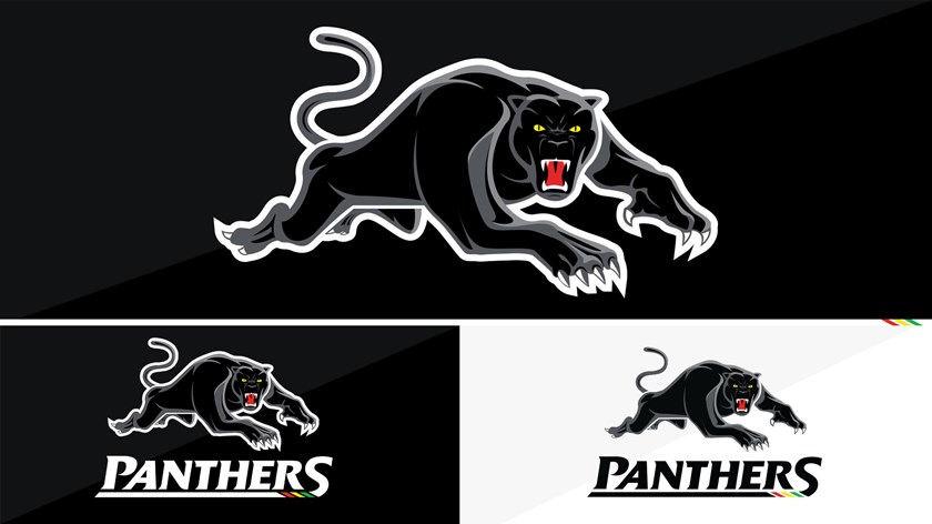
1920x1080-2019-panthers-logo-reveal-2.jpg
 

greenBV4

Bench
Messages
2,510
has it been confirmed that that is the new premiership logo? will it definitely be on the jersey's next year?
It looks more like an app / website icon or something channel 9 would use than a logo to go on a jersey

a bit of simplifying is good, but that is just way TOO simple
 

Timmah

LeagueUnlimited News Editor
Staff member
Messages
100,987
has it been confirmed that that is the new premiership logo? will it definitely be on the jersey's next year?
It looks more like an app / website icon or something channel 9 would use than a logo to go on a jersey

a bit of simplifying is good, but that is just way TOO simple
As I understand it'll be launched about 2 weeks after the Grand Final.
 

kdalymc

Bench
Messages
4,350
What are the 7 logos?

The NRL itself (the organisation) has had two logos, three if you count the green one which is just a cleaned up version of the 2013 iteration.

The Premiership logo has had five:
- The weird long box above the NRL logo in 2000-01
- The Telstra-coloured torpedo 2002-06
- The integrated NRL shield in Telstra colours 2007-12
- The short-lived rounded version of the same thing in 2012 (do we really count it?)
- The current version 2013-2018

This new minimalist thing will be six. I don't see it as a big deal, most comps (and clubs across all codes) are going through some kind of rebrand. A-League did it only last year and FFA followed suit just last week.
Not counting just adding Telstra in 01 and the green border in 98 it’s 6. Pretty ridonculous amount of rebrands imo. People gave the NBL shit
 

Zerô

Juniors
Messages
585
2 things about the new Panthers logo

1) the teal shading made sense, it Incorporated all the licorice all sorts colours. Black panther, teal shading (in place of green), yellow eyes, red mouth.

2) the word mark originally had 2 notches in the underline, representing 2 premierships. Now it has 3, representing the 3 minor colours.
 

sempmrh

Juniors
Messages
1,214
Hopefully this, once and for all, is Penrith finally settling on colours. Clearly the fans want the licorice allsorts look so keep it that way forever. The next change should be making the coloured stripes on the jersey full instead of tapering off to a point.
 

unforgiven

Bench
Messages
3,138
Asking Penrith what their colours are is like asking a 4 year old what their favourite colour; changes on a whim with little to no reasoning behind it.

They can't stick with anything, colours, captains, coaches.
lol, they can't even keep their coaches sacked without trying to reemploy them!

1st they tried to get Sheens back, then gave Gould another job, now trying to steal Cleary, who knows Griffen maybe back in 5 years.
 

Hello, I'm The Doctor

First Grade
Messages
9,124
I am with you 100% here. I LOVE the current Telstra Premiership logo and have done since it was first unveiled.

I'm not the biggest fan of the new logo, as I do feel it's too simple and has the all-important 'NRL' lettering missing which I feel is to its detriment. I think I understand why they've gone down this route, as it's very modern looking and does not look out of place in this social media world we live in these days, but I do fear it's not distinctive enough without the text below it clarifying that it's a sports comp logo that is sponsored by Telstra. I think there's too much open space in it, which can be fixed with the simple addition of the letters 'NRL'.

While the state logos won't be changing (updating) just yet, I do believe it's in the plans for future years, and I'm not sure, how the logo currently sits, how the different states will be distinctive from each other without colouring the logo and adding 'NSW', 'WA', 'QLD', ect, underneath ... tacked on the bottom.

So while I'm not disliking it, I am interested to see how it gets used in the future.

Below is what I would have done with it ... if it had to change, and had to look roughly the way it does.
The top two are if the logo must remain in black-and-white. The bottom two are what I'd do if the logo could be coloured to represent the country the team is from (NZ Warriors on the bottom-right, every other team on the bottom-left).

View attachment 23687

I think the thing everyone needs to keep in mind about these new logos is that the trademarked version isnt necesarily the final version. This same discussion happened when everyone was shitting on this in 2012.

1999760.jpg


Crap quality, but it was only ever meant for the lawyers...

I really hope they do chuck the NRL inside the shield like in Nuke's mockups (id prefer the to be a bit wider and a bit less tall/thick).

But we definitely shouldnt burn the place down just yet...
 

Chook Norris

First Grade
Messages
8,319
The new NRL logo has also made an early appearance at the dally m.
 

Attachments

  • Screenshot_20180926-222026_Chrome.jpg
    Screenshot_20180926-222026_Chrome.jpg
    392.4 KB · Views: 61

Timmah

LeagueUnlimited News Editor
Staff member
Messages
100,987
It's already in the footer of all emails at RLC, and is their linkedin profile picture. I don't think it's a secret.
 

Chook Norris

First Grade
Messages
8,319
It's already in the footer of all emails at RLC, and is their linkedin profile picture. I don't think it's a secret.
Not saying it's a secret. But I was assuming all these new logos would officially be announced on the same date.

Also, I am well aware of LinkedIn. I was the first to note, on here, the new logo on LinkedIn
 

Nuke

Moderator
Staff member
Messages
5,389
has it been confirmed that that is the new premiership logo? will it definitely be on the jersey's next year?
It looks more like an app / website icon or something channel 9 would use than a logo to go on a jersey

a bit of simplifying is good, but that is just way TOO simple

100% mate. Getting launched on 18th October.
Like I've said in a previous post, at NRLWA's awards night on Friday night, they had a montage of NRL players wishing all nominees luck and congratulations to the winners, ect, ect.
At least two (Manly and Wests Tigers), and possibly a third, featured players wearing their jersey, and they had the new Telstra Premiership logo on them. Wests Tigers jersey also had a 20yrs logo that I'm yet to see anywhere else too.

I sent my mate at NRL HQ the logos that I'd found in these threads and then cleaned up, and he replied immediately "How did you get those?!". He then went on to say that the launch date is 18th October. As he was having a day out with his young family, I didn't want to bother him any longer, and I also figured I knew too much already so didn't think I would get many more answers so left the rest alone (colours, future use) and decided just to wait for the launch.

But the short answer you're seeking is yes, these are the new comp logos and they will be on the jerseys (and I daresay EVERYWHERE) very shortly. Stay tuned!
 

Chook Norris

First Grade
Messages
8,319
My thoughts on the NRL Telstra premiership logo:

- simplicity gone too far.
- if it's the black/white one it lacks any sort of color and is totally uninspiring.
- loss of alignment with the NRL logo itself. Key question is 'why?'. I thought the whole point of the current premiership logo was to align with the NRL organization's logo.
- the less logos there are the better. So why do we feel the need to change so often? It's confusing to the fans and is potentially another source of disenfranchisement. Pretty sure the AFL don't change their logos this often.
 

Timmah

LeagueUnlimited News Editor
Staff member
Messages
100,987
My thoughts on the NRL Telstra premiership logo:

- simplicity gone too far.
- if it's the black/white one it lacks any sort of color and is totally uninspiring.
- loss of alignment with the NRL logo itself. Key question is 'why?'. I thought the whole point of the current premiership logo was to align with the NRL organization's logo.
- the less logos there are the better. So why do we feel the need to change so often? It's confusing to the fans and is potentially another source of disenfranchisement. Pretty sure the AFL don't change their logos this often.
The AFL have had two logos, the shield which had the A stylised like the union jack (1990-1999), then the current one which represents an AFL field.

The clubs however, I'm fairly sure 90% of them have logos that are new in the last 10-15 years.
 

Timmah

LeagueUnlimited News Editor
Staff member
Messages
100,987

Dean Ritchie's flipped a shit about the rebrand.

Within the article, and completely at odds with the text in the tweet:

"Insiders claim the cost to implement such minimal alterations would cost between $200,000 and $250,000."
 
Top