What's new
The Front Row Forums

Register a free account today to become a member of the world's largest Rugby League discussion forum! Once signed in, you'll be able to participate on this site by adding your own topics and posts, as well as connect with other members through your own private inbox!

2019 Jerseys/Logos/Sponsorships

Timmah

LeagueUnlimited News Editor
Staff member
Messages
100,987
I always wondered why the Roosters haven't tried an alternate red jersey with blue inside the white V (basically switching the red and blue). They've had mostly red striped alternates in the past.. a red jersey with blue and white V would be a change-up.
s-l300.jpg


This was the alternate (third) jersey a couple of years back, although I don't know that they wore it more than once.

Edit: looks like more than one of us had this idea lol
 

beave

Coach
Messages
15,677
You don’t like the bull horns across the chest of the Cowboys jersey? I think it blends in a bit too much on your navy jersey, but I like it a lot on the white strip.

no mate, I absolutley hate it. We’ve had some shockers in our day but it’s our worst along side the 2008-2010 abstract bulls head one.

I’m not one to harp on and say ‘old school’ is the best school, but NQ nailed it with the original 1995 jersey, and then into 1996 where they flipped the jersey upside down for the the home. Simple, classy and timeless.

GazF has done a modern take on it, this shits all over ‘bullhorns on titties’ every day of the week.

images
 

sempmrh

Juniors
Messages
1,213
I'm surprised the Roosters haven't experimented more with their away/alternate jersey. Their home identity is so set in stone that the away jersey is really the only chance they have to try something new. Perhaps a white version of the hooped jerseys they've done?
 
Messages
711
no mate, I absolutley hate it. We’ve had some shockers in our day but it’s our worst along side the 2008-2010 abstract bulls head one.

I’m not one to harp on and say ‘old school’ is the best school, but NQ nailed it with the original 1995 jersey, and then into 1996 where they flipped the jersey upside down for the the home. Simple, classy and timeless.

GazF has done a modern take on it, this shits all over ‘bullhorns on titties’ every day of the week.

images

Not bad looking by any means, but a bit samey with previous designs used by other clubs. I like it, but think the horns (on white) are much more striking & memorable personally.
 

flippikat

First Grade
Messages
5,244
roosters-celeb-160619010.jpg


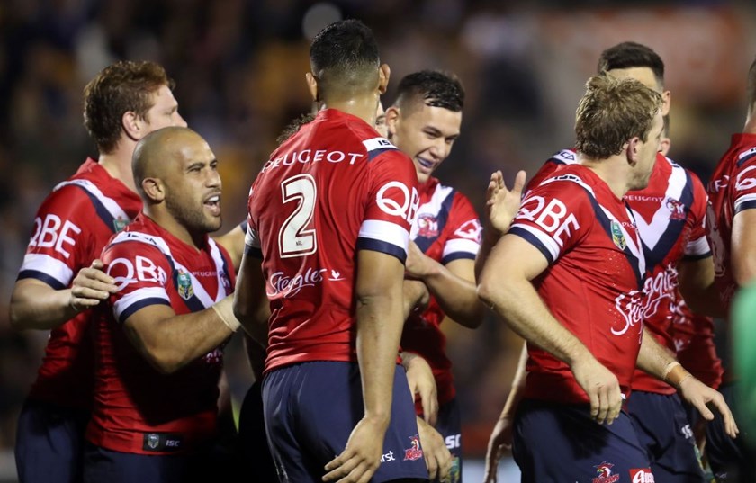
This is the closest the Roosters have gone to a 'Red' version of the home kit.

The V is more based on the Away V than the home V, still again a very professionally looking kit

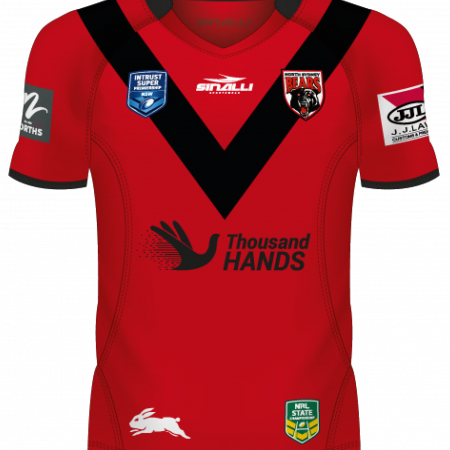
I wasn't aware that existed. Yeah, closer to the away jersey V than the home jersey V.. but not far off last year's North Sydney home jersey in NSW Cup....

Nth-Syd-Bears-2018-Apparel-2-Home-450x450.png


Maybe the Roosters could use an alternate like the one you posted for games they take to Gosford? Makes sense, given the feeder-club arrangement they have with Norths now ;-)
 

flippikat

First Grade
Messages
5,244
I'm surprised the Roosters haven't experimented more with their away/alternate jersey. Their home identity is so set in stone that the away jersey is really the only chance they have to try something new. Perhaps a white version of the hooped jerseys they've done?

I like the sound of that idea. A new spin on a traditional design.
 

beave

Coach
Messages
15,677
True, although they only appeared on our erseys for 1 season didnt they?

nope. 1999-2000. The 2000 era logo was integrated into the jersey much better. the 1999, not so much...

1999

images


2000

images


we ran out for rd1in the 1999 season without a main jersey jersey (christ, where does 20 years go????!!!!) at Penrith in the darker away. It took a few weeks to sort a deal out, the sponsor name was kept very hush hush. I remember watching the game at a pub in sydney when commentators on fox mentioned the NQ club had just secured a major sponsor and would be wearing it for the first time that night.

I was pretty excited and was jawing off at my mates that were watching with me. Bundy had been thrown around as a potential taker, as well as a few other more known brands.

As the players ran out ran out onto the field I could not believe my f**king eyes. And then the western cameras panned across the field and these new huge sky blue goal post protectors also were branded with the hideous ‘Overflow’....... my team was now sponsored by a f**king $2 shop. My completely clueless mates were hosing me deluxe when they asked me ‘wtf an Overflow was?’.....

BE2214-D6-57-FF-405-A-AA70-2-E83-FEB4-C9-D1.jpg


It was about the time I realised I probably wasn’t going to have a team in
the comp much longer.

They nearly went bust the following 2 years. Was absolutley f**ked times being an NQ fan back then.
 
Last edited:

beave

Coach
Messages
15,677
nope. 1999-2000. The 2000 era logo was integrated into the jersey much better. the 1999, not so much...

1999

images


2000

images
Whaddya reckon beave - 2018 strip > 2000 strip? Haha

i edited that original post mate, apologies.

I’d say at least the 99/2000 strip had an excuse. Clubs were trying to be all futuristic and ‘Y2k’...... ‘bulls on titties’ has zero excuse.
 

kdalymc

Bench
Messages
4,349
Just tried on broncos jersey, the badges are on my shoulder blades what’s the go with that. Even in the pics too, way to high...
 

Latest posts

Top