What's new
The Front Row Forums

Register a free account today to become a member of the world's largest Rugby League discussion forum! Once signed in, you'll be able to participate on this site by adding your own topics and posts, as well as connect with other members through your own private inbox!

2019 Jerseys/Logos/Sponsorships

unforgiven

Bench
Messages
3,138
They f**ked up the V.
They needed to either have the white V go all the way up to the shoulder, or have orange sleeves.
That is exactly what is turning me off that jersey, I've been trying for days to figure out what bugs me about it and you nailed it! lol
 

beagle

Juniors
Messages
763
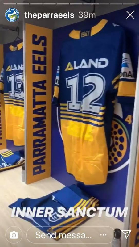
Parra will wear the 1986 style jersey

86-jersey.jpg
 

kdalymc

Bench
Messages
4,343
Eels wearing a great jersey to celebrate a wonderful event.
Tigers- better wear a shit house white jersey...
 

greenBV4

Bench
Messages
2,510
A look at the Storm ANZAC Day jersey in the flesh along with the Australian and New Zealand defence force jerseys.

e3342a1b-671b-4bed-9785-558413d2fadb-jpeg.29234

Doesn't look as bad on, still a bit messy IMO, bolts, vee, poppy vee - only use 2 of those 3 and its already better

When do the defence force teams play?
 

sempmrh

Juniors
Messages
1,210
Doesn't look as bad on, still a bit messy IMO, bolts, vee, poppy vee - only use 2 of those 3 and its already better

When do the defence force teams play?
I believe it’s the curtain raiser.

I wouldn’t be surprised if we wear something similar to this ANZAC Day jersey as a home jersey next year. Just put the (preferably white) bolts inside the navy V and you’re good to go.

I’m not sure why the club keeps persisting with the backwards lightning bolt. Sure, I get that it’s lifted directly from the logo but if it’s going to be on the jersey it needs to be flipped. Star Athletic got it right with the bolts down the side and then ISC came in and flipped them.
 

Timmah

LeagueUnlimited News Editor
Staff member
Messages
100,985
Eels wearing a great jersey to celebrate a wonderful event.
Tigers- better wear a shit house white jersey...
They had to wear a jersey which contrasted - their home jumper is black and their heritage jersey doesn't contrast either. What did you expect?
 

gzerounian

Juniors
Messages
1,094
Now that the dust has settled on the new NRL logo, what they did wasn't that drastic after all. Basically the jersey logo is white! The background colour is not part of the logo. So the different background colour options were put in place just to ensure the white logo stood out. Why didn't the NRL just put on a black background on the logo for every jersey and be done with it. It wouldn't have looked much different to what we have now (and saved us hundreds of posts on this thread!) plus it would have given the new logo a lot more exposure (and class)
Screen Shot 2019-04-24 at 4.25.35 AM.png

Clubs were not given the option to tamper with the colour of the logo itself (unlike the A-League logo). The new NRL logo seems to only exist in black or white and even then the black wasn't permitted on jerseys.

Screen Shot 2019-04-24 at 4.28.44 AM.png
 

Timmah

LeagueUnlimited News Editor
Staff member
Messages
100,985
Now that the dust has settled on the new NRL logo, what they did wasn't that drastic after all. Basically the jersey logo is white! The background colour is not part of the logo. So the different background colour options were put in place just to ensure the white logo stood out. Why didn't the NRL just put on a black background on the logo for every jersey and be done with it. It wouldn't have looked much different to what we have now (and saved us hundreds of posts on this thread!) plus it would have given the new logo a lot more exposure (and class)
View attachment 29270

Clubs were not given the option to tamper with the colour of the logo itself (unlike the A-League logo). The new NRL logo seems to only exist in black or white and even then the black wasn't permitted on jerseys.

View attachment 29271
For what it's worth, the A-League logo "club tampering" wasn't up to the clubs - it was given out by FFA in home and away versions and that was that. Clubs didn't get to choose, they just used existing colours.

As for why they didn't put it on a black background, I think the purpose was to not have the competition logo stand out like dogs balls, like the old one did being green on all kinds of colours. White on a club colour has been the go, I like it.
 

Latest posts

Top