The marketing is trying to align all the logos, like they did for magic round
Its not bad, but its getting very Americanized
https://www.underconsideration.com/...d_identity_for_canberra_raiders_by_inklab.php
A good response from the design world on Canberra's new logo
Yeah all i see now is bushy eyebrows on a koala.I knew it was only a matter of time before the Origin logo was pulled into line with the other NRL-related logos.
I can't say I'm surprised by it.
I don't love it, but I don't dislike it either.
I wish whoever said it looked like a koala's face hadn't said that though..!

Looks like an very bad tribal tattoo from Rooty Hill
Can’t say that I’m a fan of the new origin logo...
Logo needs genuine updating. This is just touching up 90's BS.
Can’t say that I’m a fan of the new origin logo...
Nice to see the old RFL badge being used in some fan gear. Bring it back to the player jersey i say.
View attachment 35314
View attachment 35315

Logo on a shield inside a shield?Logo inside a shield...why?

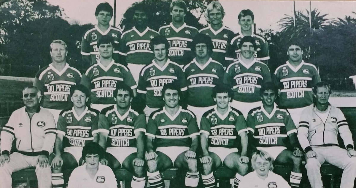
And wasn't the RFL logo only for one season?

I have been thinking about how to fix it but im baffled. They obviously want to keep the head to head design while still keeping it in line with all the other new the clean simple logo designs. Will continue to think how this can be done.@gzerounian SOS! Can you fix this mess of a logo?!
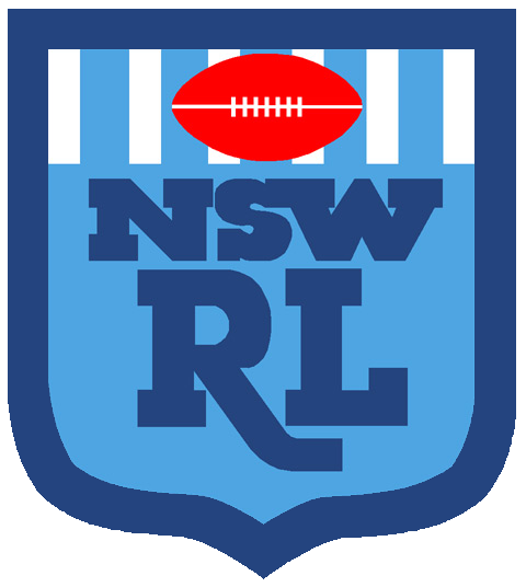
Dose anyone know what the white stripes mean or is it purely a cosmetic look?That’s cool...although interesting they chose NSW RFL logo rather than NSW RL. Nitpicking, sure, but I would have thought this one was more iconic..:

i have just posted some mockups on the other thread.@gzerounian SOS! Can you fix this mess of a logo?!
Whatever it takes???? Wasn't that the Motto Essendon used when they were doping, lacks imagination to use a drug cheating teams motto.Nice to see the old RFL badge being used in some fan gear. Bring it back to the player jersey i say.
View attachment 35314
View attachment 35315
