cooko
Juniors
- Messages
- 529
A couple of seasons now. It's on the home socks too.Since when did the Roosters have Easts on their clash socks? Or have they had it for a while and I've only just noticed tonight
A couple of seasons now. It's on the home socks too.Since when did the Roosters have Easts on their clash socks? Or have they had it for a while and I've only just noticed tonight

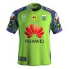
Raiders 2020 Indigenous Jersey released!
https://www.raidersshop.com.au/2020-adults-indigenous-jersey-2596.phtml
View attachment 38817
That's really cool.. looks like there's side-panels with a design too.
From purely aesthetic considerations, IMO Aboriginal art has mixed results when used all over a jersey - it looks great up close - REALLY great up close, but a lot of the fine detail is lost in long shots, and its asymmetrical nature doesn't help in that regard - as opposed to some of the Maori / Pacific Island designs that are big, bold & symmetrical.
It looks like this design has symmetry too.. which is a bit unusual for an indigenous design jersey.
I’d agree with that. Kinda like the Aboriginal style falls into an art category while Maori fits in to the Graphic design realm.
nailed it.symmetrical.
Brisbane's diagonal job would have been perfect if they still had Wow Sight n Sound as the sponsor.nailed it.
asymmetrical jerseys can f**k off.
except for Magpies 1998, thats rad.
yuk yuk f**ken yuk merkin.Brisbane's diagonal job would have been perfect if they still had Wow Sight n Sound as the sponsor.
I meant the away jersey.yuk yuk f**ken yuk merkin.
ban yaself
nailed it.
asymmetrical jerseys can f**k off.
except for Magpies 1998, thats rad.
nailed it.
asymmetrical jerseys can f**k off.
except for Magpies 1998, thats rad.

Ahem


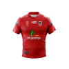
I imagine this would be selling like hotcakes right now.Dragons Away Jersey is now available to purchase from Dragons Store! Therefore it is now 100% confirmed that this is their away jersey for 2020!
https://shop.dragons.com.au/collections/mens/products/xblades-dragons-2020-mens-away-jersey
View attachment 38951
Was wearing it on the field not enough of a confirmation for you?Dragons Away Jersey is now available to purchase from Dragons Store! Therefore it is now 100% confirmed that this is their away jersey for 2020!
https://shop.dragons.com.au/collections/mens/products/xblades-dragons-2020-mens-away-jersey
View attachment 38951
No as I believe without confirmation it can be defined as being any type of jersey!Was wearing it on the field not enough of a confirmation for you?
But two white bands on the Sleeves. There needs to be a permanent Illawarra jersey at the ‘gong or as an awayDragons Away Jersey is now available to purchase from Dragons Store! Therefore it is now 100% confirmed that this is their away jersey for 2020!
https://shop.dragons.com.au/collections/mens/products/xblades-dragons-2020-mens-away-jersey
View attachment 38951
