You only turn 21 once....Are the St George-Illawarra Dragons celebrating a special anniversary? 21 years?
New home kit reminds me of this...


Where did you get these from
A certain 1991 classic will be appearing that will top this.We have a contender for best jerseys of 2021 here, folks!
Agree. Pity it's made by Classic though.Best dogs jersey in years
Why wouldn't they extend the black strip so the club logo is entirely in the black section. Bizzare decision.Looks like their is a stripe jersey in the mix for the Tigers... and just to be really really annoying the orange Neds box is bigger than the orange line...
View attachment 43818
Why wouldn't they extend the black strip so the club logo is entirely in the black section. Bizzare decision.
Good point.I’m guessing their thinking would be by breaking up the line makes the logo stand out more. It breaks the monotony of horizontal bars.
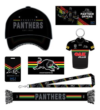
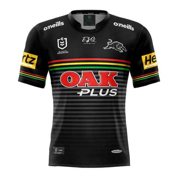
Judging from the membership pack in that link looks like the Panthers have ditched the design on the sleeves in comparison with the 2020 jersey.


So if there is a heritage round next year maybe the 1991 jersey will feature? Unless it is a full Classic retro remake with the Dahdah Uniforms sponsor.


 . If only they follow Cronulla and release a 3/4 sleeve jersey once everyone see it in the flesh. The OAK Plus is integrated really well and the stripes on the sleeves will be thinner.