Doesn't look as good on the players IMO


There really is a cool early-mid 90s vibe in jersey design at the moment.
I'm really enjoying the versions of designs from that golden age of jerseys that was just before the Superleague war.
& it's not just because I'm an eels fan
.
True... which ones weren't?
Broncos - diamonds, nuff saidTrue... which ones weren't?
It absolutely is because you're an Eels fan.one of the Best looking Jerseys in the comp for mine, & it's not just because I'm an eels fan.
If the yellow V were subtle lightning bolts like the 98-99 jersey, it'll be a perfect start to them regaining their branding identity again.
If the yellow V were subtle lightning bolts like the 98-99 jersey, it'll be a perfect start to them regaining their branding identity again.

It absolutely is because you're an Eels fan.
This is the same design as the last couple of seasons, except worse, because it looks like Macron's template is just patches of fabric sewn together - and barely even the right colours?
Conclusion: solid set of designs, a year or two before clubs started going wild with sublimation. There might be more good designs in 95 than in other seasons (debatable), but there were also a shit load more teams. I'd argue that previous decades had better designs on average. Hard to compare a 12 team league to a 20 team one.
Agree with the above. I think people remember 95 fondly simply because a lot of clubs made a lot of bad choices not long afterwards when it came to jersey design, and it was an extremely positive period for the game (before the war really settled in).
It definitely helped at the time that it was relatively prohibitive for clubs to do anything too crazy with designs (outside of the Diamonds), most major sponsors were well integrated and the clubs wore their main kit the majority of the time (and their alternates were generally just the home with the colours flipped).
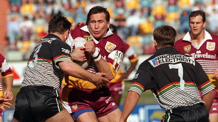
Just on the Broncos, at the time, whilst their 'alternate' in 95 was a bit out there, their main was very solid.
Sadly I agree. Different shades of blue due to the different fabrics on various parts of the jersey. And Macron do love patches. And in my opinion the neckline looks ridiculous. I'll have to see a retail version in the flesh to see if my opinion will change.

The collars have improved from last seasons monstrosities.The collar could be improved on the eels Jersey definitely.
The Dynasty made Jersey collars look good imo.
View attachment 45789


