What's new
The Front Row Forums

Register a free account today to become a member of the world's largest Rugby League discussion forum! Once signed in, you'll be able to participate on this site by adding your own topics and posts, as well as connect with other members through your own private inbox!

The Game 2021 Jerseys, Sponsorship, Logos etc

Messages
8,480
It’s so hard for NIB to have their logo stand out, I reckon we just let them have it diagonally on the jersey.

NIB has never, ever looked good on any jersey. They ruin jerseys. The Blues n the Knights...

Unless/until they give up the green block, they will always ruin jerseys. I can’t even see them working with green on jerseys like Souths or to a lesser extent, the Raiders.

Clubs like the Storm n Roosters who’ve had proven success can command sponsors that integrate well into the jerseys (although the roosters green “Unibet” did look horrible). Their jerseys look slick, a sign of a professional brand.

Others like mine who are scratching around a bit have to take what they can get in some respects, can’t command like the others, and thus have mismatching colours, “blocks” and the like that ruin the feel of the kit.

But NIB is the king of crap sponsors. They may pump loads of needed $$$ into teams, but they bastardise the look of their kits.
 

kdalymc

Bench
Messages
4,350
Clubs like the Storm n Roosters who’ve had proven success can command sponsors that integrate well into the jerseys
Wot?
You seen any storm jersey?
Yes a pass for redzed and purple bricks but c'mon man. They literally removed lightning bolts (their identity) to accommodate bad sponsor integration...
 

yakstorm

First Grade
Messages
6,072
I don't know if the NRL doesn't allow diagonal sponsors, but for a long time it had the rule that any implementation of a sponsor had to be consistent between kits in terms of layout / etc (colours were allowed to change).

This created annoying scenarios for many clubs I know who had the same sponsor in say multiple spots and wanted to use variations of the logo / or who's designs say were better suited to one implementation versus another, were prevented from doing so.

I'm not sure if this has changed now but it was a rule at least up to around 2018.

Now on the Sharks jersey one thing the Dynasty 'Reebok' remake has done which XBlades didn't, is they have made the area for the sponsor a lot taller, meaning maybe Aramex can fit in there without a box, especially as the logo isn't very tall on the main kit.
 
Messages
12,501
NIB has never, ever looked good on any jersey. They ruin jerseys. The Blues n the Knights...

Unless/until they give up the green block, they will always ruin jerseys. I can’t even see them working with green on jerseys like Souths or to a lesser extent, the Raiders.

Clubs like the Storm n Roosters who’ve had proven success can command sponsors that integrate well into the jerseys (although the roosters green “Unibet” did look horrible). Their jerseys look slick, a sign of a professional brand.

Others like mine who are scratching around a bit have to take what they can get in some respects, can’t command like the others, and thus have mismatching colours, “blocks” and the like that ruin the feel of the kit.

But NIB is the king of crap sponsors. They may pump loads of needed $$$ into teams, but they bastardise the look of their kits.


I think our club’s long history had more to do with it. I seem to remember in early to mid nineties when we were still shit but the club turned down Pepsi when they insisted on us altering our jersey to accommodate their logo. Captain Apollo or Horrie may have a better memory of it. They went to Manly in the end.
 
Messages
8,480
Wot?
You seen any storm jersey?
Yes a pass for redzed and purple bricks but c'mon man. They literally removed lightning bolts (their identity) to accommodate bad sponsor integration...

yes I have and they have looked slick ever since they got rid of Jayco, ME bank etc. Irrespective of the bolts or no bolts, the 2021 jersey has been seemlessly designed...

No blocks. No patches. No mismatching, glaring colour clashes.

How many clubs can claim that?

The Storm and the Roosters can. Not many others can though, sadly.
 

sempmrh

Juniors
Messages
1,214
yes I have and they have looked slick ever since they got rid of Jayco, ME bank etc. Irrespective of the bolts or no bolts, the 2021 jersey has been seemlessly designed...

No blocks. No patches. No mismatching, glaring colour clashes.

How many clubs can claim that?

The Storm and the Roosters can. Not many others can though, sadly.

To be fair, Jayco on the front of the Storm jersey in 2010 was only a big white box because it had to cover the giant lime green ME Bank logo. I think if Jayco were the original sponsor it might have looked a bit better - perhaps only the Jayco wordmark.

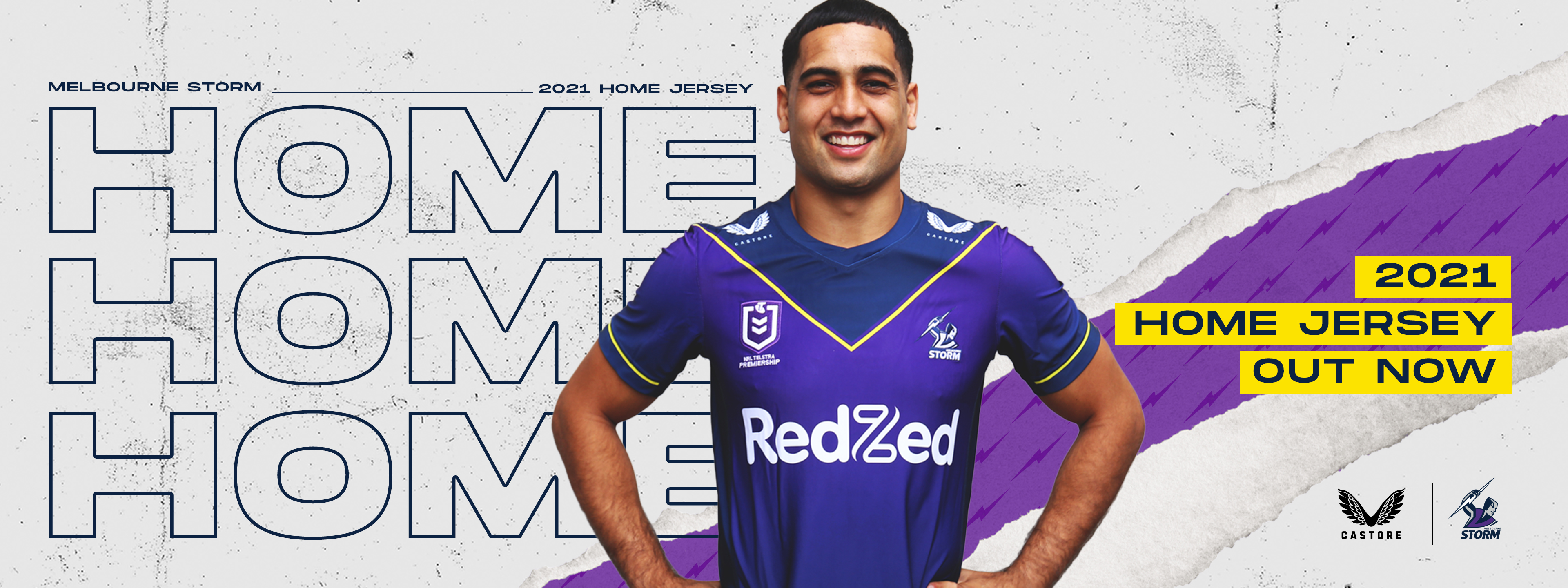
The only negative about sponsor integration on our 2021 jersey is the new red Grill’d logo on the back - but even that’s not too bad. If we pick up a sleeve or lower back sponsor it might be a problem as well - but hopefully not.
 
Messages
8,480
To be fair, Jayco on the front of the Storm jersey in 2010 was only a big white box because it had to cover the giant lime green ME Bank logo. I think if Jayco were the original sponsor it might have looked a bit better - perhaps only the Jayco wordmark.

Yep understood mate. 2010 was the year of the cap dramas too, and since then I didn't like their jerseys much for a few years. Many sponsors left them and they had to take what they could get - and slap it on the jersey they'd already designed. They ended up getting Crown and 2012 was a prime example - while the patch matched in colouring, it bastardised the whole design. Below.


s-l400.webp


But since then they've seemingly focussed well on integrating everything (although Crown Patches" did appear on some away kit - eg the purple hooped jersey) - got their sponsors on board early enough in the design proceed to see what they have to work with - and get the final design nailed. Or at least that's how it would appear to me. I think their jerseys over the last 3-4 years have been up with the best of all clubs.

This year they've simplified the design (not a bad thing in my opinion) and it still looks seamless to me.

home2x__47766.jpg


The only negative about sponsor integration on our 2021 jersey is the new red Grill’d logo on the back - but even that’s not too bad. If we pick up a sleeve or lower back sponsor it might be a problem as well - but hopefully not.

Until...... indeed if this happens.

So to my original point - when the Storm were flying, they had slick jerseys. Same as other clubs. They still do this year in my opinion. But after last season many clubs were on their knees financially, I don't know how much it affected the Storm but they had no home games and played out of SEQLD, which must have smashed them around. So to inject revenue, I can see why they may try to get more sponsors on the kit as you've highlighted - I just hope it isn't at the expense of the design. And definitely not an ME Bank/Jayco type patch.

Other clubs didnt need the covid crisis to be in financial trouble, they were already. And it's easy to spot which ones without needing to see a balance sheet - just look at their jerseys.. if you've got "bumper stickers" slapped on them, it's basically there to try and hide the rust.
 

Timmah

LeagueUnlimited News Editor
Staff member
Messages
100,990
Other clubs didnt need the covid crisis to be in financial trouble, they were already. And it's easy to spot which ones without needing to see a balance sheet - just look at their jerseys.. if you've got "bumper stickers" slapped on them, it's basically there to try and hide the rust.
Point of order here, in terms of front of jersey sponsors - most are well integrated.

Neds (Titans), nib (Knights) and I guess Brydens (Tigers) are the more obvious ones, with Eels (home only) and Cowboys arguable.

In terms of other spots on the jumper I don't know that many clubs care all that much
 
Messages
8,480
Point of order here, in terms of front of jersey sponsors - most are well integrated.

Neds (Titans), nib (Knights) and I guess Brydens (Tigers) are the more obvious ones, with Eels (home only) and Cowboys arguable.

In terms of other spots on the jumper I don't know that many clubs care all that much

No argument from me, although I think Brydens / Tigers are done quite well.

Look at the sleeves, and back of the jerseys. That's where a lot of the rubbish is.
 
Messages
8,480
I think the Brydens panel or oval is way too big. Agree with second para
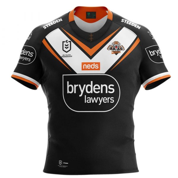
I don't mind it... I think it would look bad if the colouring on the inside of the border wasn't black.

2021wests-tigers-home-mens-front-600x600.jpg


But then looking at the away jersey..

2021wests-tigers-away-mens-front-600x600.jpg


I think the black colouring within the white border actually works with the orange background. Maybe because Black is a "neutral" colour and goes with everything.. If the colouring inside the boundary was anything other than black on these Jerseys, I'd completely agree.
 
Messages
8,480
Does anyone know if any club has gone away from the "Bordered Numbering" this season?

I hate it personally but all clubs have had it recently, the last to keep solid numbering was the Bulldogs I recall.
 

Timmah

LeagueUnlimited News Editor
Staff member
Messages
100,990
Does anyone know if any club has gone away from the "Bordered Numbering" this season?

I hate it personally but all clubs have had it recently, the last to keep solid numbering was the Bulldogs I recall.
That was a move to NRL's standardised numbering - the only way it changes will be if all clubs change.

Looks like it's remaining as is for this season at least:

upload_2021-2-22_16-14-21.png


upload_2021-2-22_16-16-47.png
 
Messages
12,501
I don't mind it... I think it would look bad if the colouring on the inside of the border wasn't black.

2021wests-tigers-home-mens-front-600x600.jpg


But then looking at the away jersey..
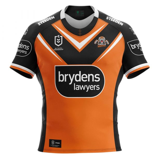
2021wests-tigers-away-mens-front-600x600.jpg


I think the black colouring within the white border actually works with the orange background. Maybe because Black is a "neutral" colour and goes with everything.. If the colouring inside the boundary was anything other than black on these Jerseys, I'd completely agree.


It’s personal of course but I just don’t like the panel. Too big for me. Surprisingly integrates well on the sleeve, however. Probably one of the better sleeve sponsors going around. Complementary colours help.
 

Latest posts

Top