What's new
The Front Row Forums

Register a free account today to become a member of the world's largest Rugby League discussion forum! Once signed in, you'll be able to participate on this site by adding your own topics and posts, as well as connect with other members through your own private inbox!

The Game 2022 Jerseys, Sponsorship, Logos etc

Hit The Post

Juniors
Messages
219
Titans 2022 Pasifika jersey. To be worn in round 14.
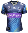
Titans22Pasifika.PNG


hellteam

First Grade
Messages
6,536
Don’t know why the Cowboys would wear their white shorts away kit against the titans…
I've always wondered why teams aren't willing to switch up shorts often. It's pretty rare.

Do team's home and away shorts generally have different sponsors? That might explain it, need to give the sponsors exposure
 

sheepbender

Juniors
Messages
514
Titans 2022 Pasifika jersey. To be worn in round 14.
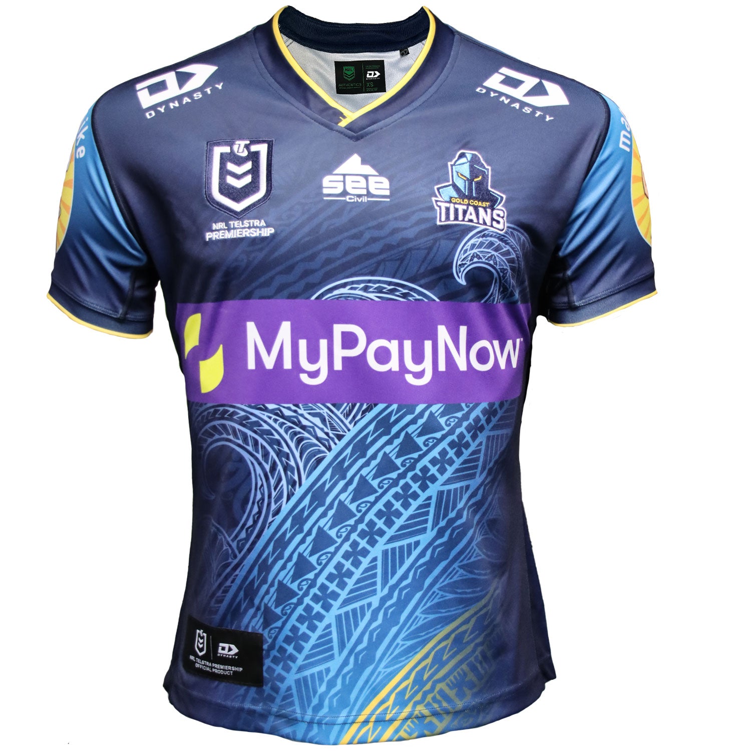
View attachment 62428

Not sure why they couldn't have combined this with the Indigenous jersey.
 

kdalymc

Bench
Messages
4,345
I like how the Titans sponsor doesn't completely wreck the wave motif of the design, only 90% of it.
ridiculous. surely whoever is designing them (although this is backward) can go 'ok theres a big box in the middle, im going to design this meaningful piece around that so it doesn't get lost'.....

if they know the sponsor aint gonna budge dont just draw a blank canvas without realising this....
 

GAZF

First Grade
Messages
8,752
ridiculous. surely whoever is designing them (although this is backward) can go 'ok theres a big box in the middle, im going to design this meaningful piece around that so it doesn't get lost'.....

if they know the sponsor aint gonna budge dont just draw a blank canvas without realising this....
If I had to guess, the art is probably done by a third party on a separate "canvas", then imported to the jersey file. Designing to accomodate sponsors goes against the convention of placing the focal point in the centre of the design, which might be why this happens over and over again.
 

It's Been Done

Juniors
Messages
716
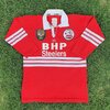
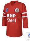
St George Illawarra Heritage Jersey to be worn in round 16 against Canberra celebrating 40 years of the Illawarra Steelers
st-george-illawarra-dragons-classic-dragons-2022-mens-heritage-jersey_2048x.png

st-george-illawarra-dragons-classic-dragons-2022-mens-heritage-jersey-2_2048x.png
 

MugaB

Coach
Messages
15,052
St George Illawarra Heritage Jersey to be worn in round 16 against Canberra celebrating 40 years of the Illawarra Steelers
st-george-illawarra-dragons-classic-dragons-2022-mens-heritage-jersey_2048x.png

st-george-illawarra-dragons-classic-dragons-2022-mens-heritage-jersey-2_2048x.png
Whats so heritage about it? 2 white armpit stripes, clap clap dragons, well done thanx for the effort of supporting illawarra....
Stanley says hello

Classic are really shit designers
 

Saint Doc

Coach
Messages
11,091
Whats so heritage about it? 2 white armpit stripes, clap clap dragons, well done thanx for the effort of supporting illawarra....
Stanley says hello

Classic are really shit designers
What’s heritage about it? Ahh, the design. I agree it looks shit but that’s what the Steelers ran around in.
 

MugaB

Coach
Messages
15,052
What’s heritage about it? Ahh, the design. I agree it looks shit but that’s what the Steelers ran around in.
What design? Hiding two stripes under the armpit? Fmd... atleast have them wrap completely around the sleeves, maybe even a few around the torso.. like so

images.jpeg-113.jpg

I suppose it was too hard for the graphic designer at classic
 
Last edited:

zombiebloodlust

Juniors
Messages
813
lol this says everything about the kind of people who fake outrage at the lack of Illawarra Steelers history recognition within the joint venture. They have no idea themselves.
 

MugaB

Coach
Messages
15,052
lol this says everything about the kind of people who fake outrage at the lack of Illawarra Steelers history recognition within the joint venture. They have no idea themselves.
that was pretty weak, listen the jersey is just red, thats it! No effort to make it look more than steelers than the soon to be Nrl Dolphins or Manchester united, like i said before the only defining trait that the steelers had on their jersey designs were the white stripes, this new "heritage" got fk all of it on there, just armpits
 

flippikat

First Grade
Messages
5,221
Stripes should be wider and under the logo.
Yeah. The thinner stripes that this year's heritage jersey has would be better for doing the 3-striped jersey that MugaB posted. (Though Adidas may not like that design reappearing)

Two stripes need to be thicker - tougher on short sleeves than a 3/4 sleeve jersey, but not impossible.

Maybe they could've done a hybrid design, with 2 thicker stripes on the arms AND 2 thick stripes under the sponsor logo on the front?
 

MugaB

Coach
Messages
15,052
Yeah. The thinner stripes that this year's heritage jersey has would be better for doing the 3-striped jersey that MugaB posted. (Though Adidas may not like that design reappearing)

Two stripes need to be thicker - tougher on short sleeves than a 3/4 sleeve jersey, but not impossible.

Maybe they could've done a hybrid design, with 2 thicker stripes on the arms AND 2 thick stripes under the sponsor logo on the front?
THIS, i mean f**kn something more than just a red jersey with Dragons and sponsors all over it
 

It's Been Done

Juniors
Messages
716
A few rejected St George Illawarra Indigenous jerseys can be seen in this video, including at least one that got to the stage where sponsors have appeared
 

kdalymc

Bench
Messages
4,345
Bit dumb having a vote on something like this... Very meaningful designs chucked in the bin. Send it to 1 artist and leave it with them.
 

Latest posts

Top