kdalymc
Bench
- Messages
- 4,384
next person who asks for this gets a coward punch‘wallabies style’
also, how much for raiders sleeves sponno?
next person who asks for this gets a coward punch‘wallabies style’
A Sydney CITY Roosters throwback maybe?it’s great but why are they calling it a “City” jersey? Utter nonsense. It’s an away/alternate. Completely missed the point of what an NBA city jersey is.
It's brought to you by City Index, clearly.it’s great but why are they calling it a “City” jersey? Utter nonsense. It’s an away/alternate. Completely missed the point of what an NBA city jersey is.
Yeah I'd say it's named the 'City' jersey as it was first introduced in 1996 when we were the Sydney City Roosters. I would still make a couple of changes to the strip, but overall, its pretty nice. Wish Steggles would allow their logo to be the Roosters navy blue for starters. These are the changes I'd make...it’s great but why are they calling it a “City” jersey? Utter nonsense. It’s an away/alternate. Completely missed the point of what an NBA city jersey is.

Looks great. Would like it even better if they colours were reversed, and the gold was up top and more prominent. Broncos trying to be the QLD Maroons in disguise is wearing a bit thin.ps- if broncos are insistent on the different stripes couldnt we just go less abstract, have a look and rate my MS paint mock
View attachment 68887
Didn't the Broncos have this song with a line about how "we're the pride of Queeeeenslaaaaand" or is it my imagination?Looks great. Would like it even better if they colours were reversed, and the gold was up top and more prominent. Broncos trying to be the QLD Maroons in disguise is wearing a bit thin.

Still have. Play it at home games.Didn't the Broncos have this song with a line about how "we're the pride of Queeeeenslaaaaand" or is it my imagination?
Yes this, its should be the other way around, they had yellow as the outliner over most of the clubs in the comp, its annoying that they lean into the maroon so much, they forget that they share the state with another now 3 clubs..Looks great. Would like it even better if they colours were reversed, and the gold was up top and more prominent. Broncos trying to be the QLD Maroons in disguise is wearing a bit thin.

Would love to see a colour block round to teach teams to embrace their unique colour, maybe for magic round?Yes this, its should be the other way around, they had yellow as the outliner over most of the clubs in the comp, its annoying that they lean into the maroon so much, they forget that they share the state with another now 3 clubs..
The original brisbane colors were meant to be gold and blue, Bennett changed the idea from blue to Maroon, good on him coz it was what made them unique as no one had that pallete..
Bronx should primarily be Gold, ive said this for years...
View attachment 68904 this is what they should look like, same as tigers in orange, knights in red, storm in purple, and cowboys in gunmetal grey... fmd getting sick of all this black, white or navy monotony in RL kits, the 90s era of kits had it right
No way get f**ked f**k off.the white shorts, though. We’ve only really worn white shorts when playing away for one jersey cycle and I’ve always kinda liked the all white look
Would love to see a colour block round to teach teams to embrace their unique colour, maybe for magic round?
For example
Storm - Purple with Yellow logos
Dragons - White with Red logos
Dolphins - Red with Gold logos
Raiders - Green with Navy logos
Knights - Red with Blue Logos
Roosters - Navy with Red logos
Broncos - Maroon with Gold Logos
Cowboys - Grey with Navy Logos
Panthers - Black with one of the allsort logos
Eels - Yellow with Blue Logos
Bulldogs - Blue with White logos
Manly - Maroon with White Logos
South's - Green with Red Logos
Warriors - Blue with Green Logos
Tigers - Orange with Black Logos
Titans - Blue with Gold Logos
Sharks - Blue with Black Logos
Have the contrasting teams play
Not even the worst nsw jersey we've seen.
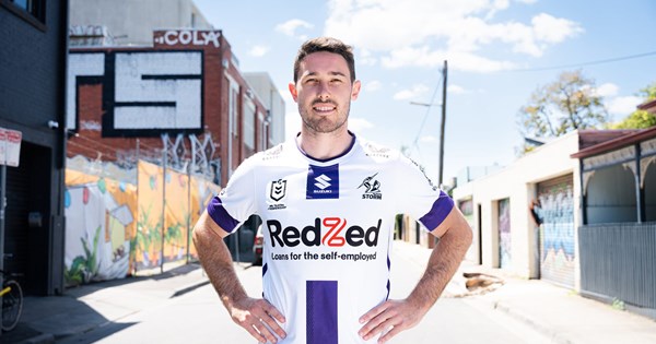
Terrible.Melbourne now officially release the away jumper

Clean, simple and nostalgic; Storm’s 2023 away jersey
Melbourne Storm’s 2023 away jersey has arrived bringing a clean, bright and nostalgic feel to the Club’s interstate kit.www.melbournestorm.com.au
I'd argue it's one of the better ones we've had in recent years. No unnecessary Vs, no strange gradients, no third shield randomly floating in the front.Not even the worst nsw jersey we've seen.
It's just the westpac logo that ruins it.
