What's new
The Front Row Forums

Register a free account today to become a member of the world's largest Rugby League discussion forum! Once signed in, you'll be able to participate on this site by adding your own topics and posts, as well as connect with other members through your own private inbox!

The Game 2023 Jerseys, Sponsorship, Logos etc

flippikat

First Grade
Messages
5,221
Is it now lamo.

The design's well executed, the jersey's well constructed, the colour palette works well and is balanced, the sponsorship integration is about as good as you can ask for, it's creative and original, etc.

Again it's nothing amazing, and probably won't have a lasting impact either, but it's certainly not objectively bad. Okay is probably the best way to describe it.

I disagree with it being well executed. Sure - asymmetrical designs are a tough sell to begin with, BUT the designers weren't doing themselves any favors by making the stripes mis-match.

There's a balance to be struck between jarring & anchored, and I think they missed it & it's ALL jarring.

I wouldn't be surprised if a heritage jersey actually becomes their de facto home jersey by the end of next season, much like what happened when the Raiders tried a revamp of their home kit to that green & navy kit (which wasn't bad IMO, but just never seemed to resonate with the fans)
 

Diesel

Referee
Messages
23,753
Why can’t RL people design RL jerseys instead of a group of designers and marketing teams in another country with no idea what RL is?
 

The Great Dane

First Grade
Messages
7,957
I disagree with it being well executed. Sure - asymmetrical designs are a tough sell to begin with, BUT the designers weren't doing themselves any favors by making the stripes mis-match.

There's a balance to be struck between jarring & anchored, and I think they missed it & it's ALL jarring.
I don't think you understand what asymmetrical means lol...

The stripes aren't mismatched anyway. The maroon lines all line up, and the gold and white all line up and interchange with each other intentionally. Sure there're extra white and gold stripes on the top and bottom respectively, but that's another motif.
I wouldn't be surprised if a heritage jersey actually becomes their de facto home jersey by the end of next season, much like what happened when the Raiders tried a revamp of their home kit to that green & navy kit (which wasn't bad IMO, but just never seemed to resonate with the fans)
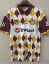
The Broncos would be morons to allow that to happen because of a loud minority of people on the internet that lack imagination and fear change.

The goal should be to keep this jersey for a few years then take the ideas that worked and improve on them. I already know what I'd do next if I was the designer; get rid of the diagonal halving on the front and back panels and further accentuate the asymmetrical stripes.
 

Victoire

Juniors
Messages
1,083
It makes sense... the Broncos were born in the 80s after all

brillen-sonnenbrillen-partybrillen-hippiebrille-kostuemzubehoer-damen.jpg
images
 

beave

Coach
Messages
15,671
I don't think you understand what asymmetrical means lol...

The stripes aren't mismatched anyway. The maroon lines all line up, and the gold and white all line up and interchange with each other intentionally. Sure there're extra white and gold stripes on the top and bottom respectively, but that's another motif.

The Broncos would be morons to allow that to happen because of a loud minority of people on the internet that lack imagination and fear change.

The goal should be to keep this jersey for a few years then take the ideas that worked and improve on them. I already know what I'd do next if I was the designer; get rid of the diagonal halving on the front and back panels and further accentuate the asymmetrical stripes.
They actually don't.

They're half a stripe width out of alignment

A628E240-F369-4CAC-AB5A-CC5F397EA2BC.jpeg
 

yakstorm

First Grade
Messages
6,037
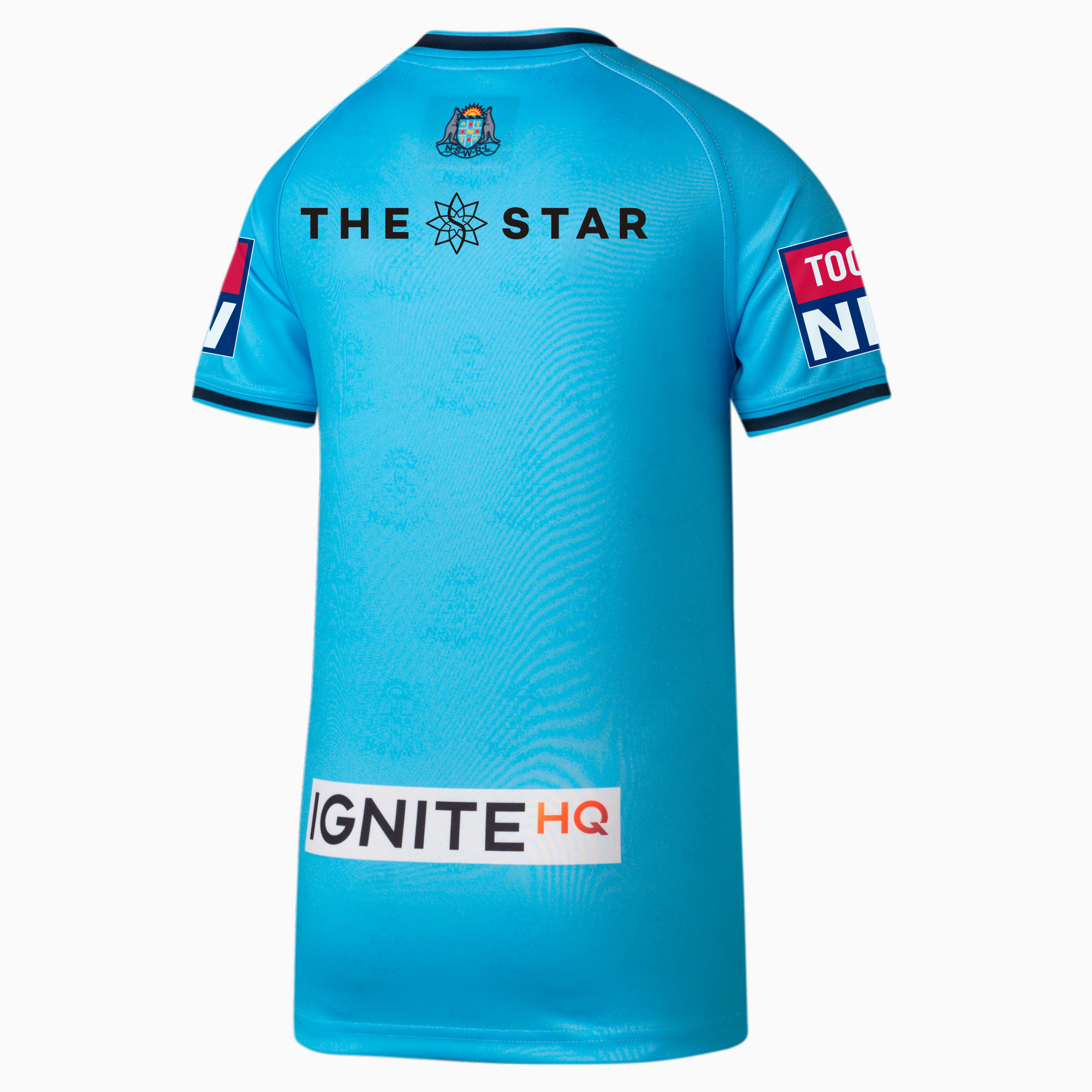
So the missing NSWRL crest has made it's way to the back of the jersey for 2023.

Far better placement than trying to fit it on the front of the kit. Also nice to see 'The Star' is no longer in a giant black box. Shame Ignite HQ is in a white box... on sky blue their logo is still just as legible.
NSW-Blues-Men%27s-Replica-Jersey
 

kiwiwolf43

Juniors
Messages
5
I don't get it people have a problem with Team Jerseys is nothing wrong with any of the Jerseys is people being too picky about colours etc St George Illawarra told The Dolphins not to use the V at all is all shit ok if The Dolphins had of used a gold or grey V for there Jersey is ok St George do not own the V they are a shit team and no team owns any colours or designs so get with it it sounds like a gang where ohh you cannot have that color because we have it is really stupid is all my opinion like it or hate it
 

kdalymc

Bench
Messages
4,343
I don't get it people have a problem with Team Jerseys is nothing wrong with any of the Jerseys is people being too picky about colours etc St George Illawarra told The Dolphins not to use the V at all is all shit ok if The Dolphins had of used a gold or grey V for there Jersey is ok St George do not own the V they are a shit team and no team owns any colours or designs so get with it it sounds like a gang where ohh you cannot have that color because we have it is really stupid is all my opinion like it or hate it
f**ken full stop or comma wouldnt hurt
 

Latest posts

Top