It's Been Done
Juniors
- Messages
- 793
At various times you can see a blur on the back of the training jerseys, which can only mean one thing, an unannounced sponsor for the Dragons next year

 www.rabbitohs.com.au


Rabbits jersey is amazing.
On another note, has anyone else banged on for years about how teams should stick to traditional jerseys etc, but have now been left disappointed when teams are no longer changing jersey designs yearly? May be just me..
Seems to be less change than usual. I'm not sure if that's actually the case, or perhaps it's that makers like Dynasty are often re-using older designs, which we've seen before a lot.
Isn't it about time the Roosters did something different for their away jersey?More Roosters 2024 gear.
View attachment 81767
View attachment 81768
View attachment 81769View attachment 81770
Just realized they have replaced the old Easts logo with that generic logo for our training gearMore Roosters 2024 gear.
View attachment 81767
View attachment 81768
View attachment 81769View attachment 81770

The away jerseys often disappoint because they’re often boring white but Easts is the one that actually makes sense imo and I do prefer it to the disastrous three band chevron thingy of 2012 or the early V with horizontal bands within. Wouldn’t mind that white model with original hoops pattern getting a run.Isn't it about time the Roosters did something different for their away jersey?
White with a red V and a navy blue V (whichever one is in top) has been done to death.
I absolutely agree that the home jersey should be a traditional design, and stay that design - and the Roosters are a GREAT example of that, but IMO they've been too predictable & conservative with the away jersey barely changing at all.
Let's see them use the white tricolor striped jersey, or a red tricolor striped jersey.. or something!
Oh and the sky-blue striped training jersey could be a good idea for ANZAC day - it's a clever blend of the sky blue of WW2-era Roosters teams and the stripes of WW1-era Roosters.
Man I love this.View attachment 81844
Players wearing Souths home kit. It does look good.
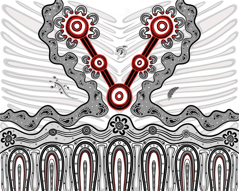
Looks like a vaginaThe Dragons have just announced the winning design of their Indigenous Jersey
Looks like a training jersey.Parramatta Home Jersey ,Away is White No Yelow (Gold)
View attachment 81861
View attachment 81862
View attachment 81863
View attachment 81864


