What's new
The Front Row Forums

Register a free account today to become a member of the world's largest Rugby League discussion forum! Once signed in, you'll be able to participate on this site by adding your own topics and posts, as well as connect with other members through your own private inbox!

2025 NRL Jerseys, Sponsorship, Logos

MugaB

Coach
Messages
15,055
One other thing I noticed was the chevron difference - the chevron splits before the sponsor on Su'a's jersey but it doesnt on Leilua's. Dragons got some explaining to do.
It's probably the size difference, a large would need more V hence why the V stretches out on Su'a's frame, look at Hunt's and then to Su'a's, it's obvious they want the V to stop at a certain point of the jersey (around the belly button), and the sponsor fits in the same spot regardless of where the V actually is, Luciano is similar to Hunts also, he might also be a smaller size to Sua's....
 

blue bags

First Grade
Messages
9,597
For anyone interested, this is from the agency who redesigned the simplified Dragon logo. It explains what they did & why the club didn't use the version the NRL made

I've seen that design. Dragon. Before
From a European football team I think 🤔
 

It's Been Done

Juniors
Messages
716
It's probably the size difference, a large would need more V hence why the V stretches out on Su'a's frame, look at Hunt's and then to Su'a's, it's obvious they want the V to stop at a certain point of the jersey (around the belly button), and the sponsor fits in the same spot regardless of where the V actually is, Luciano is similar to Hunts also, he might also be a smaller size to Sua's....
Could also be a prototype the manufacturer had lying around
 

Nuke

Moderator
Staff member
Messages
5,363
The redrawn dragon is really well done. I know the Dragons don’t want to touch their primary logo, but they should consider it - just redraw the full logo in the new style. Everything else can stay the same.
That Dragons emblem was designed by one of the biggest Bulldogs supporters I know. Given the rivalry between those two clubs, party of me wonders if any of the passionate Dragons decision-makers don't like that the best looking thing they've had logo-wise was done by a huge fan of their biggest rival.

Our maybe that's just where my mind would go if that happened to my club ... and it probably has..!
 

Matt_CBY

Juniors
Messages
1,541
That Dragons emblem was designed by one of the biggest Bulldogs supporters I know. Given the rivalry between those two clubs, party of me wonders if any of the passionate Dragons decision-makers don't like that the best looking thing they've had logo-wise was done by a huge fan of their biggest rival.

Our maybe that's just where my mind would go if that happened to my club ... and it probably has..!
As a Bulldogs member, when he created the Manly logo I was more annoyed than this.
 

Nuke

Moderator
Staff member
Messages
5,363
Looking through the blur, I can see a Bulldogs logo that looks closer to the round 1980s - mid1990s logo. Obviously it'll have its '90 Years' flavour, but I suspect it's based on that logo. I guess we'll see in a few days.
 

MRN

Bench
Messages
3,428
It's probably the size difference, a large would need more V hence why the V stretches out on Su'a's frame, look at Hunt's and then to Su'a's, it's obvious they want the V to stop at a certain point of the jersey (around the belly button), and the sponsor fits in the same spot regardless of where the V actually is, Luciano is similar to Hunts also, he might also be a smaller size to Sua's....
Well I wouldn't think Damien cooks needs a size difference the same as Sua, in fact he is probably smaller then Hunt, yet his Vee is the same as Sua's and he is also very clearly missing the red cuff of the sleeve.
1000001445.jpg
 

MugaB

Coach
Messages
15,055
Well I wouldn't think Damien cooks needs a size difference the same as Sua, in fact he is probably smaller then Hunt, yet his Vee is the same as Sua's and he is also very clearly missing the red cuff of the sleeve.
View attachment 95872
Interesting seems that there are two then, why the two different cuts then? Don't tell me one's the "heritage' and the other is the "home"
 

Hit The Post

Juniors
Messages
219
Correct me if I'm wrong, but to me I see three different jerseys - Hunt's and Leilua's are the same, Cook's is slightly different, and Su'a's is different again.
 

Saint Doc

Coach
Messages
11,091
I reckon Classic made a number of prototypes.
Not sure which version will have been selected.
It was meant to be a new sponsor launch, rather than a jersey launch. They probably didn’t realise we were all such legends and gonna sit here analyzing it to the nth degree. Probably just thought- boys put on one of those new squadron jerseys in the box and come over here in front of the camera
 

Hit The Post

Juniors
Messages
219
What's the difference between cools and su'a, they look the same
they have a different sized gap where the chevron meets the sponsor

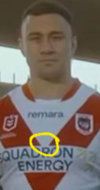
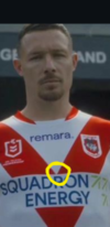
Screenshot_20241029_002354_Instagram.pngScreenshot_20241029_002419_Instagram.png

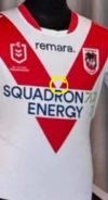
and i could be wrong, but I noticed that the original photo doesn't seem to match either of these (or Hunt's) - the gap is bigger than the one on Cook's jersey and smaller than Sua's. So in total I see four variants.

Screenshot_20241029_003152_Instagram.png
 
Last edited:

Latest posts

Top