ACTPanthers
Bench
- Messages
- 4,842
Penrith just a cut and paste from last season. Saves me money on new jerseys 


I understand your thought process but I don’t think it would. I’d be interested in seeing it in red, yellow and green thoughIf they insist on the pink alternate, that design would look so much better if they made the 3 horizontal stripes black instead of a hot pink.
That’s looks much better. Would sell more jerseys your way too.I don't why the Cowboys & Toyota couldn't have done something like this (of course a cleaner better version than my 2 minute photoshop) where the Toyota logo is still unobstructed, but the bar design isn't just suddenly cut off...
View attachment 96023
View attachment 96024Looks way better. Would sell more jersey like this.
| Home Jersey |
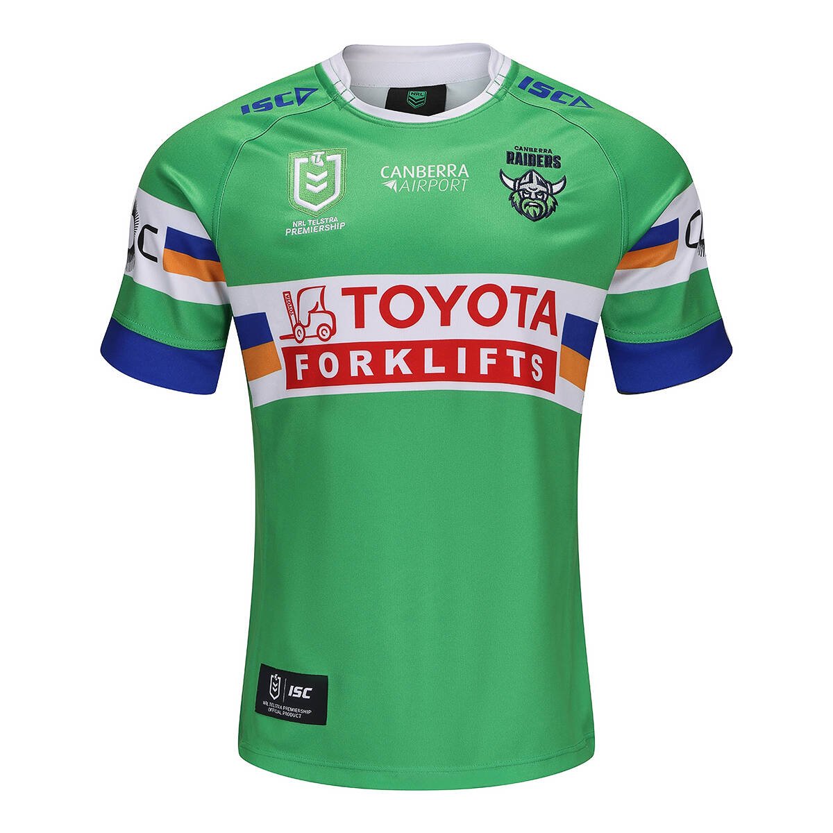
|
| Away Jersey |
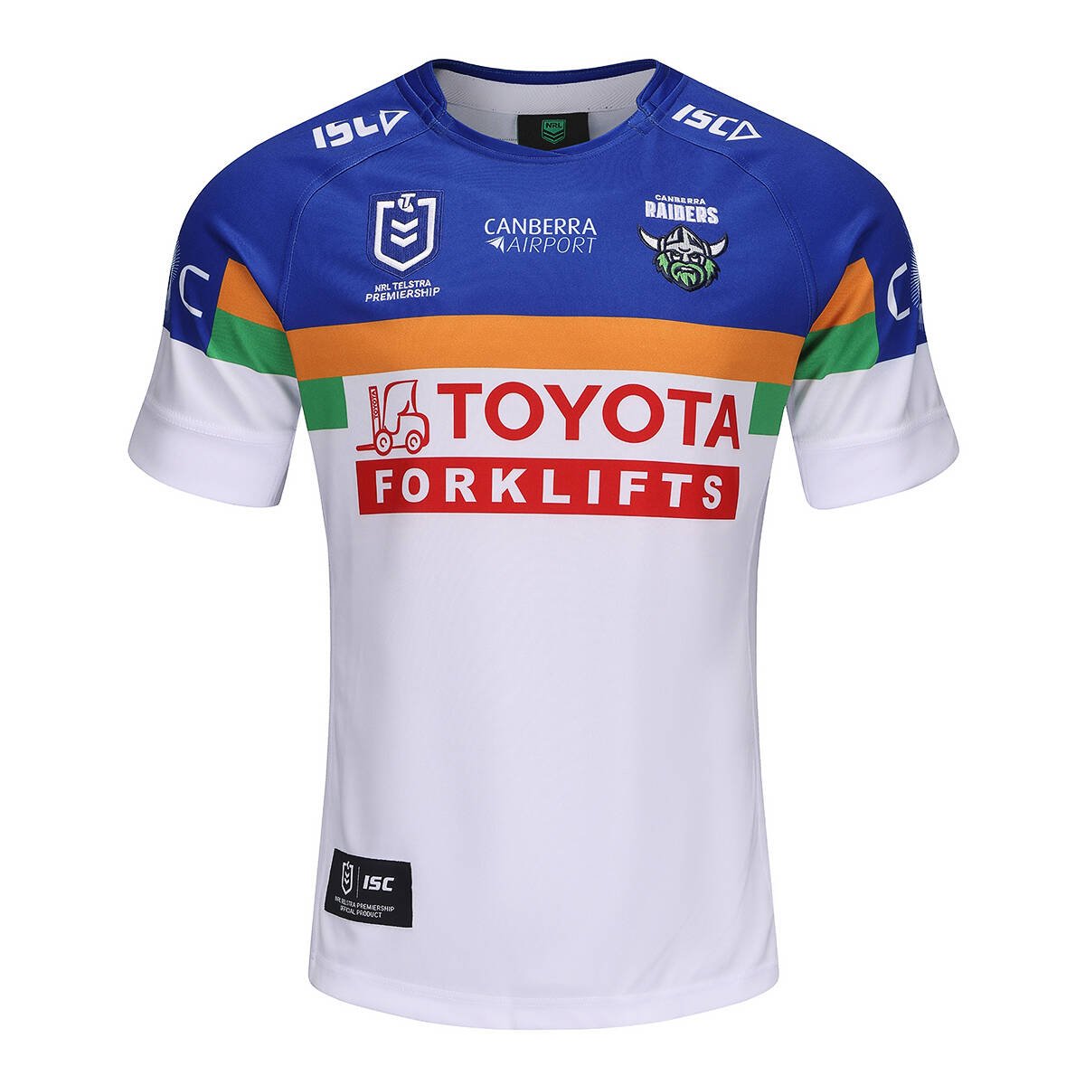
|
| Alternate Jersey |
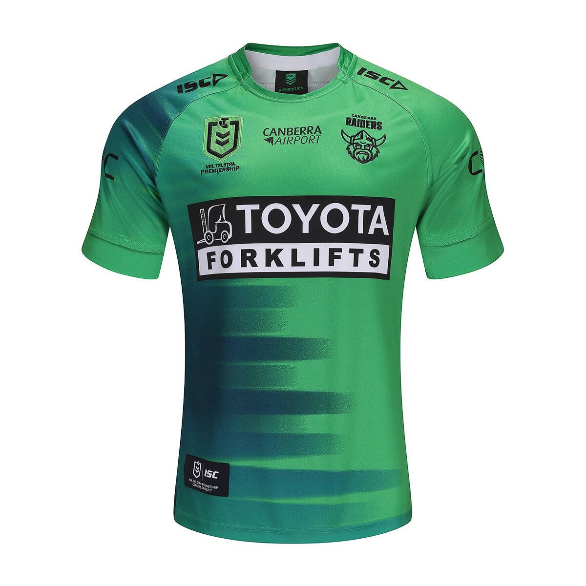
|
That, but with thicker yellow stripes.I don't why the Cowboys & Toyota couldn't have done something like this (of course a cleaner better version than my 2 minute photoshop) where the Toyota logo is still unobstructed, but the bar design isn't just suddenly cut off...
View attachment 96023
View attachment 96024
Home Jersey 
Away Jersey 
Alternate Jersey 
Much better and the Toyota logo is more prominentI don't why the Cowboys & Toyota couldn't have done something like this (of course a cleaner better version than my 2 minute photoshop) where the Toyota logo is still unobstructed, but the bar design isn't just suddenly cut off...
View attachment 96023
View attachment 96024
Honestly a thousand times betterI don't why the Cowboys & Toyota couldn't have done something like this (of course a cleaner better version than my 2 minute photoshop) where the Toyota logo is still unobstructed, but the bar design isn't just suddenly cut off...
View attachment 96023
View attachment 96024
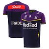
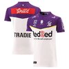
It's at least 3 or 4 years since we've had a good jersey and the better part of 10 years since we've had a decent home or away that's an original design. In that time we've also had two disastrous rebrands. That's an impressively low hit rate for a professional organisation.
Home Jersey 
Away Jersey 
Alternate Jersey 
That away kit may as well be a Brumbies jersey!Raiders alternate-
Potential 10/10
Delivery 3/10
diabolical effort covering the green stripe
The 'colour rush' jersey doesn't meet the minimum standards to be a color rush design.Raiders to wear 'colour rush' jersey in Vegas
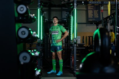
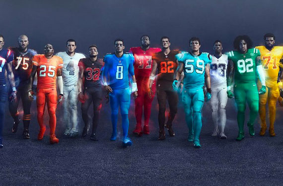
It was a crap design to begin with that's only being brought back because it was created in the 5 year golden period from 89 to 94. Most people didn't even know or remember that the Lions Tour jersey existed until Seekem randomly did a retro of it.Raiders alternate-
Potential 10/10
Delivery 3/10
diabolical effort covering the green stripe
