It's Been Done
Juniors
- Messages
- 830
Dolphins teasing their 2025 jerseys being unveiled tomorrow
The NRL sets a maximum size for the front of jersey sponsors, not a minimum size. The clubs make the decision as to how big the sponsor needs to be, often as part of the contract negotiations with the sponsor. They also make the call whether there needs to be a giant box around the logo or what the signed off kit will look like.The NRL has sold the front of jersey space to sponsors, there are minimum requirements on this space. You'll find they have increased the sizing.
It's not the clubs or the jersey manufacturers call.
Real 2010-12 vibes from part of that video
It's not looking gold AT ALLReal 2010-12 vibes from part of that video
Could be the heritage since Dynasty like to pick old classic designs.. hopefully?It's not looking gold AT ALL
You raise a good point, and if a club today was to try something as groundbreaking as Penrith's 1991 rebrand from chocolate soldiers to allsorts (which is arguably the best brand revamp in the league's history), you'd have a massive outcry.It's sad how creatively bankrupt the NRL's jersey culture has become. I mean when was the last time a club released a primary kit with an original design that was genuinely good?
I'm not sure you've read the room, TGD loves that sort of stuff, he was no.1 fan of the Raiders move away from lime to navy and steelYou raise a good point, and if a club today was to try something as groundbreaking as Penrith's 1991 rebrand from chocolate soldiers to allsorts (which is arguably the best brand revamp in the league's history), you'd have a massive outcry.

My pecs, can see you!!!!!
Adidas, BLK, classic, now dynasty - everyone loves trying to work the helmet and/or swords into the designView attachment 96355
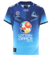
Our ‘25 Home Jersey. The Away is the same as the last few years. Some initial opinions of mine:-
- I was initially disappointed with it due to the lack of gold on it (there is a tiny bit on the bottom side panel)
- Love that we have stuck with the tone fade. It looks better too with the dark on the top.
- Has shades of the 2013 Jersey with the Logo built into it
- Hoping this gives room for a Heritage Jersey, but they might leave that for our 20 year coming up.
As a fan, I’m keen!!
Could be the photos, we were all bagging the 2023 jerseys on release but in the flesh they looked a lot betterI liked the “shiney” gold the dolphins did with their previous jerseys. Unless this is just a bleh image on their insta, the gold looks faded this year and kinda bland.
