What's new
The Front Row Forums

Register a free account today to become a member of the world's largest Rugby League discussion forum! Once signed in, you'll be able to participate on this site by adding your own topics and posts, as well as connect with other members through your own private inbox!

2025 NRL Jerseys, Sponsorship, Logos

Messages
194
View attachment 96355
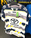
Our ‘25 Home Jersey. The Away is the same as the last few years. Some initial opinions of mine:-

- I was initially disappointed with it due to the lack of gold on it (there is a tiny bit on the bottom side panel)
- Love that we have stuck with the tone fade. It looks better too with the dark on the top.
- Has shades of the 2013 Jersey with the Logo built into it
- Hoping this gives room for a Heritage Jersey, but they might leave that for our 20 year coming up.

As a fan, I’m keen!!

NSW!! NSW!!!

It has always seemed weird that a team trying to challenge the Broncos to be “THE qld team” is copying the NSW state teams look…..

It just seems logical that they would make gold their primary colour:
- it is distinct within the comp
- it is representative of qld (secondary to maroon)
- they are from the GOLD coast

but that makes too much sense……
 

Frailty

First Grade
Messages
9,454
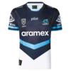
Sharks '25 Away leaked on NRL Shop.

Not a fan, I like the design they're trying to go for but it looks really bad on black - we've seen it the past it works so much better on blue (2022 heritage for reference). Sponsor integration isn't great either.

View attachment 96834
View attachment 96835
The are some things that really bother me with this jersey:
- The sponsorship integration is just horrible. They've been able integrate well in the past, so I don't see why there is a need for the box approach.
- The badges seem really low - like below the nipples.

It just looks like a botched knock-off jersey.
 

flippikat

First Grade
Messages
5,219
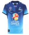
I was hoping the Titans would have kept the "city jersey":
View attachment 96839
As ridiculous as it seems, I thought it looked really good in action and represented their home.
A slightly sandy yellow (not as bright as Parra) & light blue (somewhere between the shades of Bulldogs/Eels Royal Blue & the Sharks sky blue/almost pastel) is what the Titans need to wear.

Mostly gold, some light blue, little to no navy blue
 

Victoire

Juniors
Messages
1,081
Sharks '25 Away leaked on NRL Shop.

Not a fan, I like the design they're trying to go for but it looks really bad on black - we've seen it the past it works so much better on blue (2022 heritage for reference). Sponsor integration isn't great either.

View attachment 96834
A new contender for the worst Sharks jersey ever has emerged. The below jersey may lose the crown

sharks06away-e1681209279490.jpg
 

Matt_CBY

Juniors
Messages
1,514
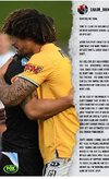
NSW!! NSW!!!

It has always seemed weird that a team trying to challenge the Broncos to be “THE qld team” is copying the NSW state teams look…..

It just seems logical that they would make gold their primary colour:
- it is distinct within the comp
- it is representative of qld (secondary to maroon)
- they are from the GOLD coast

but that makes too much sense……
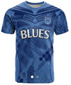
Looks nothing like the Blues jersey.
 

flippikat

First Grade
Messages
5,219
A new contender for the worst Sharks jersey ever has emerged. The below jersey may lose the crown

sharks06away-e1681209279490.jpg
I actually like that as a light away jersey for the Sharks. That early '00s shade of blue they wore really pops as a trim colour, and grey is a nod to the actual colour of sharks.

Execution might not be 100% but the seed of a good idea is there.
 

It's Been Done

Juniors
Messages
716
Sharks '25 Away leaked on NRL Shop.

Not a fan, I like the design they're trying to go for but it looks really bad on black - we've seen it the past it works so much better on blue (2022 heritage for reference). Sponsor integration isn't great either.

View attachment 96834
View attachment 96835
Looks like something Western Suburbs might've worn had they gone over to Super League
 

MugaB

Coach
Messages
15,041
Why couldn't Aramac be white on the black background? The red looks terrible
Yes we'll the heritage has Aramex with no box in white, not sure why this new away jersey couldn't do the same? Why are we ruining all these new jerseys with ugly boxes lately?
 

beave

Coach
Messages
15,671
The Toyota box cutting in to the grey stripe is the main reason I probably won’t buy this, probably the only reason really. Could have been so much better with a few minor adjustments.
I agree they 100% should have keyholed the toyota logo in all 3 jerseys for 2025, but the alt jersey the shit logo style is less noticeable due to the busyness of the design. The fans version with the extra material over the players makes it also a bit more bearable.

IMG_9247.jpeg
 

toomuchsoup

Juniors
Messages
2,255
The are some things that really bother me with this jersey:
- The sponsorship integration is just horrible. They've been able integrate well in the past, so I don't see why there is a need for the box approach.
- The badges seem really low - like below the nipples.

It just looks like a botched knock-off jersey.
Here’s an edit of how I think it could have been so much better. I actually love the design, it just wasn’t executed perfectly. Obviously the sponsor box is a crime against aesthetics, and the thine blue line towards the bottom is unnecessary Untitled design - 2.png
 

League Unlimited News

Administrator
Staff member
Messages
8,677
Here’s an edit of how I think it could have been so much better. I actually love the design, it just wasn’t executed perfectly. Obviously the sponsor box is a crime against aesthetics, and the thine blue line towards the bottom is unnecessary View attachment 96858
Just a reminder if it's an edit/mock up please make it clear on the image that it is an edit or mock up.
 

Latest posts

Top